
The Museum was founded by Amy, Eleanor, and Sarah Hewitt—granddaughters of industrialist Peter Cooper—as part of The Cooper Union for the Advancement of Science and Art in 1897. Cooper Hewitt, Smithsonian Design Museum is devoted exclusively to historic and contemporary design. It is the only one of its kind in the nation. Cooper Hewitt educates, inspires, and empowers people through design by presenting exhibitions and educational programs and maintaining active publications. It is the mission of Cooper Hewitt’s staff and Board of Trustees to advance the public understanding of design across the thirty centuries of human creativity represented by the Museum’s collection. Its collections and exhibitions explore approximately 240 years of design aesthetic and creativity.
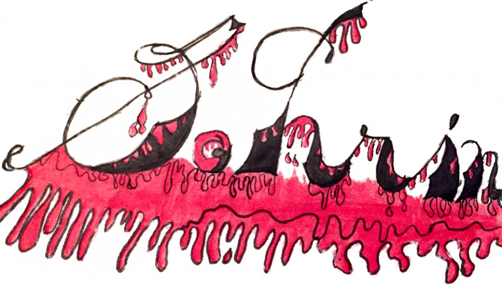
After learning about the Cooper Hewitt, I will now share my thoughts on three pieces i saw at the museum in New York.
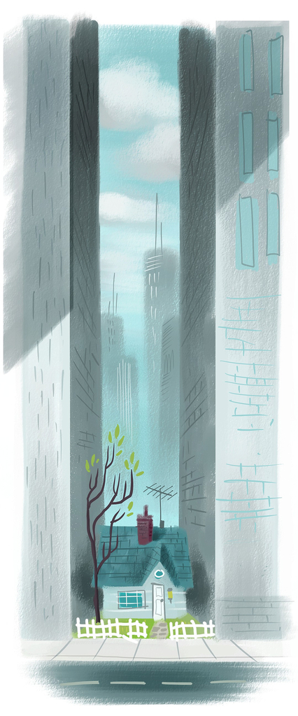
This piece is part of the “Pixar: The Design Story”. What drew my attention to this particular design was the representation of the small house between two skyscrapers. The different shades of grey fill the art piece. The design is a concept art of Carl’s House made in 2009. From top to bottom: the top of the skyscrapers with other skyscrapers in the blurred background, next the top of a tree with very few leaves and a tv antennae, then Carl’s house is visible, and last the street in front of the house. The use of the house being the only non-modern element in the artwork shows that the is a stubborn old man who refuses to leave.
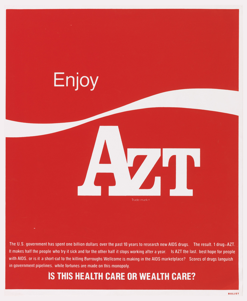
Poster, Enjoy AZT, 1989. screenprint on paper. Gift of Steven Heller and Karrie Jacobs. 1993-53-103. H x W: 58.6 × 48.4 cm (23 1/16 × 19 1/16 in.)
This piece is part of the poster exhibit on the first floor. What drew my attention to this particular design is the familiar design go the poster. It is the same design as the coca-cola commercials. But the only difference is that “Coke” was replaced by AZT. This is a PSA poster from 1989, for a drug used to treat AIDS. The drug unfortunately became toxic and ineffective for some patients. This poster condemned the product as a consumer product from the misery of AIDS patients. The overall fluorescent red and white color fills the poster. The design is a double-sided monochromatic poster, 23 1/16 x 19 1/16 inches. It is using a serif and sans serif typeface.
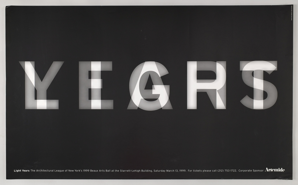
Poster, LIGHT/YEARS, 1999. offset lithograph on white wove paper. Gift of Michael Bierut. 2007-12-2. H x W: 23 1/2 x 38 1/2 in.
This piece is also part of the poster exhibit on the first floor. What drew my attention to this particular design is the overlapping of the words “LIGHT/YEARS”. At first glance it is hard to depict what it says but if you look at it a little closer, you can make out the letters L-I-G-H-T under the letters Y-E-A-R-S. This is another monochromatic poster. The overall black and white color fills the poster. The dimensions of this poster is 23 1/2 x 38 1/2 in. Its medium is offset lithograph on white wove paper. Micheal Beirut realized that each word had five letters in each, so he thought to overlay them. This was made for the annual Beaux Arts Ball in 1999.

