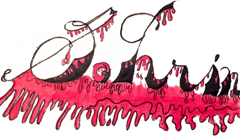
 This project is made up of the idea of using 7 vocabulary words that we had learned in class. One composition had to consist of 3 variables, one of 5 and one of 7. I also had to consider the use of a 50/50 ratio of black and white to show the contrast between light and dark throughout one of the compositions. It all started with drawing random spots.
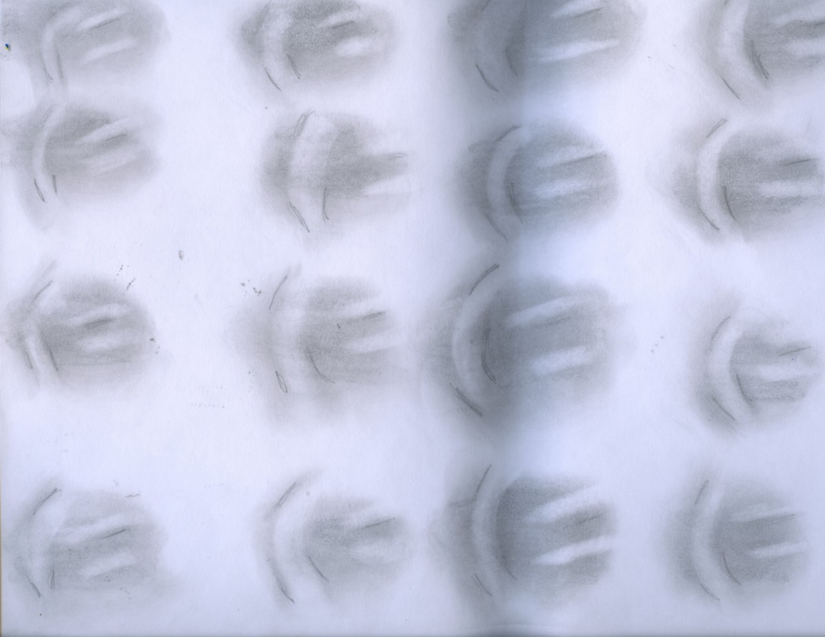
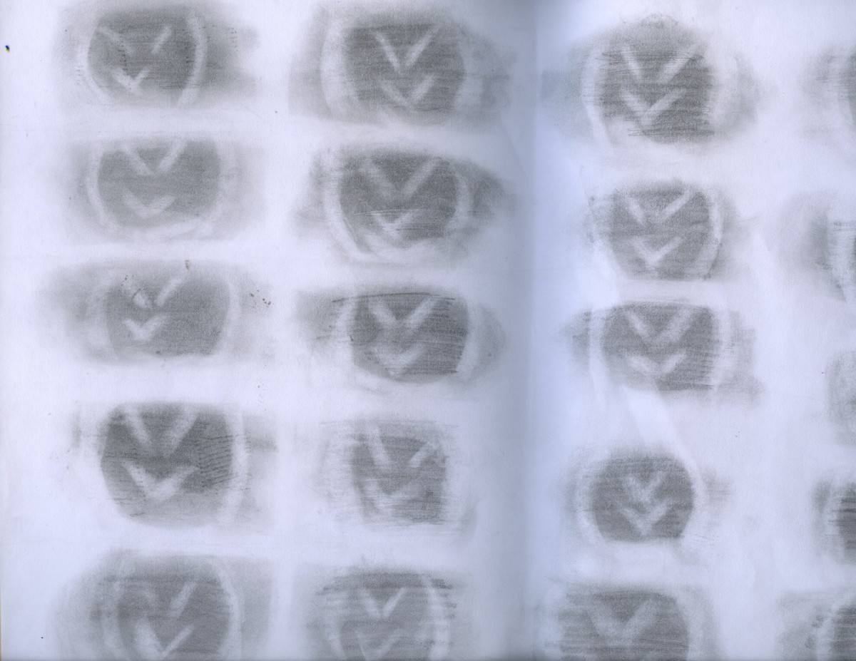
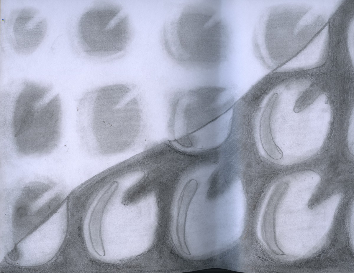
After finding the right spots, I redrew them into a 11″17″ drawing papers, where I had to consider the variables that I chose to work with and make sure to include the idea of 50/50 (white and black) as well. this was the difficult part because I had to be careful when and where to place every object and prevent that my other ideas for the other variables altered the others, the variables were the key point for this project in order to work together with the spots. Well, for this I had to sketch my ideas several times! Experimenting with size, direction, distance, proportion, interval, scale and density.
Overall, this assignment was very difficult; the idea of sketching several times, having my brain multitasking all the time, and the amount of time that it took. However, this project made me realize that I have to pay more attention to every detail in order to end up with a stronger composition.
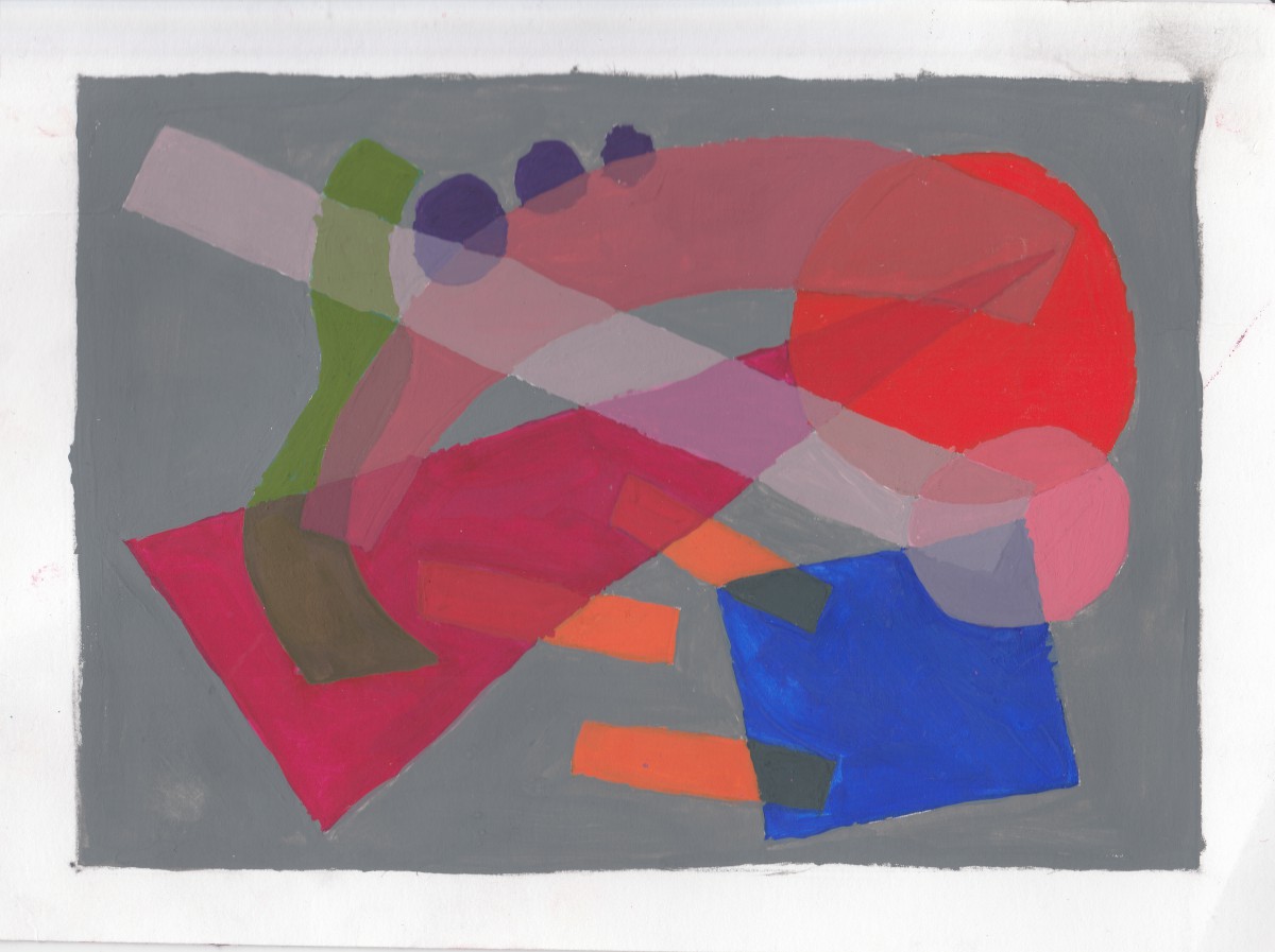
To begin this project, I had to create a composition that consists of various elements: three dashed, three dots, one circle, one line, one square, one triangle and one arch. They had to be arranged in a way that they overlap. The purpose was to show our understanding of transparency and color mixing. I had to select 3 shapes with 2 layers and 3 shapes with 3 layers of overlapping transparency.
After arranging the elements I had to figure out what colors I would use. One of my main concerns was selecting colors that did not cause me trouble when mixing them for the overlapping parts, and that I could run out of paints. Painting the smallest parts also terrified me at first, but I set that as a challenge to myself and began focused more on the arrangement of every object and the appropriate color for each. After selecting my colors, I began painting them, making sure that it looked professional and neat. Compared to my previous attempt, this one looks much better, and needs few correction for the mixture part.
The time, frustration, and wakefulness that this project required was worth it because it served me a lot to practice my skills of painting and developed new techniques during the process.
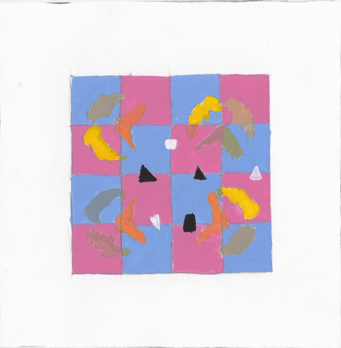
To begin this project, I had to create a composition that consists of various blobs. They had to be arranged in a way that they overlap. The purpose was to show our understanding of transparency and color mixing. I had to select 3 blobs and arrange them so they can show the 90º rotation, a flip of the original and the flop.
This project was my favorite overall the coursework. When the professor asked us to randomly draw different kind of shapes on a big piece of paper I never expected it would end up like this. When I started drawing my first composition I wasn’t that concerned about the colors. After re-reading the handout again, i had re-done the assignment again the next day.
What I liked the most was the result of my second composition. The lighter muted colors of the background doesn’t affect the blobs. Instead it is relaxing on the eyes.

