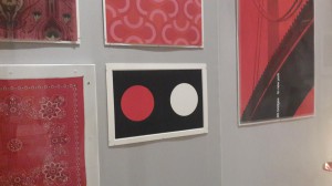
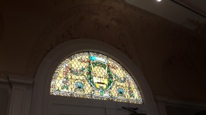
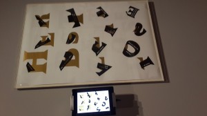
 We had nice trip to a museum in Manhattan last Thursday. There are many interesting thing there.
Category Archives: Uncategorized
Project 5
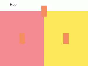
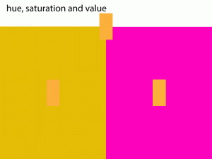
Change in hue (400px x 400px)
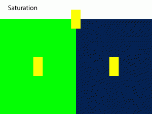
Change in saturation (400px x 400px)
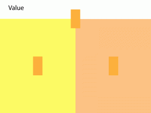
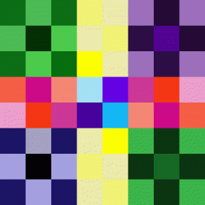
Change in value (400px x 400px)
Make a bigger composition
What I have learned from this project is that it is very convenient to use AI tools to do a craftsmanship. Besides, saturation and value of color can help us to create an interesting pattern or spacial depth. Our eye balls will firstly notice the brightest color, and then focus on the darker one. Therefore, it create a movement.
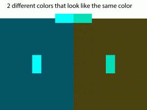
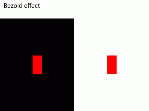
Color relativity tests
Project 3
In Project 3, I did my composition in term of transparency, layering and different value. Firstly, I used pencil, marker, painting and magazine paper to make a value scale set. Then,I created a composition in AI, and labeled the 9 values. I find it very difficult to use painting. I did the composition in gouache by using big brush, but I am not satisfied with the result. Therefore, I did it again. I painted on another paper, cut them out, and then put them on the frame. I am not satisfied with the second result either. I asked my classmate for some suggestion. They advised that I can use smaller brush to finish my cured line. I think suggestion is very helpful.
Design Journal entry #15
What I Learned from the First Project
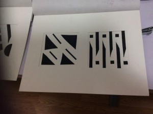
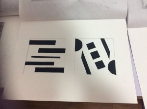
When I began to do my first project: black paper cutouts, professor told us to use the knowledge geometric and organic shapes and the figure ground relationship. Firstly, I designed my mock-up at a piece of paper with pencil. I find that it was easy to learn the definition of an art work, but it is difficult to use that, so practicing is very necessary. Before I thought cutting a 4 by 4 inches square was very easy, but I totally was wrong. I wasted my two pieces of Bristol, when I practiced how to cut a better square. Therefore, I learn that nothing is easy but practice makes perfect.
Before I did my inked project, I did the design on AI. I used one of on my pattern to create a composition at class, but I did not really satisfied with that, so I went home to design another more simple composition. I learned that less is more from this project.
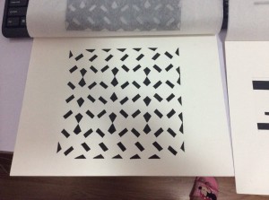
Then I used marker to color my composition. Some of the pattern did not look good, because finally I had no patient.I found that I had to be very patient to finish my project.
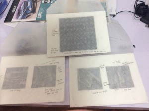
I must give some commend about these three projects with tracing paper. I learn that an designer must check his or her design first when they want to send to the clients.
After all this is a very funny experience that I really enjoyed and learned a lot.
http://www.freepik.com/free-photo/art–texture–watercolor–textures_317765.htm
I choose this painting because different color of oil create positive space. Different color oil go together to create an implied color. The mark from painting brush become a visible outline on this painting. The remain white area become a positive space or negative space, which is interesting.
I love this because the letter ARTS seem to come out from the page. Then the white letters which are around the strong texture ARTS make the whole page more fancy and interesting.
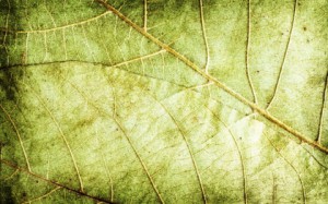
I choose this leaves texture because I think things from nature could be the best way to explain the definition of texture.
4.
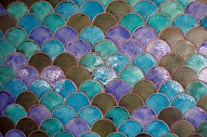
http://designbeep.com/2012/12/10/a-new-collection-of-free-tile-textures/
I love this texture because the color of that is very harmonious. The repeated pattern seems to make the page no negative space, but Purple, blue, green and brown color come together create the positive and negative space.
I download this texture because the color is very fancy. Besides, the leaves overlap together so that positive and negative space change to each other.
Introduction
Hi everyone. I am Landy
My design goal is: be a good designer; be good at different design software. I enroll in the class Graphic Design Principle mainly because my major requires this class. Personally, a good designer should know the foundation of design, so this class should be very necessary for a beginner.
One of my family is a designer, and he inspires me a lot. He tells me that a good designer should learn by himself for whole life. Besides, the knowledge we learn from school is not enough to handle our work, so we should update our knowledge as soon as possible.
Firstly, I will brainstorm when I begin my design process. Secondly, I will write down some note or draw down the structure on a paper. Thirdly, I will search some background information about the project on internet. Finally, I will finish my design on the computer.
I am interesting in how to use color and finishing a project independently. Also, the project should be close to reality.

