
1.

http://www.freepik.com/free-photo/art–texture–watercolor–textures_317765.htm
I choose this painting because different color of oil create positive space. Different color oil go together to create an implied color. The mark from painting brush become a visible outline on this painting. The remain white area become a positive space or negative space, which is interesting.

I love this because the letter ARTS seem to come out from the page. Then the white letters which are around the strong texture ARTS make the whole page more fancy and interesting.
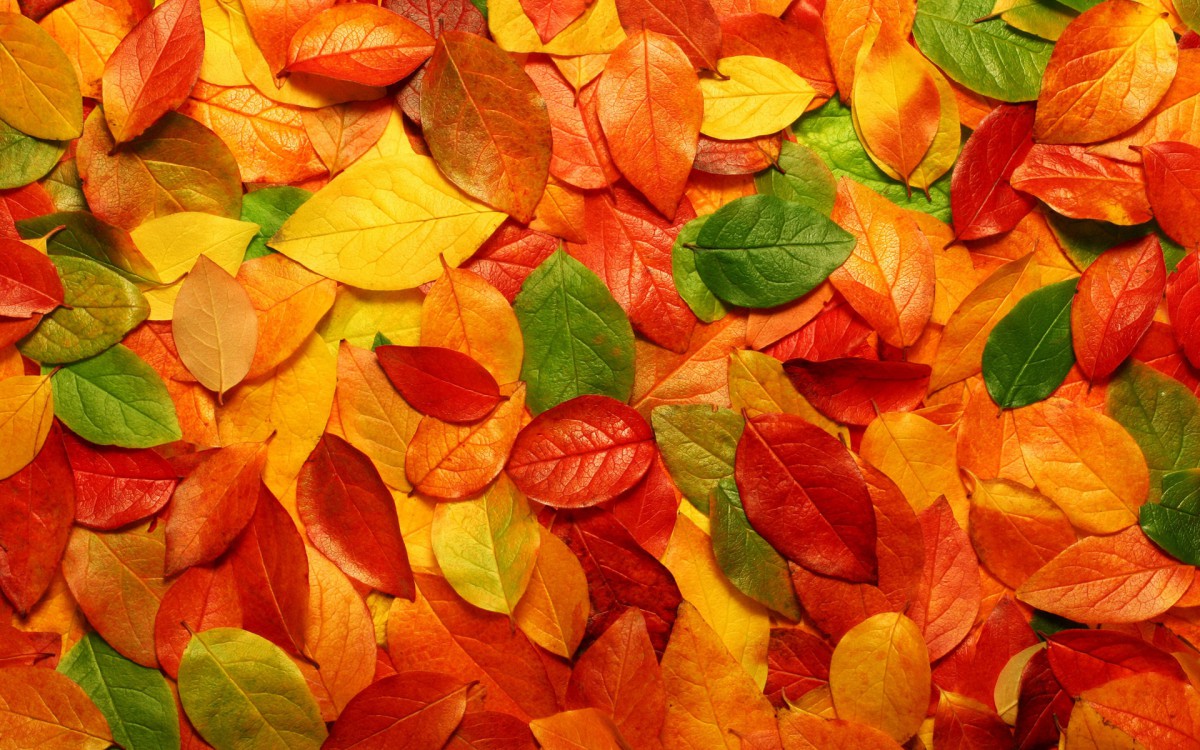
3.

I choose this leaves texture because I think things from nature could be the best way to explain the definition of texture.
4.

http://designbeep.com/2012/12/10/a-new-collection-of-free-tile-textures/
I love this texture because the color of that is very harmonious. The repeated pattern seems to make the page no negative space, but Purple, blue, green and brown color come together create the positive and negative space.
5.
I download this texture because the color is very fancy. Besides, the leaves overlap together so that positive and negative space change to each other.


http://veerle.duoh.com/design/article/illustrator_full_spectrum_spirograph