Contents
Class Info
- Date: 09/20/2022**
- Meeting Info: P116 at 6:00 PM
* we were still wrapping up week three last week so we will be doing the activities below and then, if we have more time moving on to week Five Class activities
**After this class, we do not meet until October 11th as there are no classes scheduled on Tuesday, September 27th and Tuesday, October 4th.
Topic
Design Principles/Bitmap vs. Vector Images; Lossy vs . Lossless Compression
See terms you were to know from Week Three Reading Assignments
Objectives
- Recognize Bitmap Images and the Programs that create them
- Recognize Vector Images and the Programs that create them
- Understand how both types of images are imported into an InDesign postcard template for your visually enhanced quotation project.
- Analyze designs for the following principles: contrast, alignment, repetition, symmetry and proximity.
- Understand the distinction between Native Applications Formats and Standard Image file formats such as JPEG
Discussion/Lecture

At the end of our second class, for homework, you were to reviewing the Pentagram Typographic Conundrums (riddles) at https://www.pentagram.com/news/conundrums and http://jaced.com/2009/12/04/for-the-love-of-nonsense/. In these riddles, Pentagram just uses type, lines, and color to create effective references to well-known phrases. See how many of these well-known sayings you can guess. These are an extreme form of visually enhanced quotes and they can inspire you in your own work, as can looking through the rest of Pentagram’s site as Pentagram is one of the leading design companies in the world. We just reviewed the We Are One exhibit from the one club. Now, let’s look at designers who were invited to design the course cover the UCLA Master Cover Series.
After reviewing as many as you can in 15 minutes, pick your favorites and write a brief post on our discussion board describing how the designer manipulated the type and layout to get the message across.
Let’s discuss five principles of design I’d like you to keep in mind when continuing to refine your postcard concepts:
•Contrast
• Alignment
• Proximity
• Repetition
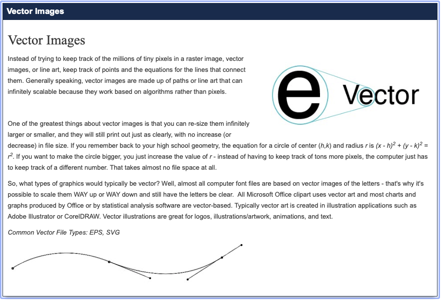
The Two Types of Images You will Use to Design Your Postcard
Now, let’s watch this brief video of the differences between vector and raster imagery before we go into Photoshop and Illustrator.
The University of Michigan Library has an excellent site for covering the key ideas on File formats that cross all digital applications.

https://guides.lib.umich.edu/c.php?g=282942&p=1885352
https://guides.lib.umich.edu/c.php?g=282942&p=1885352
Let’s Look at the following site for even more detail about Pixels vs. Paths
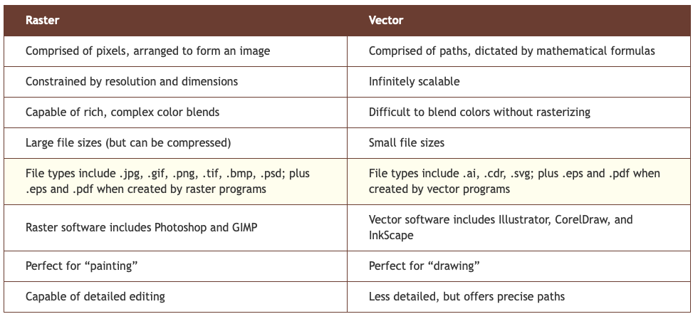
https://www.psprint.com/resources/difference-between-raster-vector/
Labwork
We will be reviewing the Image size menu in Photoshop and saving an image out as a JPEG, TIFF, PNG and GIF and comparing them for file size and quality. We will be using different compression methods as well.
We will be looking at the Twitter Brand Guidelines and the Master Card Brand Site to see how they specify file formats comply with brand guideline instructions. We will also resize an image, taking note of how to do this properly to maintain existing resolution. Also, we will review the photo sites listed in this site’s Design Resources.
Work on Exercises from Chapter 10, Repetition & Cloning in your text Digital Foundations


Recent Comments