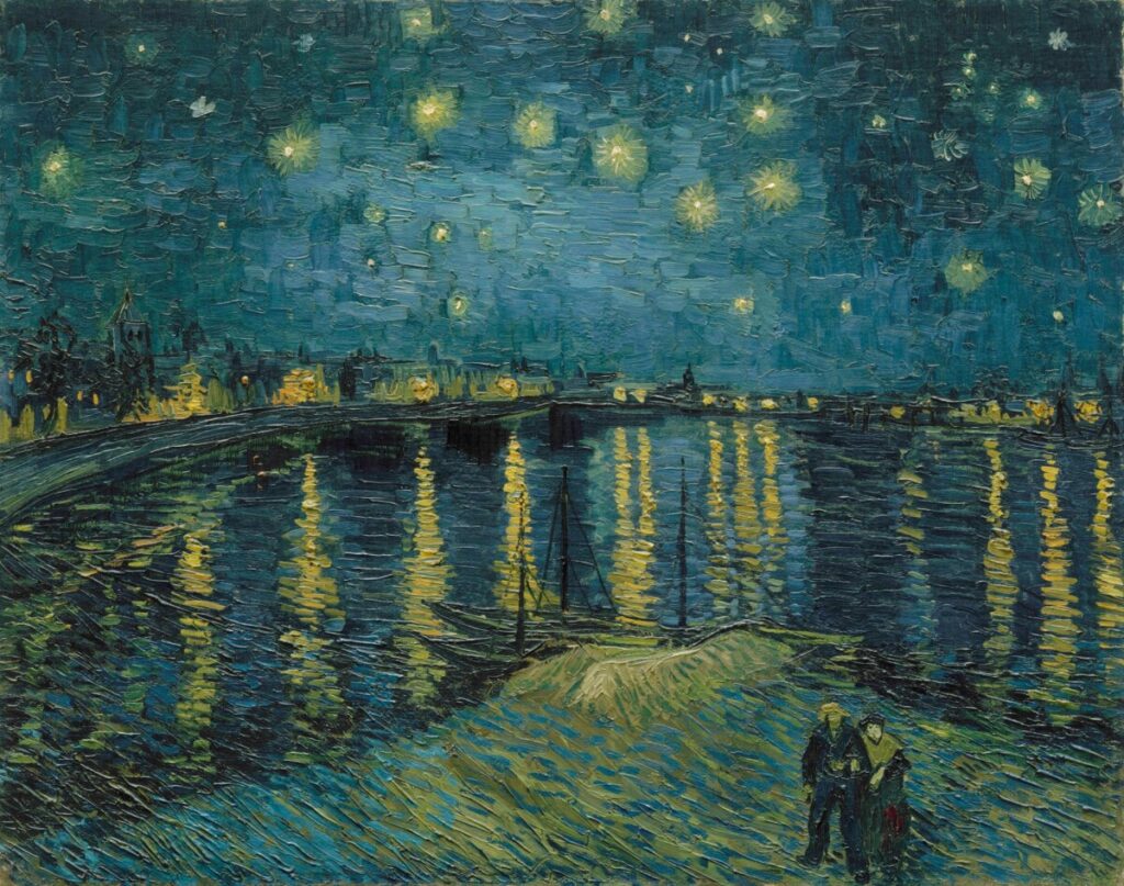
“Starry Night”1888 Painting by Vincent Van Gogh
I chose the “Starry Night” by Van Gogh because I think Van Gogh did a wonderful job of using a limited palate in many of his works. He also uses color to add value, depth and proper shadowing in his pieces. In this piece Van Gogh uses color theory by playing around with value and temperatue. He uses different hues of blue to emphasis, for example a light blue line work is painted in the foreground to separate where the couple is walking and make it stand out against the dark blue hues of the water. This same light blue though, is carried out sparingly into the shadowing of the water to create the sense of reflection. He also plays with different temperatures of blue in the sky to add the feeling of light from the stars. A very dark navy blue is set around the bridge to show reflection of hard to make out buildings, as if from the point of view of someone looking out across the water. He uses a contrasting color to blue, yellow, to give the eye a place to rest in the bright stars and to play with reflection again as the light from the moon and stars casts refractions of light in yellow line work across the water. Van Gogh seems to be using oil paint and mixing white in with the blue to lighten it and create new hues of blue. He also seems to modulate colors using warm and cool hues to create depth in the painting. I think Van Gogh’s work is effective because he is able to create a vivid scene with movement, rhythm and beautiful line work to pull the viewer into the painting and make it come alive. An awesome website to check out with more of his work is: https://vangoghworldwide.org/search?current=n_4_n&size=n_12_n



Recent Comments