
________________________________________________________________________
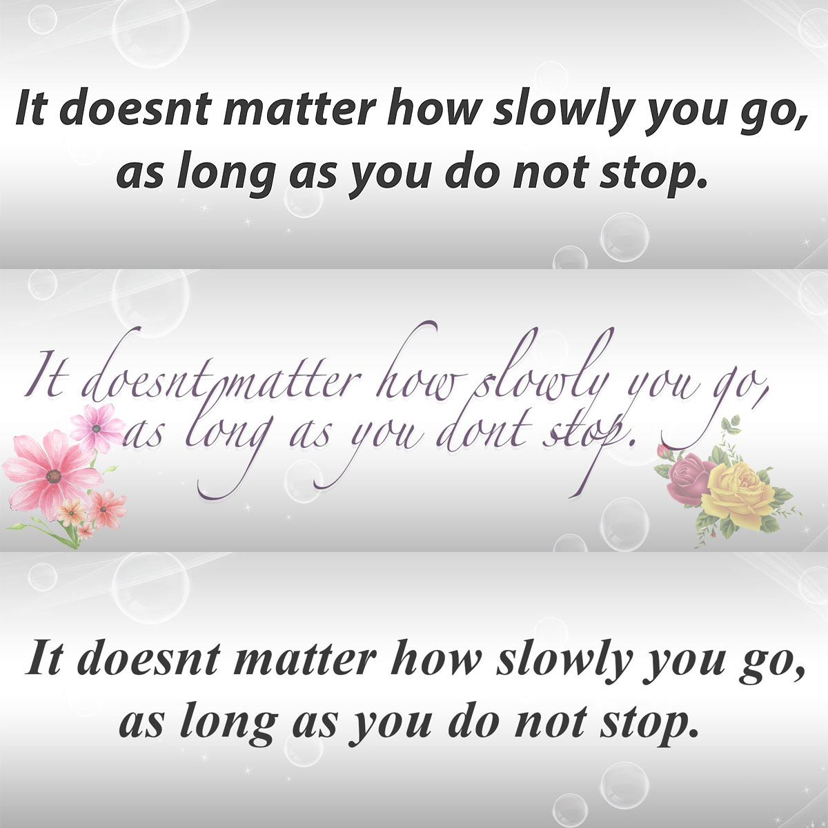
In my quote collage of different font style, I choose these fonts because of how I wanted the message to come off across to the reader. In the first picture I used Myraid font style, I choose this font because I wanted the reader to be able to get the message clear and direct, that’s why I choose a more cleaner and clear font. In the second picture I used the font Verdana, it had a more feminine look along with a lot of swirls and curves that would more represents the ladies, so I choose that one to more represents the ladies and the final picture I used Times New Roman font, I choose this font because its old school and a lot of people mind can read and understand anything that written in this font style, so I wanted to use that specific font because everyone would be able to read and understand that quote.
________________________________________________________________________
Logo Research
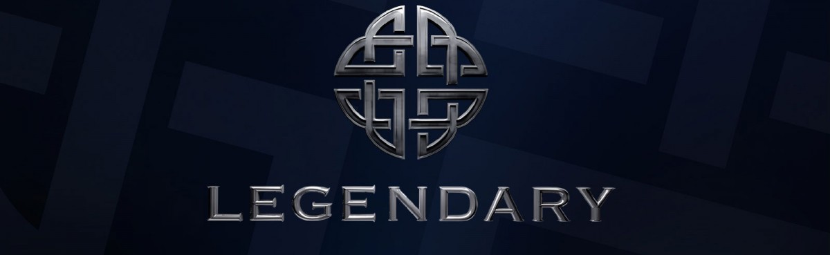
The legendary logo has been one of the most recognizable logos in Hollywood today. The logo can be spotted at the beginning of anyone of the company box office hits or even on the building at it’s Headquarters. At the top of the logo we have a beautiful “Celtic Knot Shield” as reported by caintheanimator.wordpress.com. the company adopted the idea of the Celtic knot, created they’re own version and then use it as they’re logo. A very creative process to symbolize what the company is about, because in Hollywood legendary pictures are known for adopting comic book stories, then making they’re version of that story on the big screen. caintheanimator.wordpress.com also stated that “According to historians and anthropologists, this unbroken line was intended to represent eternity, fidelity and unity”, eternity to represent that Legendary would want they’re company to last forever, Fidelity to represent faithfulness to the fans, business partners and everyone who works for the company and last but not least unity to represent what legendary pictures does every time a new film has been released, unite everyone to go a see the movie. I believe the bottom half of the logo was designed in such a clean and bold way to let the company competitors and fans know what the goal is, and that’s is to be LEGENDARY.
Logo research task [Legendary Pictures and Warner Bros.]
________________________________________________________________________
After taking a trip to the United Federation of Teachers (UFT), I was impressed with how intricate printing has become, normally when the word printing is mentioned all I imagine is a small printer with paper, But after visiting UFT I was mind blown to how much equipment and accessories was needed to run a full on printing facility. I found three specific printing process at UFT very interesting, I found the Silk screen printing, offset printing and web press printing as 3 of the most impressive printing in the facility. The offset printing process was the most interesting to me because the idea of ink being transferred onto another roller wheel to then be transferred on the designated object was very impressive, because during that transfer process the quality doesn’t change as the ink is transferred.

