Discover:

Define:
Develop:
 By Cui Zhang // 12.19.19
Ways of Seeing – FYLC Fall 2019
First Year Learning Community
Discover:
Define:
Develop:
By Cui Zhang // 12.19.19
The OpenLab is an open-source, digital platform designed to support teaching and learning at City Tech (New York City College of Technology), and to promote student and faculty engagement in the intellectual and social life of the college community.


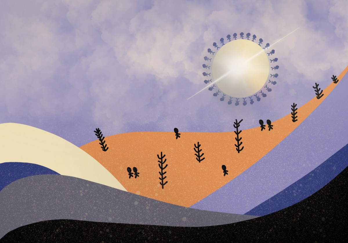
I like the color contrast and how like many setting are combined together. The thing I would change is the color of the siliote could contact the background of the sand in background. The sky is pretty nice because it contacts the regular shapes
This is very good, I totally love it! The colors you used came out pretty awesome in your digital art, the use of the color on certain location made the image stand out a lot. Keep up the good work.
I like how your images including the one you made has a consistent theme of Skies. I also like how your image that you created has texture. how did you do that? I would really like to learn if you are willing to teach me.
I really like the image you created, looks so cool. You’re a really artistic person and keep up the good work throughout your design career.