Discover
Define
 Develop
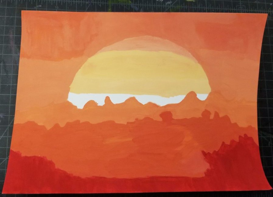
I chose this composition because there is a lot of tones into the picture and i really liked the different shades of oranges.
Ways of Seeing – FYLC Fall 2019
First Year Learning Community
Discover
Define
Develop
I chose this composition because there is a lot of tones into the picture and i really liked the different shades of oranges.
The OpenLab is an open-source, digital platform designed to support teaching and learning at City Tech (New York City College of Technology), and to promote student and faculty engagement in the intellectual and social life of the college community.


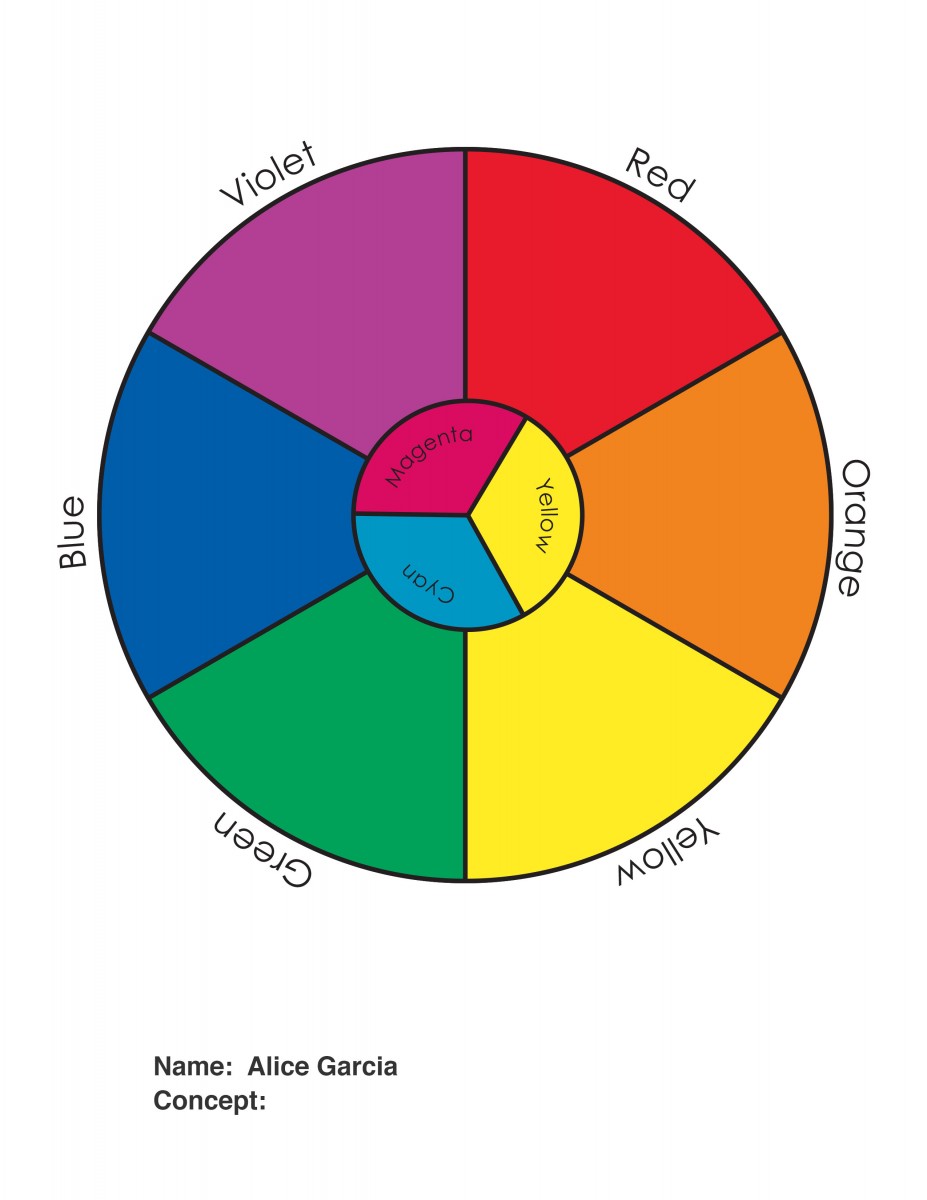
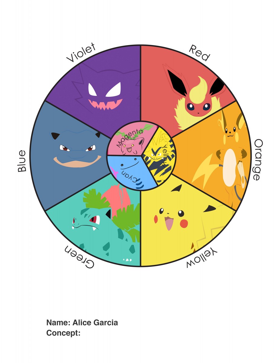
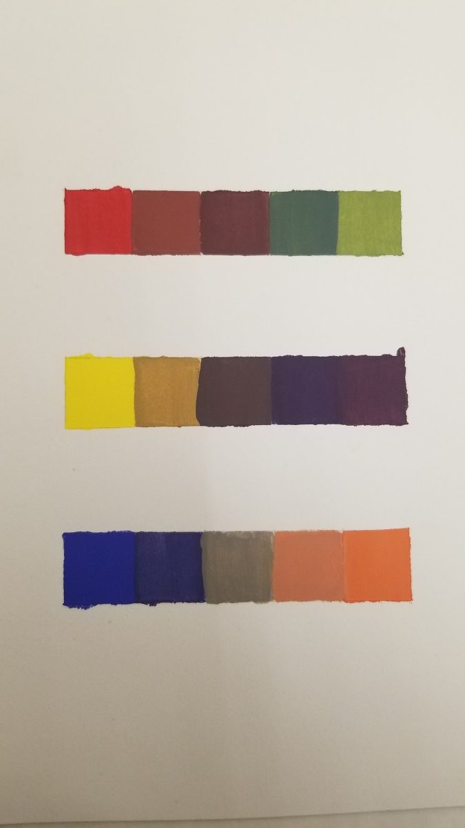
Great job with the saturation scales like how they look. And they are pretty much exactly how they should be except for maybe the middle color of the 3rd set of squares in the second (scale) other than that their good. And great job on the custom color wheel, interesting concept using Pokémon to represent each color.