
Saturation Studies: Phase 3

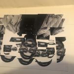
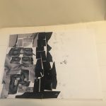
The temperature of my group was cool and we also got the poster named “Ween”. My group decided to have the word soft echo. The sense relating to Soft was the sense of touch and the sense relating to echo was the sense of sound. For a cool temperature some would usually think of blue of green but I thought of the color white and orange. The color white is known to reflect heat is that was the reasoning behind picking white. The color orange may seem like its the color that relates to heat but I look at it as a cool breeze while the sunset is coming closer toward the ocean breeze. I wanted to use a Helvetica font but for some reason my computers fonts were not changing my word into the font I wanted. But al in all this is the poster we thought of.
project 3: phase4
project 3: phase 2
5 hours
Color Harmony: Phase 4
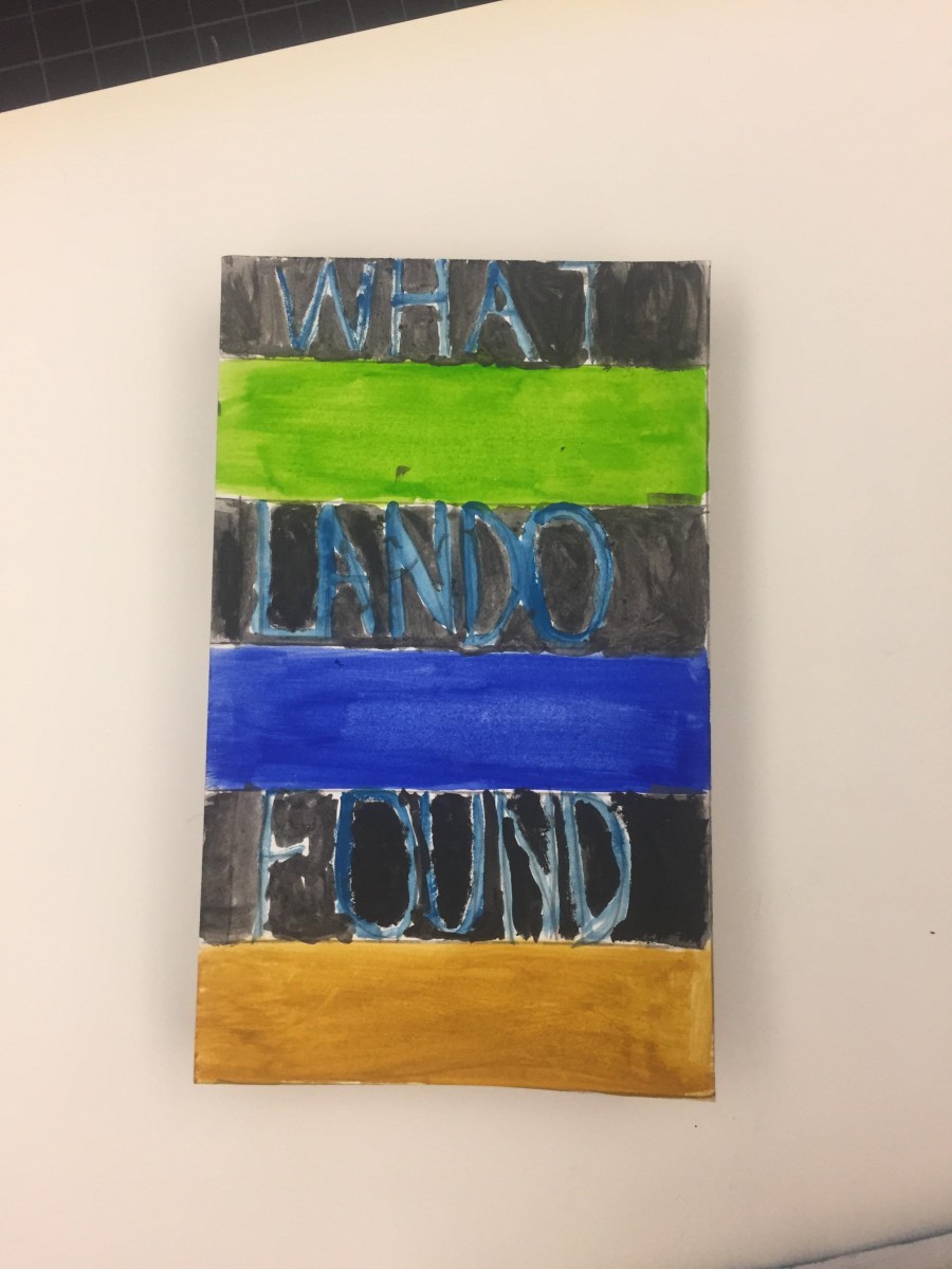
All in all, this whole semester was very new and also a bit challenging to me. I learned many new terms in relation to graphic design and other things. For this project, I think I could’ve been a better creative thinker when it comes to words and all other things. I felt as if I could’ve done more in regards to the painting for my book. I left out one color and I did the green a bit too light in terms of the shade. In short, this was a good semester.
This whole project took me more than 6 hours.
Color harmony: Phase 3
Hours spent- 2
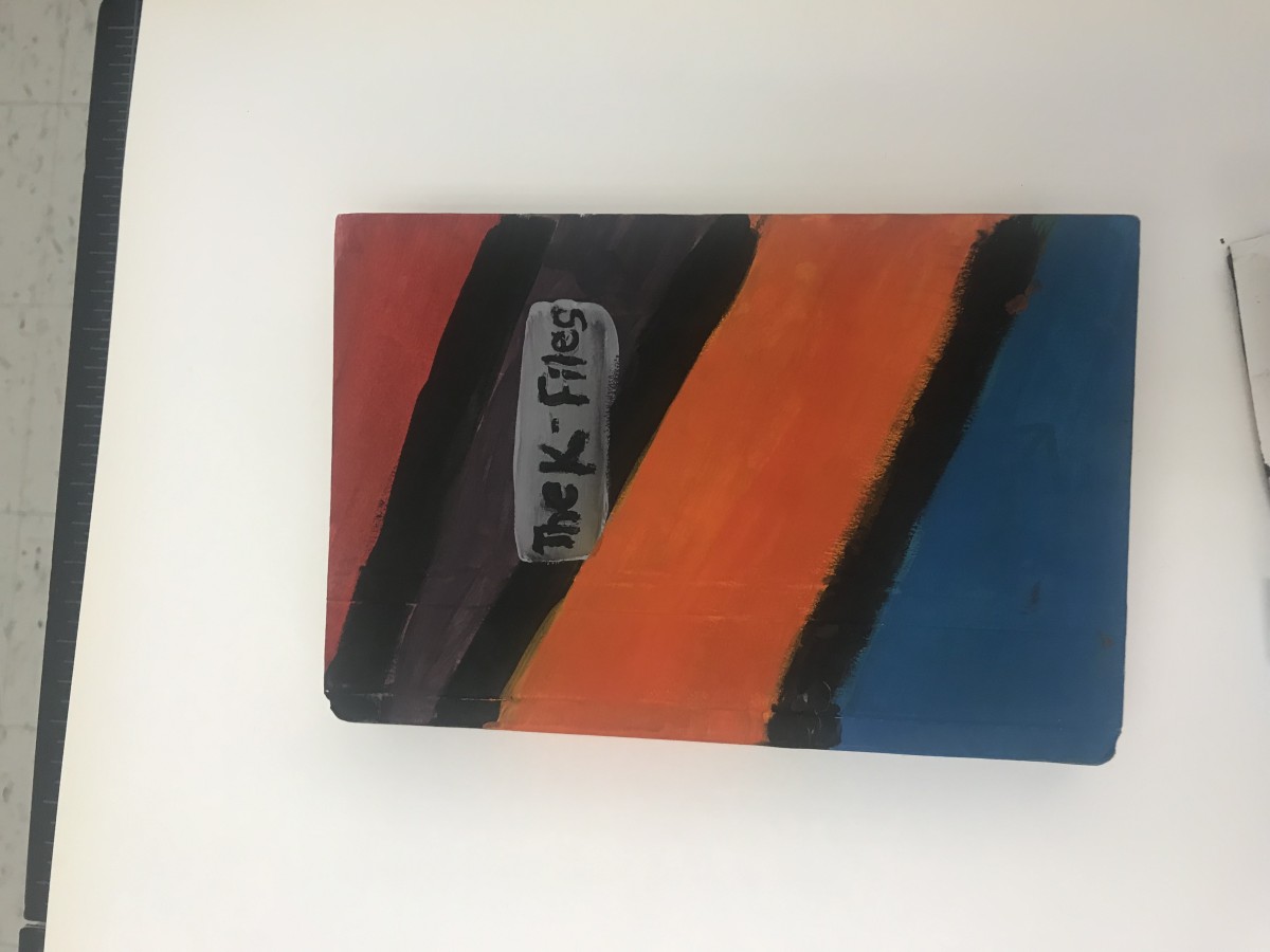
The picture that I based my book cover off of was a painting of a sunset with trees. I can’t really draw so I mad a abstract like cover that represents all colors that I used to make the color proportions.
Color Harmony: Phase 3
I based my book cover on the picture I had uploaded on phase 3’s color proportions and shades. Since my book had to do with the theme of opposition and dullness I had to put colors that seemed like opposites and I tried doing a formal book cover based on stripes. I think the creation of my book got my point across to the following audience.
This part of the project took me 2 hours to compete since I had to try to paint carefully and in between the lines.
Color Harmony: Phase 4
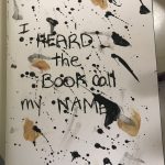

Throughout this project i enjoyed making the cover the most. I wanted to keep my book plain and simple with the colors black and white. I was inspired by my phase 2 painting, splatter paint art. When making it, splatting the painting the paper was the best. I tried using the colors that was given and noticed i used too much tan. I learn about monocromatics, complementary and analogous. I learned a lot about colors, before these lessons i would think a color is just color but theres more to colors than i thought.
Shunned
Verb
Definition- persistently avoid, ignore, or reject (someone or something) through antipathy or caution.
I found this word In the text of “Here Poverty and Privilege are Neighbors; Income Gaps are a Source of Resentment and guilt” by Janny Scott where it talks about how the wealthy people were “shunned” as they were being pushed into by neighbors.
Disparate
Adjective
Definition- “essentially different in kind; not allowing comparison.”
“here, poverty and privilege are neighbors, income gaps are a source of resentment and guilt” where it states “A defining characteristic New York city its is economic diversity, The juxtaposition of people of disparate circumstances in limited spaces.”

