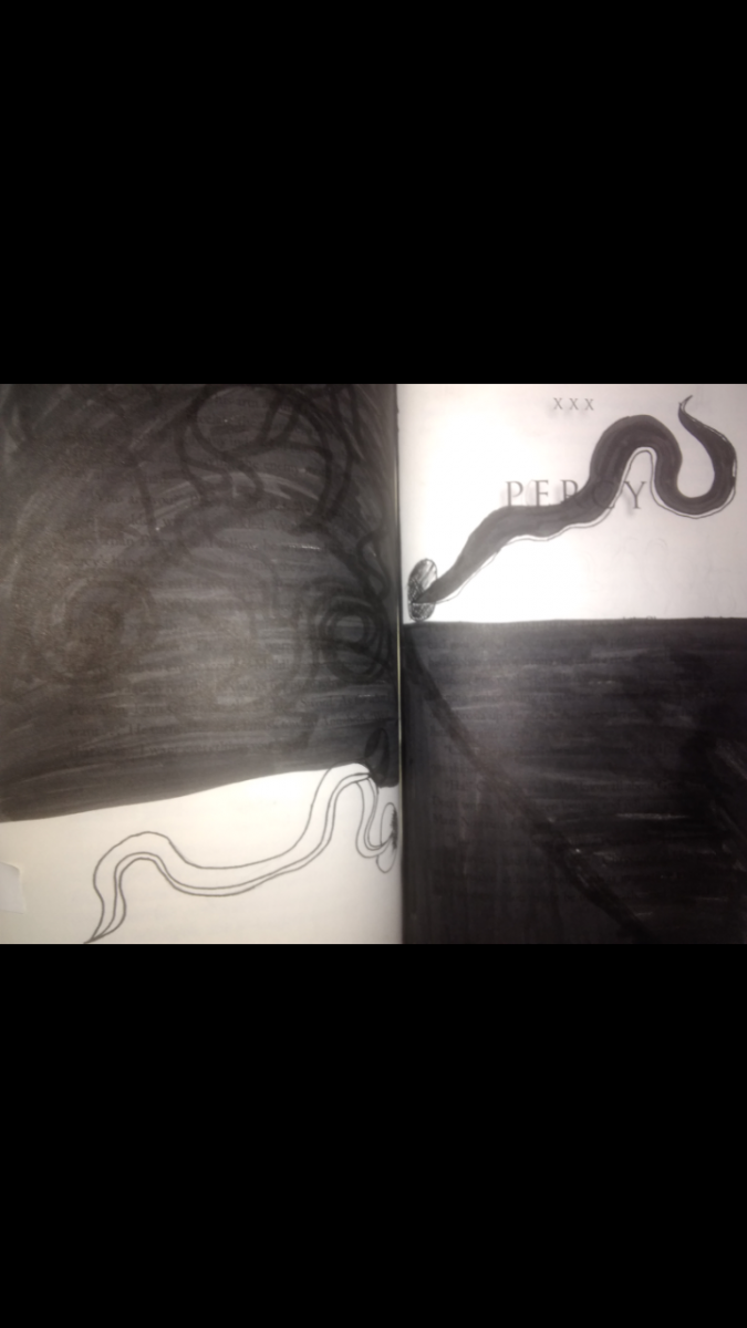
The illustration visually represents the word nematode. Nematodes are visually represented through the illustrations of worms, drawn in black and white. The materials used t create this illustration were inking pens and a brush pen.

Ways of Seeing – FYLC Fall 2018
First Year Learning Community
The illustration visually represents the word nematode. Nematodes are visually represented through the illustrations of worms, drawn in black and white. The materials used t create this illustration were inking pens and a brush pen.
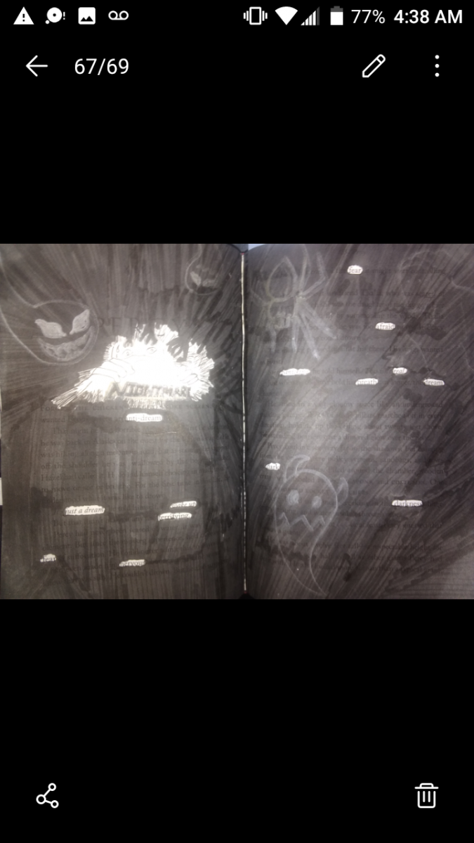
The image above provides the authors visual representation of the word nightmare. The material used to create this image were inking pens and a brush pen. The word nightmare is visually represented through a lot of dark shadowy figures, drawing closer to the frightened man hiding him himself under sheets.
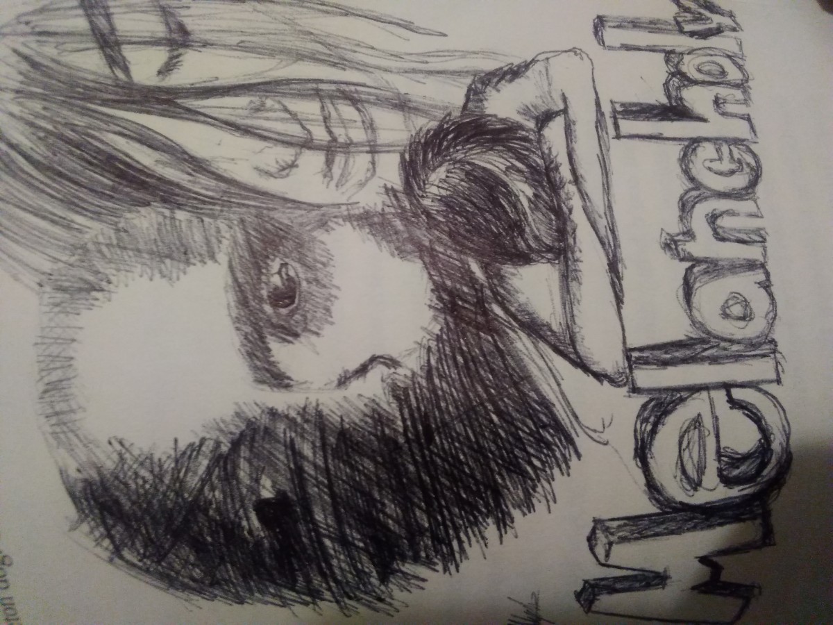
the image contains an illustration that represents the word Melancholy The image contains illustrations of people, all with expressions of sadness and despair. The image gives a feeling of sadness, depression, sorrow, and misery. The materials used to create this image was a black pen.
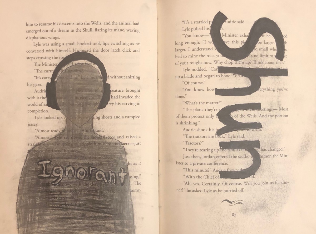
For this dicactic, the word that I will be using and describing both the definition itself and the drawing is “shun” and it defines to persistently avoid, ignore, or reject through antipathy or caution. (Dictionary.com) On the left page, the first think I thought of being avoidable or ignoring is someone with a pair of big headphones, therefore I decided to use a page with long text that will surround the person in headphones. According to my design, there’s a person wearing dark headphone and that person is shaded with a gray color. Now, I was thinking that maybe I could compare the psychology of the color value and the image itself. First, the headphones are shaded with black and opposes the outside which is white with text. The person is shade with a dark grayish color that represents that the headphones is consuming him/her, avoiding to make any contact to the outside, typically ignoring and inside the person , there used to be texts but since it is shaded with a grayish color, we can’t see what it says or barely see it what it was written. There’s the word “ignorant” inside of that person that it is kind of a light gray and the reason I decided to make it lighter is because first that word is a synonyms for “shun” and second that person is aware of that word and describes who he/she admits that he/ she is a ignorant, then that person goes on listening to there music and ignoring at the same time. This project was uses with pencil for the gray shading of the person and black marker.
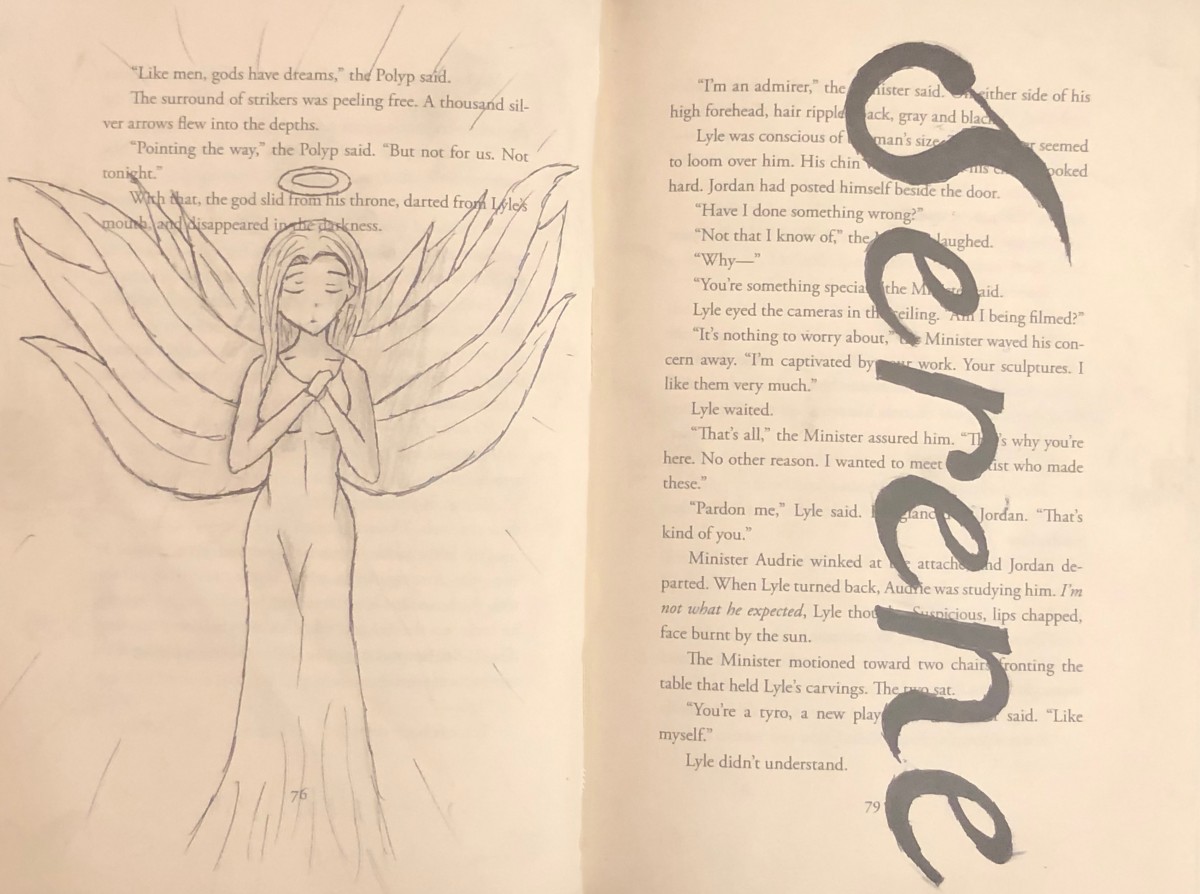
The word I use for this artwrok is Serene and it defines peaceful, calm, untroubled, etc. (Dictionary.com). I decided to use a angel as an example for serene because angels are represent to be an signal of peace. So, I decided to draw an anime character with a halo on top of her head that will represent herself an angel on the left page and design the word serene with a eligent font on the right page. This artwork was design with penicl, black marker and a razor point.
The glossument book named “What Lando Found” consists of illustrations based on vocabulary words. This project is inspired by “A Humument” made by Tom Phillip. Olando feels as if he can upgrade the aspect of any book and turn it into his own. As a creative person Olando can describe himself as a blind visionary. It’s understood that as a creative person Olando must be able to turn nothing into something. He also understand that creativity is the infusion of different aspects. This glossument project was made through many aspects such as creativity, inspiration, tools, motivations, and many different themes such as opposition and dullness.
Olando’s main inspiration was a video on blackout poetry that he seen on youtube. Also Olando seen articles on the internet about drawing pictures based on vocabulary words. This inspiration came from his class project called “A glossument”. He was also inspired by his own motives to draw pictures that relates the the vocabulary of words and to make every other word relate to each other through his drawings. This book is also more inspired in his strive to get towards greatness and uniqueness.
The motivations for this book were mainly tools. Olando tried to experiment with different shaded pencils and he also used blades and exacto knives to cut out some pages to make them more appealing towards the audiance. He did many shapes and creative cut throughs. For example Olando cut through his pages to make the cut spaces look like doors and windows. I also used cut outs from magazines to try make the book more colorful since he’s not really into using paint. Olando also used glue to make things stick to where they belong. The tools used played a big part in his glossument.
The theme of Olando’s book is opposition. He wanted things to seem either authentic or fabricated in his own book. He choose this theme because he feels as if opposites make things in reality balance out, Examples like white and black, up and down, and left and right. So in Olando’s head he thought why not make things balanced out in his creative book. Olando just wanted to develop more techniques as he continues on with his blasphemous book.
Here, we can see a woman, loosely resembling the Virgin Mary in a contemporary style, weeping, surrounded by a red halo, and next to a heart, with a yellow bored around it, and thin blue, vaguely gothic archways in its corners. This piece is centered around the word ‘Afflatus’ meaning a divine creative impulse or inspiration, and can be seen above. In a way this piece captures the definition, its Devine inspiration is the Devine.
Marker, pen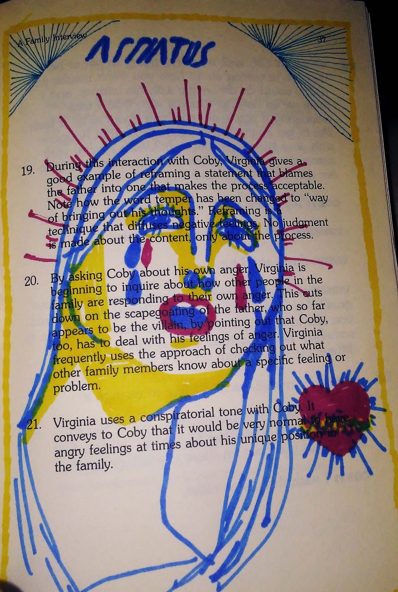
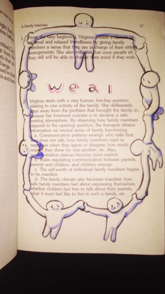
This piece centers around the definition of ‘Weal’ that which is best for someone or something. The illustration depicts ole figures linking hands and forming a circle around the word, and the original text featured in the book. These figures come together in a supportive circle, much like other illustration featuring of people on earth standing together holding hands.
ink, watercolor
In today’s class, you will be writing a practice final exam. This writing will become the basis for our Final Exam review next week.
You should bring with you your practice Final Exam reading “A Natural Fix for ADHD” by Richard A. Friedman, and make sure it’s as marked up as you need it to be to write the essay.
You were also given a copy of the questions. Bring that page as well. Choose one of the two questions and write your response.
Your writing is your attendance for the day. I need one volunteer to get the envelope from my mailbox (N512) and one volunteer to return the envelope with everyone’s writing.
For the lab, we decided that the best use of time would be to work on Project #4. This can include drafting your didactic panels, drafting or further developing your catalogue entry, or beginning to draft the cover letter. We will address the cover letter in class on Monday, so it would be most productive if everyone had spent some time brainstorming for that aspect of the assignment.
If you have any questions, please ask by leaving here or emailing me directly. If you would like to volunteer to pick up or drop off the envelope, please do so by leaving a comment here. I will be very grateful!
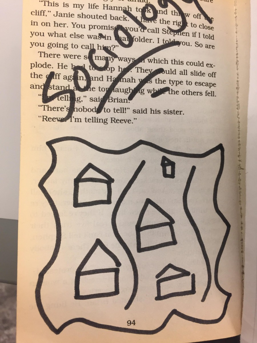
Didactic 4: sociology
This part is the book is located in the middle part of the book. It represents the idea of societal structure. So for this part, I gave the illustration of houses that happen to look alike and separated by a river. This part of the book also represents one of the main themes in this book which relates to balance and fabrication.
The OpenLab is an open-source, digital platform designed to support teaching and learning at City Tech (New York City College of Technology), and to promote student and faculty engagement in the intellectual and social life of the college community.

