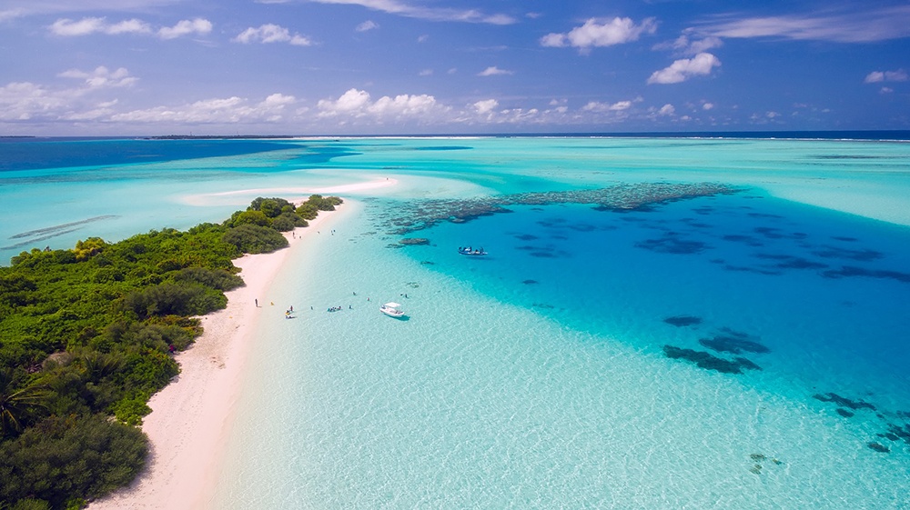
Analogous Blue And green oceans, Picture by Jennifer Levine
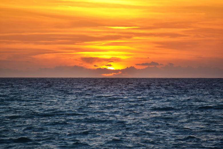
Complementary sky/ocean, Picture by Dave Johnson
The first photo is monochromatic because it’s showing the sky with one color which happens to be blue and it also shows different shades of blue. The second photo isn’t analogous because the photo includes two colors that happen to be near each other on the color spectrum/wheel. The last photo is complementary because it shows two complementary colors which happens to be blue and orange.
Overall this project was something new introduced to me and it also introduced me to the terms of saturation and grayscales colors. I never knew that the value of colors can be so indefinite. On the other hand I felt as if I could’ve done better in the paintings but all in all this project was a bit Moreno time consuming than it seemed but it was a good projects.
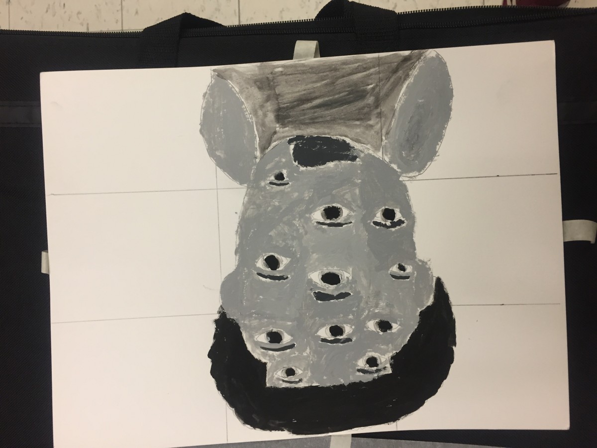
The first picture was meant to be mysterious and more of an expiriment. The second piece was more of an artistic style. I tried to convey the theme of illusion and humor at the same time.
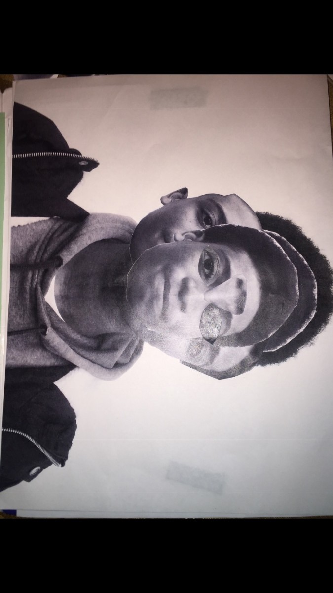
This part o the project took me about 5 hours of cutting out and putting glue to Mae these posters work.
The glossument book named “What Lando Found” consists of illustrations based on vocabulary words. This project is inspired by “A Humument” made by Tom Phillip. Olando feels as if he can upgrade the aspect of any book and turn it into his own. As a creative person Olando can describe himself as a blind visionary. It’s understood that as a creative person Olando must be able to turn nothing into something. He also understand that creativity is the infusion of different aspects. This glossument project was made through many aspects such as creativity, inspiration, tools, motivations, and many different themes such as opposition and dullness.
Olando’s main inspiration was a video on blackout poetry that he seen on youtube. Also Olando seen articles on the internet about drawing pictures based on vocabulary words. This inspiration came from his class project called “A glossument”. He was also inspired by his own motives to draw pictures that relates the the vocabulary of words and to make every other word relate to each other through his drawings. This book is also more inspired in his strive to get towards greatness and uniqueness.
The motivations for this book were mainly tools. Olando tried to experiment with different shaded pencils and he also used blades and exacto knives to cut out some pages to make them more appealing towards the audiance. He did many shapes and creative cut throughs. For example Olando cut through his pages to make the cut spaces look like doors and windows. I also used cut outs from magazines to try make the book more colorful since he’s not really into using paint. Olando also used glue to make things stick to where they belong. The tools used played a big part in his glossument.
The theme of Olando’s book is opposition. He wanted things to seem either authentic or fabricated in his own book. He choose this theme because he feels as if opposites make things in reality balance out, Examples like white and black, up and down, and left and right. So in Olando’s head he thought why not make things balanced out in his creative book. Olando just wanted to develop more techniques as he continues on with his blasphemous book.
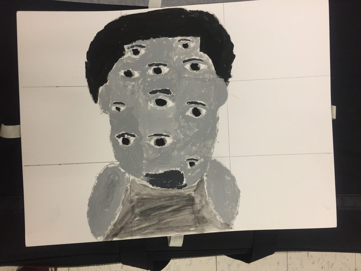
This project thought me the importance of the way we see colors within different backgrounds. Color is prolific and exciting. They are viewed in very different aspects of the color wheel. I also learned the importance of how compliment colors can create illusions to the naked eye. I learned the important lesson that Illusions worked best with opposites or complementary colors. The reason our(Olando and Evelyn) shared color(green) appears different is due to the fact that green complements red and yellow is a very different shade from tree. Its also important to recognize that colors appear different based on background color. To be honest I could’ve worked better on phase 2 of the projects where I had to make the same color appear to seem like different saturations on different backgrounds. All in all this project was long but it was something new.
calm, relax, classical music, video games, friendly
Step 2 – Color Mockups
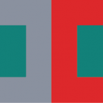
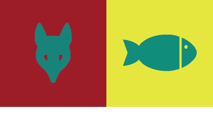
I picked gray for my partner Evelynn’s color because she likes gray and also she has a sort of neutral personality. The video that I saw on youtube explains gray as a neutral color and gray is also a color that’s desaturated and plus evelynn always wear neutral colors so that’s why I picked gray. The color we both shared was a greenish color that we both find amusing and drawn to. The medium green also gives the concept of calmness and relaxation.
Step 3 – Icon Research Process
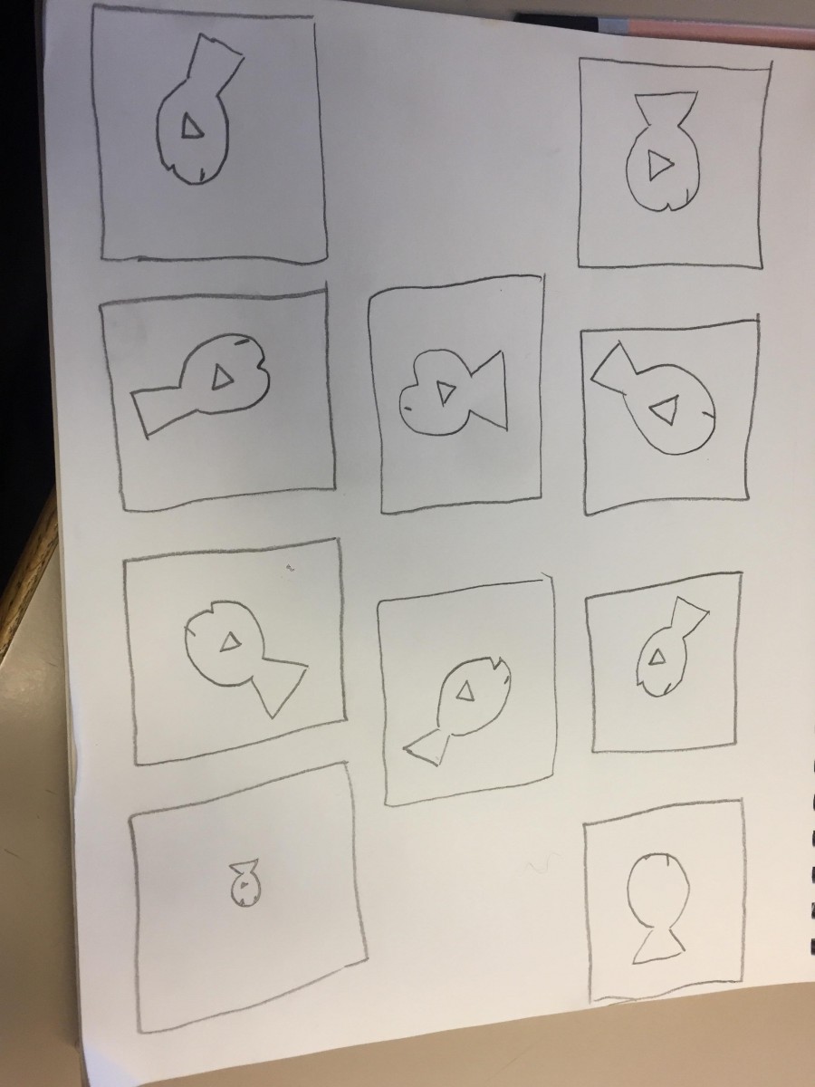
Lando’s Thumbnails
I chose a fish for evelynn because she interested in sea mammals. She also fishes as pets and she enjoys the simple things in life. Shes also a very calm person and shes nice.
Step 4: ICON MOCKUP
I learned the important lesson that Illusions worked best with opposites or complementary colors. The reason our shared color(green) appears different is due to the fact that green complements red and yellow is a very different shade from tree. Its also important to recognize that colors appear different based on background color.
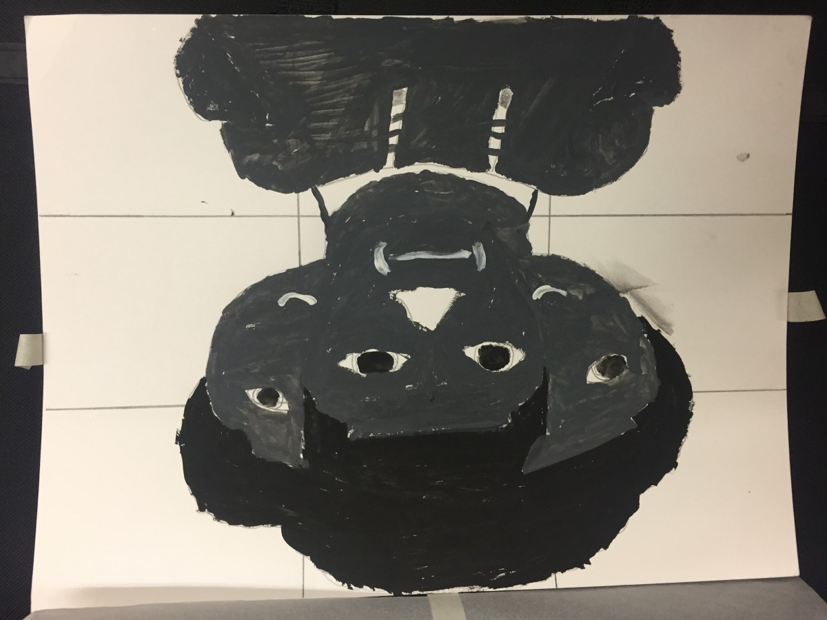
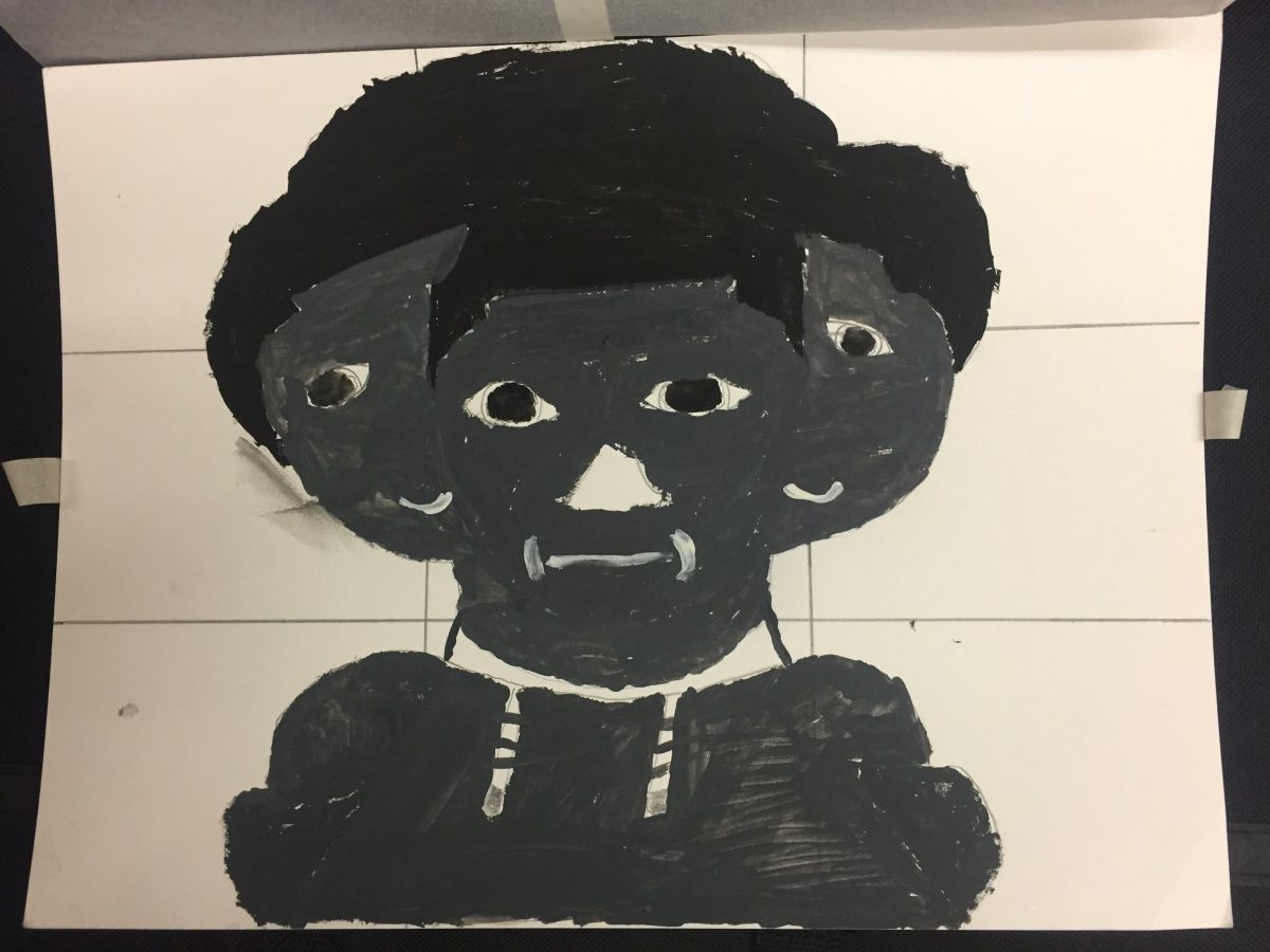
This part of the phase took approximately2 hours to complete.
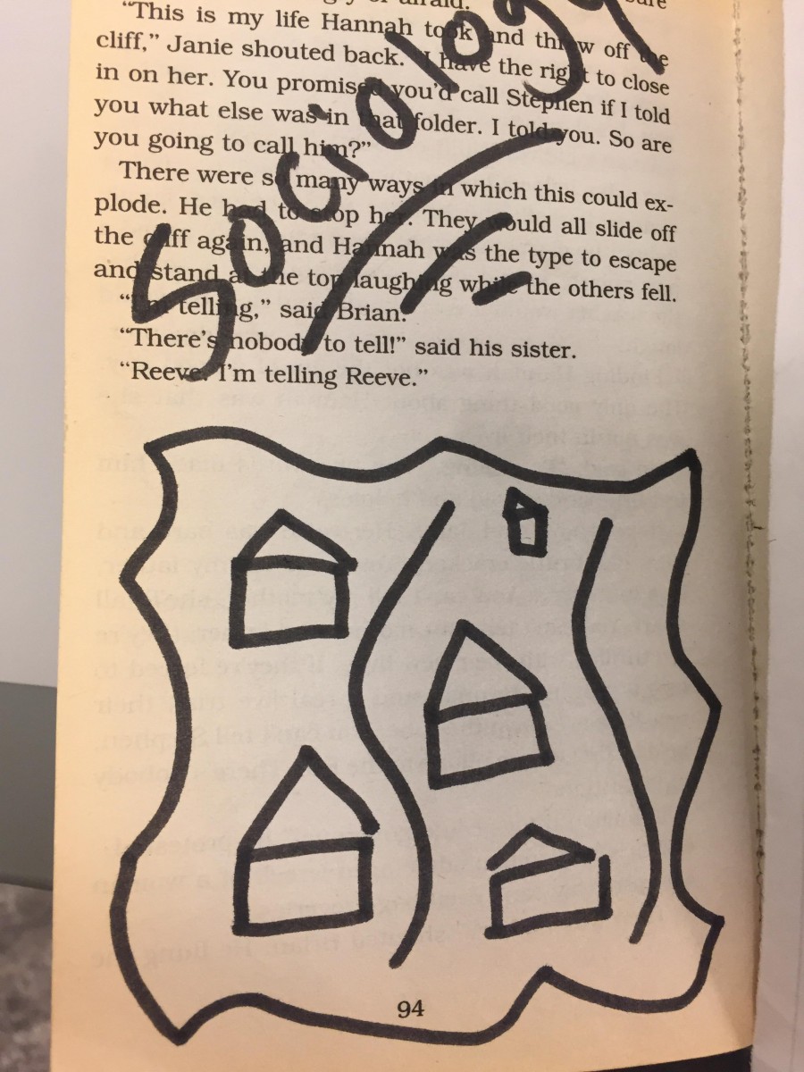
This part is the book is located in the middle part of the book. It represents the idea of societal structure. So for this part, I gave the illustration of houses that happen to look alike and separated by a river. This part of the book also represents one of the main themes in this book which relates to balance and fabrication.
This part of the book illustrates a bottle of liqour on a page sourounded by liqour. It also illustrates the idea of alcohol and how its portrayed in society. Also the liquid around the bottle doesn’t represents liquor, it also represents those people who happen to be engaged in drinking or alcoholics. It also shows how people tend to drown in their own problems hence the alcohol drowning them because they involve themselves in alcohol. Liquor only makes things worst not better.
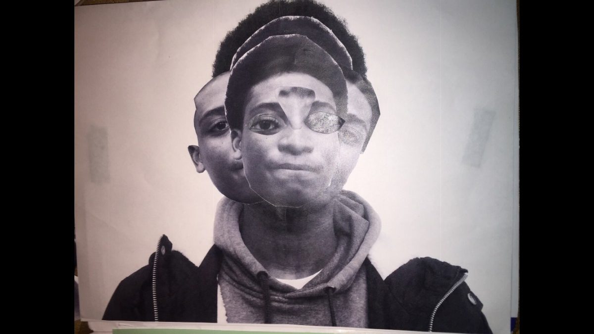
This part of the book is located towards the end section of the book. I drew a pink panther because it illustrates the theme of fabrication. I also cut up squares to give the illusion of the pink panther walking down the stairs. Its fictitious due to the fact that panthers cant walk like a human because they crawl on the ground. Also the theme of fabrication plays a big role in this book because its shows how creative the book can get when there’s no limits.