Color Harmony: Phase 4

All in all, this whole semester was very new and also a bit challenging to me. I learned many new terms in relation to graphic design and other things. For this project, I think I could’ve been a better creative thinker when it comes to words and all other things. I felt as if I could’ve done more in regards to the painting for my book. I left out one color and I did the green a bit too light in terms of the shade. In short, this was a good semester.

Phase 1

Phase 2

Phase 3

This whole project took me more than 6 hours.

Color Harmony: Phase 3

I based my book cover on the picture I had uploaded on phase 3’s color proportions and shades. Since my book had to do with the theme of opposition and dullness I had to put colors that seemed like opposites and I tried doing a formal book cover based on stripes. I think the creation of my book got my point across to the following audience.

This part of the project took me 2 hours to compete since I had to try to paint carefully and in between the lines.

Final Glossary write-up

WORD LIST

Fictitious, Diatribe, encompasses, Carousing, Affluent, Disparate, Inadvertent, Sociology, Omnipotent, Cartographer, Flabbergasted, Juxtaposition, Bind, Prolific, Perennial,

During the whole semester we had a  glossument project in which we had to find or cite approximately one word per week based on class readings or outside sources. So basically the main concept is this Was basically defining these words and define them. We also had to site the sources on where we found the definitions and provide the titles of the readings. Added to that, we had to comprehend these words by exposing what they meant in our own words. That was a pretty good task be cause that gave us a better understanding of the words meaning. In my case, half of My words we’re  found in class reading or in relation to the class. The other half of my words were found on outside sources such as advertisements, subway stations,, sport center reports, YouTube videos, and even my peers from my class and other classes. that I just to happen to have access to on an consistent basis. All in all this project really helped me understand how words can have different meanings and how it can affect our everyday lives. Based on this project I was able to read more articles with a more open-minded understanding. For example, i even started using new words in many of my conversations and text messages with friends and family and in some cases even some of my professors. My personal favorite words includes fictitious, flabbergasted, and affluent. This project for sure has helped improved my vocabulary and it had also helped me articulate my words in a fashion in where i feel as if i can be understood by my peers better.


Bind

Word: Bind (Verb)

Definitionto make secure by tying

Source: https://www.merriam-webster.com/dictionary/bind

Encounter: I encountered this word in my typography class and my Graphic principles class.

Comprehension: I now understand how this word is used in society, It’s like putting two things physically together. For example, you can bind a whole bunch of paper to turn it into a book.

Juxtaposition

Word: Juxtaposition (Noun)

Definition: the act or an instance of placing two or more things side by side often to compare or contrast or to create an interesting effect

Source: https://www.merriam-webster.com/dictionary/juxtaposition

Encounter: I encountered that word through my class semester-long projects and we had countless reading based on juxtapositions.

Comprehension: Juxtapositions can be used anywhere in modern civilization. For example, Sand and ocean, tall and short, fast slow.

Prolific

Word: Prolific (Adjective)

Definition: producing young or fruit especially freely.

Source: https://www.merriam-webster.com/dictionary/prolific

Encounter: I encountered this word at a concert me and one of my friends went to, the singer happened to

Comprehension: I know could say that I understand fully how this word is used in society. For example, its like I have a plant and I water it every day if it grows then that means its prolific in terms of growth and productivity.

Juxtaposition photo

For my juxtaposition project I chose to be more meaningful and try to take a photo of something more casual. I just so happened to have taken a picture of two buildings that happen to intersect between each other. One building was roughly rigid, eroded, and looked very old. On the other hand, the other building was more like a common style skyscraper in New York City. The juxtaposition in this picture was the view and perception of what’s considered new and old or ancient and advanced. It’s crazy to think that in a civilization/economy as advanced as New york city is so ancient but also advanced at the same time in the exact same space as each other.

Color Harmony: Phase 2

This image is an image taken by Victor Gladkov. My theme for my glossument is opposites and fabrication. So for that I chose the colors like brown, white, and different shades of blue. I feel like the color blue has many opposites and I also feel like brown Is an opposite of blue because light brown is a shade of orange. I also learned that colors can harmonize to create compatibility.

I spent about an hour an a half on this phase of the project.

Perennial

Word: Perennial (Adjective)

Definition: present at all seasons of the year; regularly repeated or renewed

Source: https://www.merriam-webster.com/word-of-the-day

Encounter: I encountered this word while I was on the Merriam Webster website and I clicked the link “the word of the day” by accident.

Comprehension: I understand that this word has to do with repetitive things. That could be many things from seasons, birthdays, holidays, and even patterns.

Cover letter

New York City College of Technology
300 Jay Street
Brooklyn, New York 11201

December 12, 2018

Clout Bee, DFA
Art Manager
WordArt Gallery
1407 Vertical Street
Brooklyn, New York 11256

Dear Mr. Clout:

I’m writing an inquiry about you to inquire about your gallery/museum/etc space and to propose an installation based on the work maybe classmates and I have compiled. I am a communication design student at NYCCT studying art interested in advertising together with my classmates. We have developed an installation entitled  a glossument. Inspired by Tom Phillips’s “A humument”, this project is a new innovative way to express our art in this technological age. It may sound corny but trust me, this project were working on will gain you many audiences and popularize your museum.

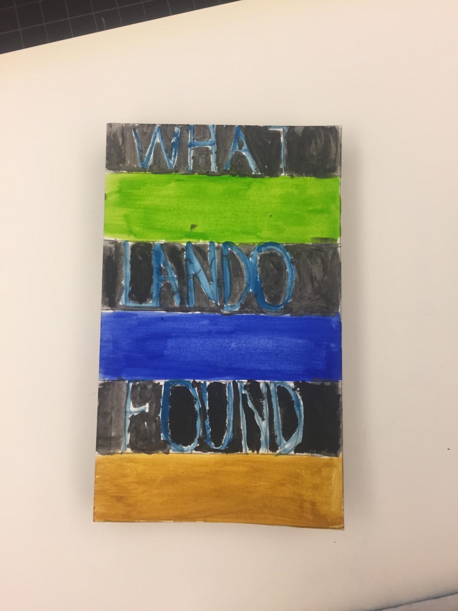
Our installations includes various artistic perceptions through drawings and many individual idealistic creativity. We bring life to our books through various means such as cut-ups, paintings, vocabulary, and etc. We’re basically trying to find creative ways to put an artistic meaning to books and give books a better concept than the usual heavy, long, dull look. My work, in particular includes many things such as blackout poetry, magazine postings, and side cuts. Each piece to be displayed has already been prepared  with appropriate didactic panels (see inclosed links, “omnipotent ”, “Fictitious ”, “Carousing ”, “sociology”. You should also check out my Catalogue Entry. This should be very interesting towards your audiences perspectives. Please consider our works for the culture of art and design.

My classmates and I hope that this installation is of interest to you Museum. If I can answer any additional questions, Please reach out to me at the address above. I look forward to your reply. Hopefully my classmates and I would be able to work with you in the near future. Have a wonderful evening and please try to get back to me when you can.

Sincerely yours,

Olando 

Olando Alexis