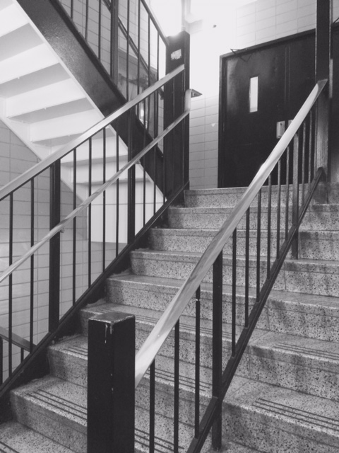
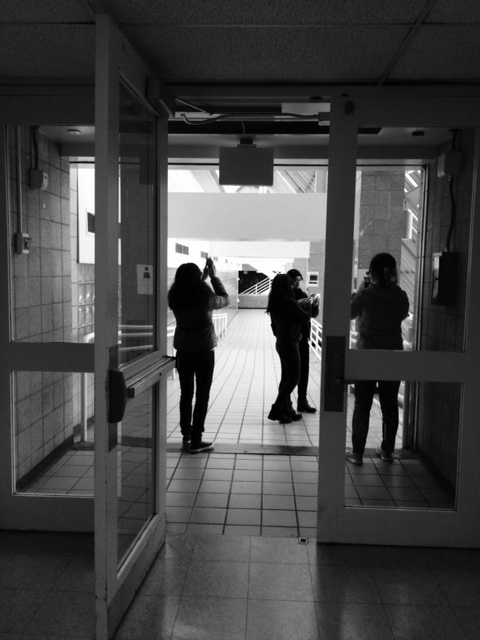
These are my two pictures that I took, where one on the left is High Key and the right is Low Key. The one on the left is High Key, because the more of the white and gray tone of the stair case stands out. On the other hand, the right side of the image contains more value in Low Key, which it contains more black shadings. Most of the figures of people or an objects turns out to be more of the Low Key.
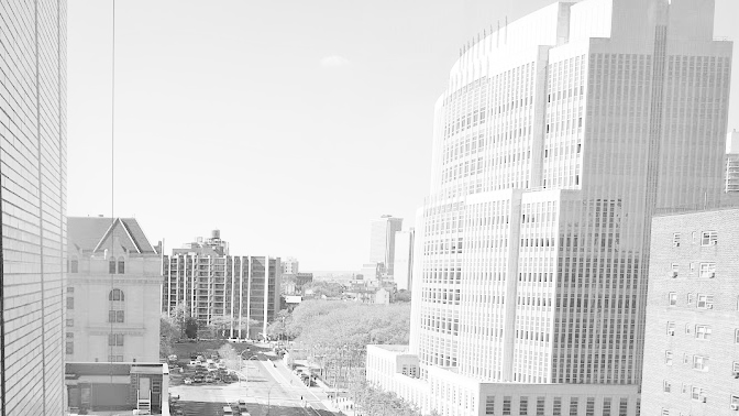
This first image is a High Key image of Jay Street. You can tell it is a High Key image because of how bright it is. you can clearly see how the sun is shining bright on the edges of the building. You can tell the sun is on the left by looking at the huge shadow the building created on the street. By making this image gray scale, it made the street looks sad and depressing. You can only see a few cars drawing by which people can take as this part of town is really dull and boring.
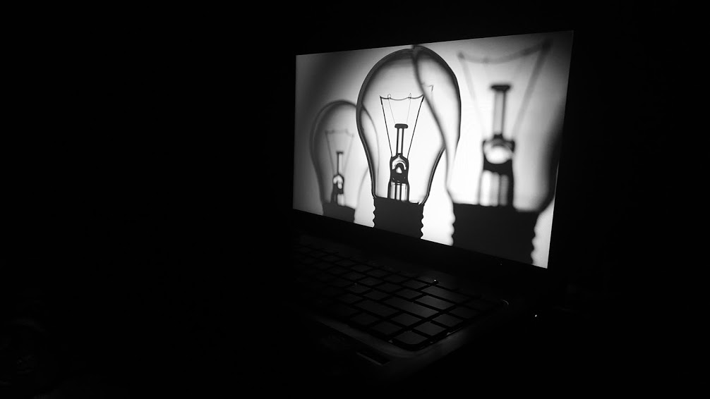
Low Key
This second image is a Low Key image of a computer with the screen on in a dark room. You can tell this is a Low Key image by all the negative space. There is no shadow in this picture only a little highlight on the keyboard caused by the brightness on the screen. Part of the keyboard is light and the rest faded into the darkness. This picture can represent there will always be light in the darkness.