Didactic post

Brandy Ortiz

Lives and studies in New York

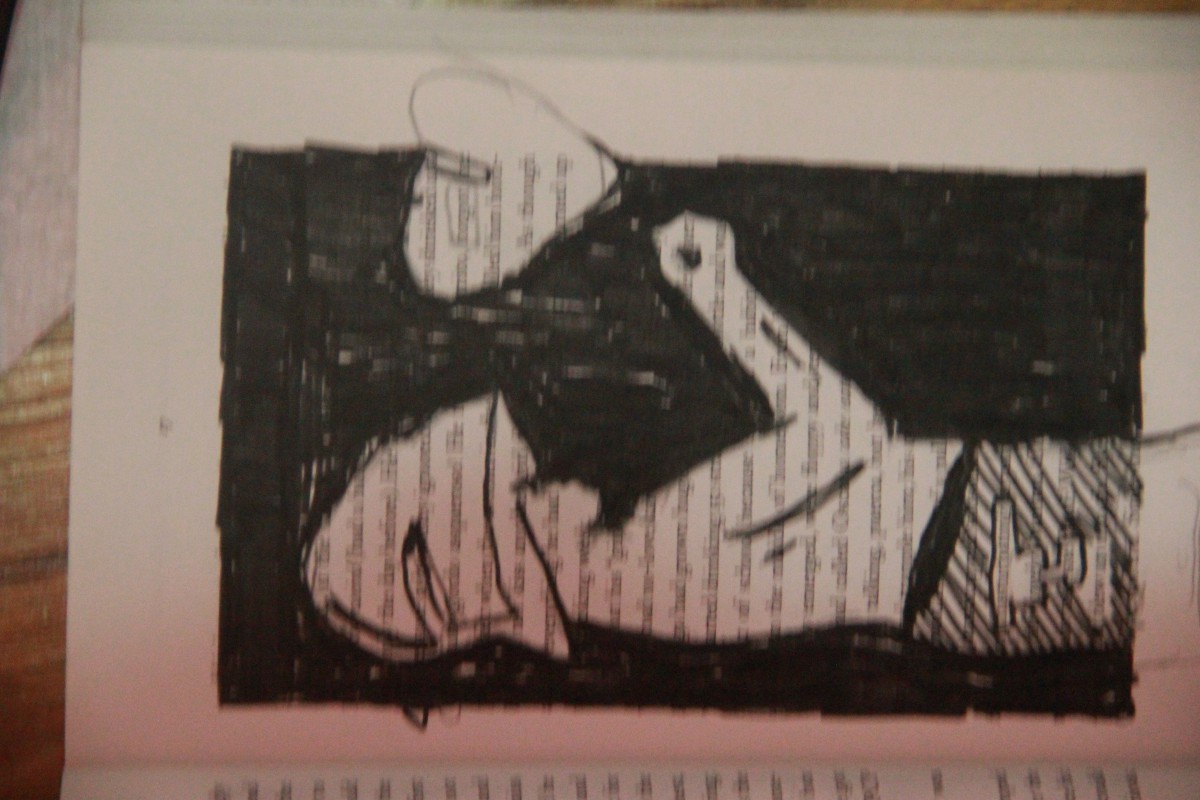
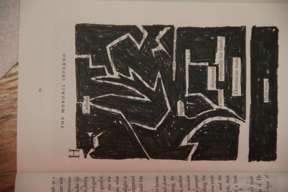
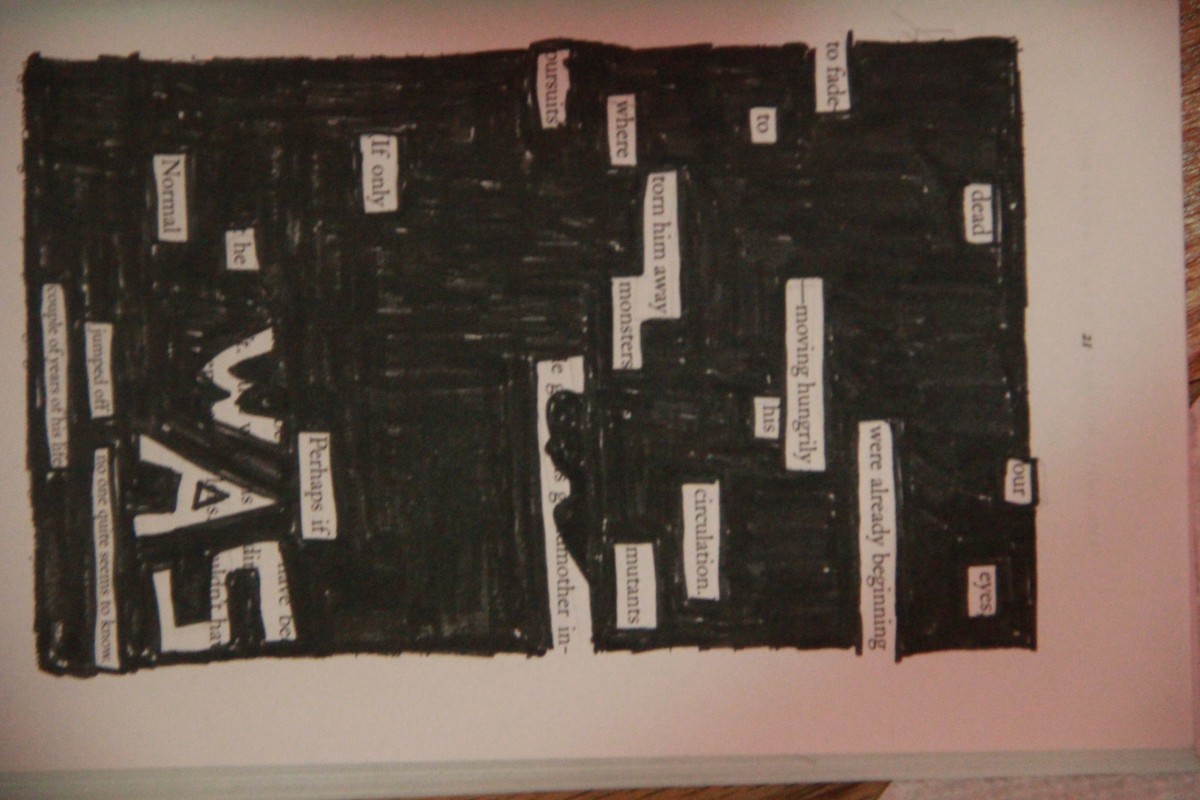
Picture Perfect Family and Love Exists  2015
Pigma Micron Pens(0.2, 0.5 and Brush), Faber-Castell Brush Pen, scissors and various pencils(HB-6B).

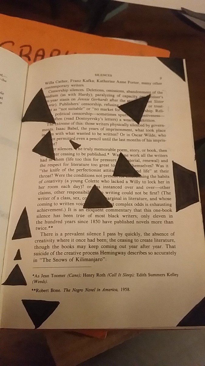
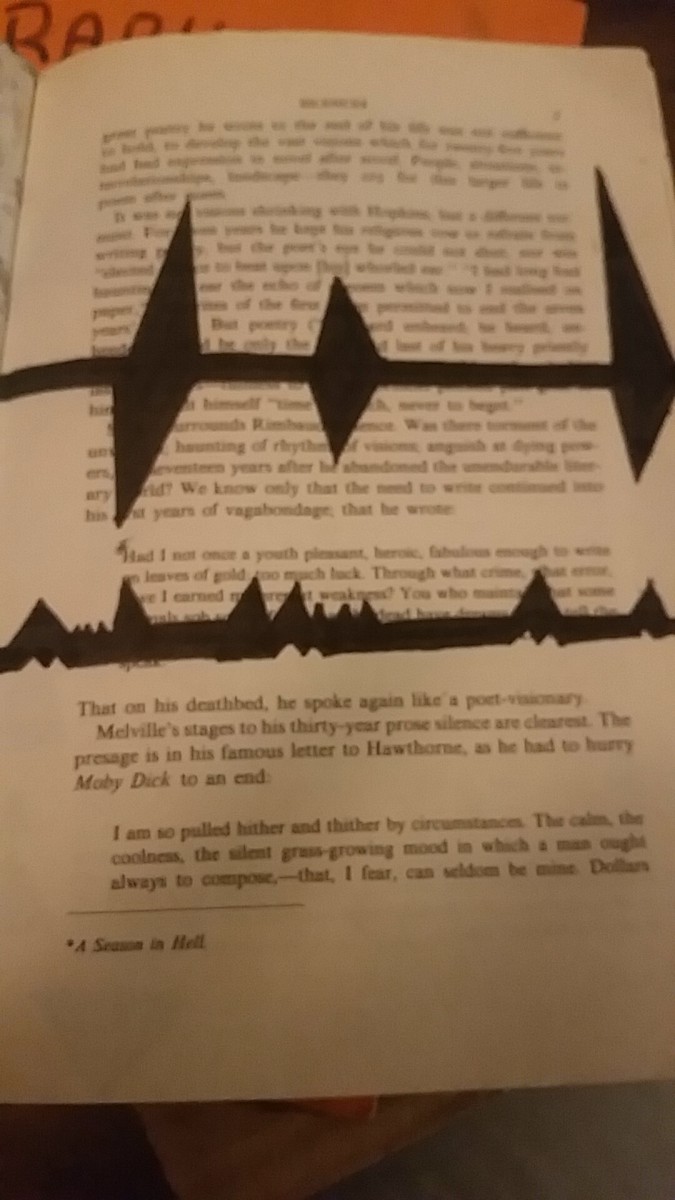
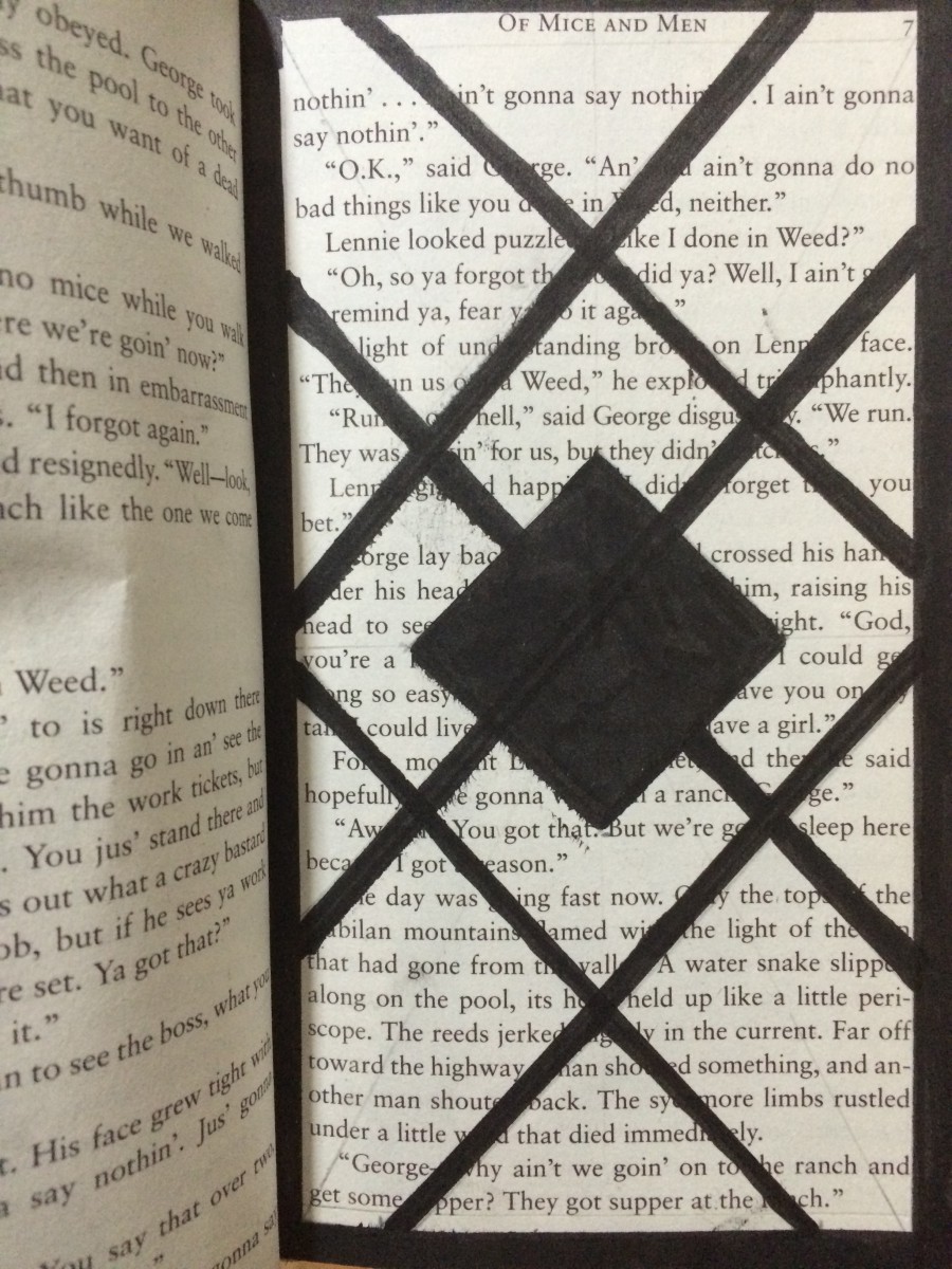
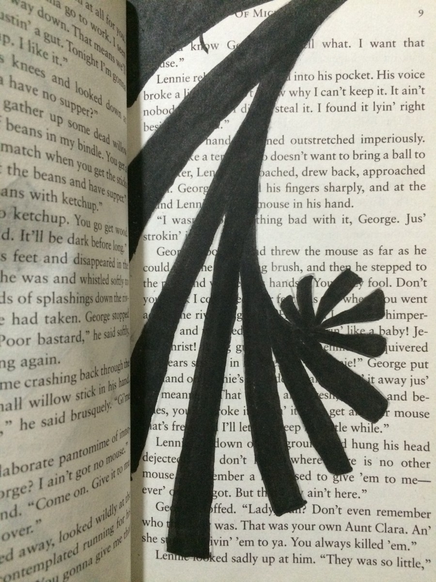
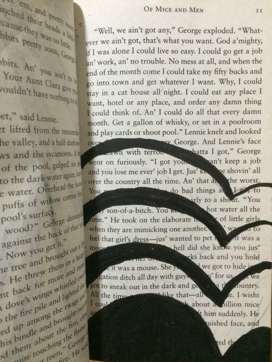
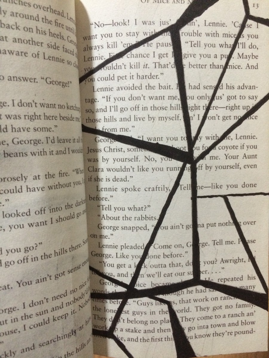
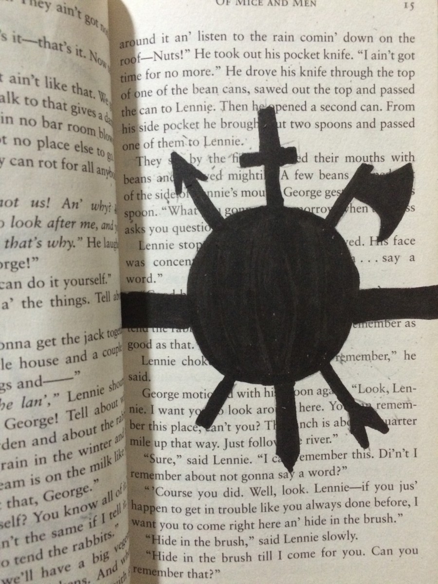
While combining concepts from graphic design and linguistic language, Brandy Ortiz made compositions with themes that juxtapose from the original theme from the novel “Brimestone” by Douglas Preston and Lincoln Child. The theme for the pages she constructed shows love while the theme for “Brimestone” is thriller. “The Picture Perfect Family” shows the message from the selected text by making a frame within the margins. The frame was first made by using the pens to make an outline. Then with the Faber-Castell Brush Pen she inked the page while leaving out the selected text to be revealed. The message explains a family that enjoys getting together and the frame makes the text appear to be the picture. “Love Exists” has the text appear from cutting out certain words from various pages to show all on one page. The idea behind the message was that love is a great feeling to have in the world we live in. Most of the page is shaded by pencil and represents low key. The heart shows that love will always be there even when surround by darkness.


didactic panel

Brian Mifsud

When looking at this page we can see that the artist Brian has taken a simple phrase and actually  was able to flesh out and make a connection between the word and the phrase. Using the universal symbol for a thought or an idea, a cloud used mostly in comic books and cartoons as a way of showing that the character has an idea. This design fits very well with the phrase “your idea” outlined on the page. The use of variation of sizes between the clouds helps make the biggest cloud the focal point of the piece. Even the repetition of the clouds helps get across the sense of ideas and thought.

Didactic Panel

Jaichan Kirty
Born 1996 in Guyana
Lives and studies in New York
___________________________________________
“Oh! So that’s whats it looks like”, 2015
Sharpie on paper, 7.5″ x 5″

The Portrait of Ivan is about a young boy becoming of age while he is also discovering himself. The Artist has created a new window (a new view) into this book by using over-lapping to create an illusion of a boy, (Ivan) looking through a new page by cutting a square on the next page in the book. The artist uses an X-Acto knife to carefully cut this square out of the page. Also the Artist uses sharpie markers to cover up a huge amount of the pages leaving out a few words that create its own new story. These words creates a whole new meaning of this page. “So that’s what it looks like”.

———————————————–

For the Poster;

Jaichan Kirty
Born 1996 in Guyana
Lives and studies in New York
___________________________________________
“Oh! So that’s whats it looks like”, 2015
Sharpie on paper, 7.5″ x 5″

The Portrait of Ivan is about a young boy coming of age while also discovering himself. Kirty uses an X-Acto knife to carefully cut this square out of the page to reveal the Portrait of Ivan that is on the previous page. Also Kirty uses sharpie markers to cover up a huge amount of the pages leaving out a few words that create its own new story; “Oh! So that’s what it looks like”.


Didactic Panel (Emma Is Still Alive)

Upon opening the pages of this piece, an individual will observe many different techniques and ideas throughout, all pertaining to one theme. One can observe a contrast in one page, or overlaps in another, all while telling the same (though gruesome) story. Most pages consist of either ink or pencil compositions, as was the preference of the artist, although it also features paint and cut compositions as well. The original story of Emma was of a young girl who is gifted in matchmaking, though she struggles to find the one she herself can fall in love with. The story takes place in a high class Victorian England, and Emma lives a life of comfort and wealth throughout. Using the idea of contrast, the author manipulated the story into one of horror and death. The compositions, varied in technique, all pertain to a story where Emma, now a viscious and ruthless killer, goes on a bloodthirsty spree.

Thendrous Lifowao (Didactic panel)

Shadin Risha

Using the book The Brief Wondrous Life of Oscar Wao, which is about a boy’s life and the ups and downs he experiences as he grows up, Risha changes the theme of the book to focus instead on love and horror. The artist uses black inked pen to cover a huge amount of the page representing contrast, positive and negative space.

IMG_3115

The book The Brief Wondrous Life of Oscar Wao changes the mood as you move on from pages to pages. In this page the artist uses black inked pen to create positive and negative space which creates a visual image with the theme of love which transformed from the main theme of the chapter which was the main charecter’s bad luck.

IMG_3117

In this page of the book the theme of culture is transformed. The artist focuses more on the words to create a physical reading story instead of creating a story just by the visual aspect of the page. This way the viewers has a more of a solid story that’s right front of their face. The theme of the new story is breaking the barriers.

IMG_3118

In this page of the book the theme is horror. It give the reader both a reading and a visual story. It ties together all the different moods and transformed into horror. The specific choice of words and creation of new words creates a different dynamic in the project book Thendrous Lifowao.


Didactic panels

Due: by the time the layout team is meeting on Thursday!

For our Learning Community poster, students will represent their Humument project with one or two pieces, plus didactic panels for each. We discussed what didactic panels are: short notes that aim to teach the viewers about the work of art and the materials, techniques, and ideas that were used to create it.

In writing your didactics, aim to write one or two paragraphs, approximately 150 words to start (we can adjust), that use the terminology from Graphic Design to describe what you have created.

Didactics are written in third person.

One example we looked at was from Maxime Rossi’s Père Lachaise, 2010.

We also read a description of didactic panels.

ENG Project #2 in our Humuments

Ideas for how to represent Project #2 in our Humument projects:

  • opposites: represent good guy/bad guy (characters)
  • opposites: words (could relate to overlap in Project #2, could not)
  • 2 different pieces of artwork (different styles/principles) overlap on the page
  • overlapping language: maybe cross-crossing of the connecting lines that connect the words; leave some of the old page visible to convey the overlap of old and new; use some of the same words for both, even the same instances of those words
  • use space to represent the overlapping locations: large and small
  • use color, value, line, etc to represent the overlap
  • use of space: on the page we have words, maybe illustrations, page number, title on one page and maybe author or chapter title on the other in the header, color of the paper, margins. can we use margins to represent part of the overlap? facing pages? back-to-back pages–with ink bleeding through?
  • addition/subtraction: see through to the next page to represent the overlap? add words from one page to another
  • do you cross the threshold of the margin?

For Wednesday: bring in your book or sample pages to draft your Project#2-oriented Humument pages; final version by Monday 11/2

Annotating our reading: https://docs.google.com/document/d/1UPbSIXA3-bF6g-7gqPNszGJh7y0S20tOccfSHitGTO4/edit?usp=sharing