New York city has lots of landmarks, many of them are really famous. The U.S. Post Office on Adams street in Brooklyn is a historical main post office and Federal office building. The building its self appears particularly special in the area because of its Romanesque Revival style design.
The Post Office is just one block away from City Tech, Namm Hall. I didn’t notice it, until I took my sixteen minus of walk. To get to the U.S. Post Office with my path, first you need to walk left after get out of Namm hall, at the first block on your right hand side across the street, you can see a park, its a lively playground, many people who is local play sport, handout with friends and relaxing here. As you keep walking, at the same block on your left hand side, there is another building of City Tech. In front of that building cross the street, there is a church which is right next to the park. Keep walking about 5 minus, you can see the third building of City Tech. On the right hand side, you can see a little garden where you can take a break. Keep walking straight down to the next block until reach to the road turn right and look up, you can see a bridge that connects two building, that is for people who in the building could directly walk to other building on the other side of the street . Walking straight to the next block, you can see a parking lot and also, you can see the Brooklyn bridge is not far away from here. Now turn right so you are on the direction towards to the Post Office. This is Adams Street, as you can see on this block its all apartments, until you reach to the end of the block, you can see a restaurant called. Celeste Cafe & Grill. Now look diagonally across the street. There is the U.S. Post Office.
This U.S. Post Office is just one street away, behind the Namm Hall building. The building took over the whole block. The post office is not the only work site of the building, US Passport Agency, US Attorney’s Office, and US District Bankruptcy Court are also in there. The architecture feels like 19th centuries, because of its appearance. The whole building appears in white, it contains many features of the Romanesque Revival style. The building has seven stories tall.
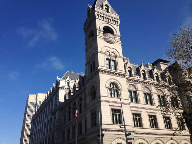
I took this photo at a small park which is at the junction between Johnson St. and Cadman Plaza. In the photo, you can see the square corner tower rise above the roof line. Each level was distinguished with different belt courses around the building. You can also see an American flag is on the left side of the photo. In order to capture angle in the photo of the building, you must stand on the right hand side of the statue in the park I was talking about earlier.
I choose U.S. Post Office as the location because when I first arrive to that location, it attracts me with its bright white appearance, and the juxtaposition of the post office and the nearby building. The architecture feels like it was built in past few centuries , because of the special design of the building. What I thought about of the building is it must has some stories or it may be a very important building back in time, for some reason the origin purpose of the building is gone, however people don’t want take down the building and make a new architecture. They probably think this building is part of the history, its priceless, so they make the building to a post office. From what I learned about this building is this building was build for both a post office and courthouse, designed the building in the Romanesque Revival style of architecture in 1885. Its original purpose was build for post office, and courthouse. In 1999 the U.S. General Services Administration purchased the building and began the renovations included the new courtrooms and the restoration of historic courtrooms, original windows and numerous site features. Then the U.S. Bankruptcy Court, the U.S. Trustee, and the Offices of the U.S. Attorney added in to the building.
From the article “City Limits” by Colson Whitehead, it states that “Go back to your old haunts in your old neighborhoods and what do you find: they remain and have disappeared.” Even though, we didn’t have the opportunity to see the changes of the post office, however the history would like to tell us about what part of the building have change. The building was built in 1885, after the almost fifty years later, in 1930, as the population continued to grow, officials determined more space of the building was needed, the addition extended to the north. The article also mentioned “Our old buildings still stand because we saw them, moved in and out of their long shadows, were lucky enough to know them for a time.” the statement have shown that it was luck enough that people can still see those old buildings as they walking through their long and short shadows.
The U.S. Post office on Adams street in Brooklyn is a very historical architecture, it’s also a very important building in New York. This is an example of juxtaposition in New York, buildings overlapping each other, make the city more diverse with different scene. Also to remind people that world changes so unpredictable, when they realize something was changed, its probably has changed months ago, because people became so careless about the stuffs they seem everyday in their life. So we should pay more attention to the stuffs surround us, before they change their original form.