Color Harmony: Phase 2

analogouspalettesplit-complementarypalette

For the those two images, which is analogous palette and split complementary palette. It was the time to understand more about the color harmony. By picking three colors from the color wheel, and looking from the example, is easier to create the new one. Since I know the concept of the shades, tint, tone, gradient, gray scale, and compliments. It took 15 mins to complete at the class.

Color Interaction Parings: Phase 3

tkandklevercolorinteraction

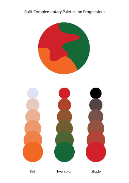
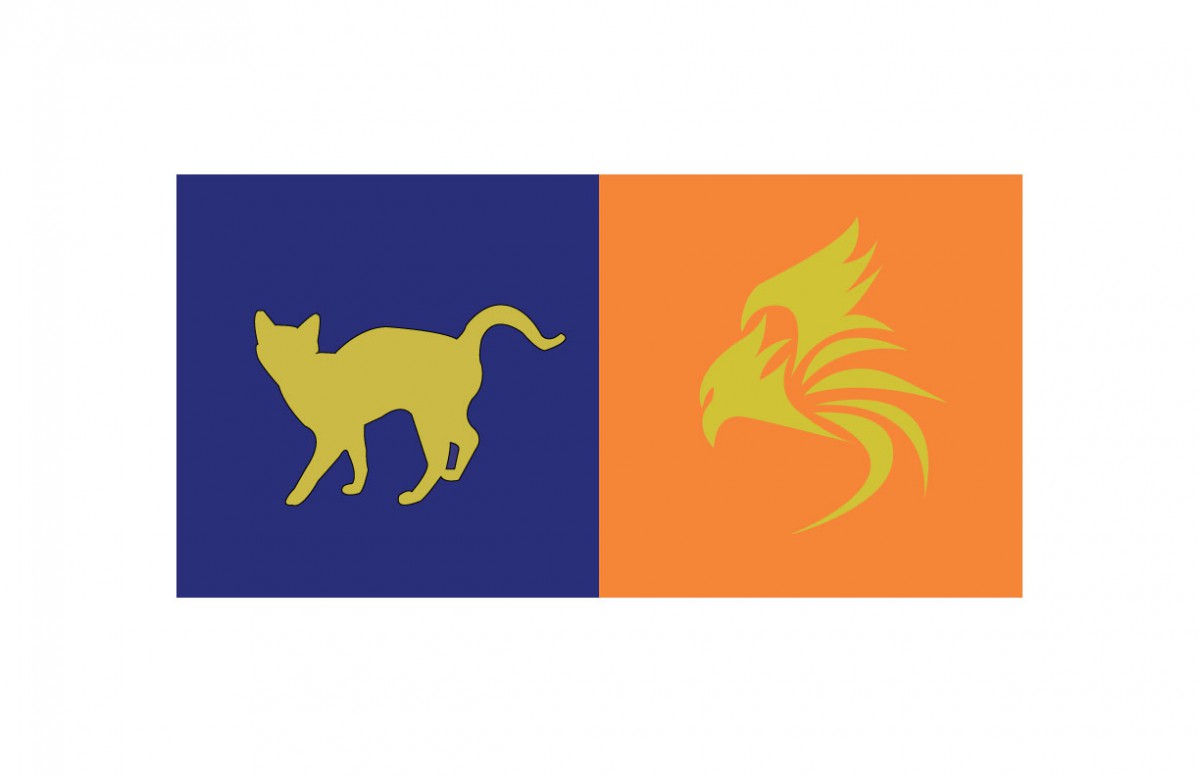
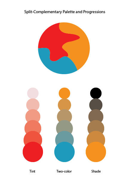
I thought this project was fun. For this project, Klever and me picked a color that represents us for the color and the logo. These logo and color have to represent our personality which is yellow at the logo, because we are positive, clarity, energy, optimist person.  Then Klever chose the blue color that represents my personality such as bubbly, reserved, shy, etc. I never think I’ll be a blue color person, that is the first time someone say it. In my observation, Klever is a talkative, positive, optimistic person, when I see the meaning of an orange color, the color is represent his personality very definitely. After that, we had to come up some idea for the logo, than I saw his necklace which was a bird from the movie (hungry game). I came up some idea like phoenix or bird that prominent his personality, because Klever has leadership at the class participation. When I used to draw the logo of the illustrator, it took me half hour to finish it. I know how to use the illustrator that is more helpful and save a lot of times to create it. I really liked this part of the project 5, and thank you to my partner Klever who understands and help me a lot of this project.

Color Interaction Parings: Phase 4

Project 5 lightning and sun png

From doing project 5, I learned a color could look different compare to the original color when it is surround by another color. When the color is surrounded by low value color, the color will appears more brighter, when its surrounded by high value color, it will appears more darker. I also learn some techniques of illustrator. I think what I can done better in the project is I want to make the color illusion look more effective. I wish I could use what I have learned about illustrator for the last project. Total time took 4 hours to finish .

Color Harmony: Phase 2

split-complementarypalette-01
Split Complementary Palette
analogouspalette-01
Analogous Palette


For Analogous Palette, I need to choose three colors from the color wheel that are adjacent to each other. And create color dominance by varying the value of one or more of your chosen hues by adding complement, white, or black. For split complementary palette, I need to pick first color and  two other colors that are are next to the opposite side of the first color on color wheel. Then follow the same step as split complementary palette.

This phase took 30 minutes to complete.

Color Interaction Parings: Phase 4

colorinteractionfreestudy

In this project, I did a research of the meanings of different color. Then I picked a color that I think it represents my partner’s personality the most. The color I chose is cream yellow. Because I feel like she is a friendly and quiet person. Next we chose a shared color that contrasts both of our color choices. I also learned how to use less-saturated hue or variation in value to create good contrast. Finally, we picked a icon for each other. By making the icon, I learned  some Illustrator techniques. I learned how to use pen tool to create a simple silhouette. I filled it with the shared color and place it within the background. Overall, I really enjoyed this project.

Color Interaction Parings: Phase 3

Step 1: COLOR RESEARCH PROCESS

Marcus’s personality: Creative, positive, responsibility, playful, and secretive.

Color: Purple

Step 2: COLOR MOCKUP

lightningsun
Step 2: color mock up

Step 3: ICON RESEARCH PROCESS

92026A76668D7D653F57B876BA387C25

Step 4: ICON MOCKUP


Project 5 lightning and sun png

This is the Paired Color Identities with Simultaneous Contrast I worked on with Marcus. Total time took 3 hours.

Color interactions: phase 4

For this project, color and how its perceived was the main idea. I’ve learned that one color can appear differently according to its surrounding color because surrounding color subtracts itself from the influenced color. There can be differences in hue, saturation, value or all depending on color combinations. For this project, four color interactions were observed. An achromatic interaction with difference in hue and 3 color interactions with changes in hue, value and both. The change in value can be made by selecting three colors with different values. One hue light in value, one dark and another in between. As designers, colors are consistently used as a means to communicate to viewers so learning to manipulate the eye is significant.

color interactions: phase 3

Click on the link to view the color interaction pair-ups: lightningsun

Me and my colleague did not know nothing about each other. As an experiment we gave each other a color according to how we felt through our energy. My partner guessed violet and I green. Deeper research was then carried out to learn about color and psychology. Colors can often specify specific personalities, sounds, emotions, smells, and so on. That shows how the human mind links color to all the five senses and the power of color. We then learned different shades and tints of hues had more specific meanings which is how we chose the colors we did. Using knowledge we had on each other we chose the right shades for another and we used similar qualities for our influenced color. We’ve conjured the color yellow as our shared color. For our icons i chose a lightning bolt and he a sun. This  is because he loves electronics, nature and is a very straight forward person. Me because I love the summer, photography and traveling. Both icons relate because they both are found in nature and emit light. Time taken was around 90 minutes

Saturation Studies: Phase 2

Achromatic color saturation
Muted Saturation studies
Prismatic color studies

I learned that prismatic colors are the purest and chromatic colors are the least saturated. Muted colors lie in between. In order to obtain prismatic colors (pure R,O,Y,G,B,V) you use the primary colors (Red, yellow, blue). In order to make the other 3 prismatic colors (O,G,V) you mix red, yellow and blue accordingly. To create muted colors you can add either black, white, or it’s compliment. When adding black, you are shading and when adding white you are tinting. Using compliments can be tricky because using too much can lead to chromatic colors. Chromatic colors are essentially a muddy brown/grey and are created using a color and it’s compliment.