color harmony phase 3

observation_phase3bookspine bookcover


For this project i chose as piece called “THE GREAT MOON HOAX OF 1835” Posted on October 25, 2015. I chose this piece of work because it represents what my theme of my book is, the theme of my book is observation and the title “Essence” comes from the original title of the book which was “silences” by Tillie Olsen. I also liked the colors that were used in the work that i used and i think it goes great with the aspect i was trying to convey. 

Reference Link


Color Harmony: Phase 3

Color Inventory
Color Inventory
1561
Humument Book Cover

The reason I chose this image(CONCEPT ART, MONSTER CITY, MONSTERS, INC., 2001) from Cooper Hewitt is that I feel like it really match the themes of my humument work. The themes of my humument work are dreams and loneliness. The picture is basically bule and black. That gives me a stronge feelling of derams and loneliness.

Source Link

Glossary Write-Up

propeller

inextricably

Filthy

coherent

genre

Chiaroscuro

Beguiles

Sentiment

secluded

illuminati

vehement

cliché

midair

riveting

The glossary assignment helped me a lot in building vocabulary. I learned from my own glossary, at the same time learned from the glossaries posted by others. I born and raised up in China, that caused I didn’t have much chance to contact with the English. So when I came to NY, English becomes one big problem to me in conversation. The glossary is a good assignment for the students study for English. When we don’t understand any words, we could searched up to see the definition and make it as a glossary, not only to help myself, also helped other students who never seen this word to encounter it.

Color Harmony: Phase 3

I chose this image (DATA VISUALIZATION, FLIGHT PATTERNS, 2005–08) to reference in my Humument book cover because it is a juxtaposition of my books them. The original theme is about a boy becoming of age, and the new theme is mysterious. This image is mysterious because of all the negative space with the colorful spirals in the center.
Source Link

Time Spent – about 2 hours.

Evaluating Glossary

Ambiguous

Cosmopolitan

Brochure

Gadget

Hitherto

Simultaneous

Ponderous

Drudgery

Eloquent

Saboteur

obligation

Fundraiser

accusations

Grievances

facility

From doing this glossary assignment, my experience is its really helpful. Since English isn’t my native language, this assignment helped me learned many new English vocabulary. To do this assignment, I have read a lot news and articles, when I encounter words or terms that I don’t understand or never seem before, I will look it up on internet, this way, so I can understand the words meaning and how do I use it in right place. Not only these fifteen words I learned but also i have seem other students post, and I do learn a lot from their post too. By doing this assignment, I’m not just learning vocabularies, but I also see what is going on in the world by reading those news.

Color Harmony: Phase 3

I picked this from the design gallery at the Cooper Hewitt, Smithsonian Design Museum; Book cover, Amerika, 1947 design by Alvin Lustig. The explanation of why Lustig made this cover is said from the the didactic from the web site that states, “…employ abstracted iconography and simple typography and lettering to create emotionally compelling representations of a book’s themes.” I picked this cover, because it was simple. As in, it had simple colors compared to others. Others tend to have multiple colors that it didn’t identify it, for my connection in the theme. Since my dominant color is dark blue, the use of shade in the ballerina drop shadow was difficult. However, if you see it closely it is actually a more dark shade of blue. I also used tint in the title of my book and also a shade for my name at the bottom. For over all phase 3, I spend about two hours. I didn’t use any tin or shade at the back cover, since I wanted the reader to actually see the text. I used Photoshop to complete this phase. Link to Cooper Hewitt Research: Here

Exhibit Catalogue (Revised, Final)

This exhibit is presented by Ayano Morishima, who was born and raised in Tokyo, Japan, then moved to New York, where she now lives and studies. She was inspired by Tom Phillips’s work, Humument of transforming a used book into an art and poetry project. Morishima then created, La Fay-Vaile a new name she picked out from the original book she used for her project. She also changed the theme of a book to dark wonderland to show the difference from the original theme, Wish. She was also inspired by the original creator of Alice in Wonderland by Charles Lutwidge Dodgson under the pseudonym, Lewis Carroll in 1865. The three design Morishima created, Gates to Wonder, Book to Wonder, and Dreams to Wonder are from the book that represents to the theme the most and an message about how anyone can rewritten a destiny of the book. Though Morishima’s knowledge and techniques from her studies in COMD 1100 and ENG 1101, college courses that is part of Learning Community: Ways of Seeing, it helped her to be able to create this project. To create her designs, she used her technique in using ink brush pen, x-acto knife, old book and folding to show the viewers, the new kind of story that unfolds.

For the first design, Morishima title the design, Gates to Wonder. Because of multiple doors of the design, indicating a way to the wonderland. A starting point that everyone must encounter. She used the ink brush pen to make many repetition of connected diamonds to indicate a chandelier also, blocking out most of the text in the book to show how visible text are connected to the picture that is shown as a ground. Each words representing the meaning behind the design, such as went, door, worse, cry, wondered, etc. In addition, used figure and ground technique to show the viewers where exactly to see; in this case, the shapes of the ground shows more vividly since the black ink, the figure blocks out other negative space.

Down into the rabbit hole; the second design, Book to Wonder leads the viewers to go though the door to read a little book that came from the concept of the original, Alice in Wonderland. She used x-acto knife to cut open a block of text at the bottom of the page and glued only in the middle. By doing this, she wants the viewers to see that there is a book in a book. Same as the first design, she used the technique of figure and ground, showing the ground to block other negative space. In addition, by folding the corner to the right top, it shows the next design that shows the technique of a chromatic gray; grays that exhibit a subtle, but visible hue; created by adding larger amounts the complement and white.

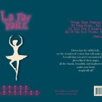
Dreams to Wonder is a design that was created to show “the after math of Wonderland”. Story goes as the darkness in wonderland was finally came to the end. Many would think that the ballerina could be Alice, however being the character in the original story, Morishima completely disconnected the characters from her project. The ballerina indicates a spirit that it stabilizes the wonders in the wonderland. She also used ink brush pen to create curtains on the right and left sides to show that she is on a stage, and the visible words that fits with the story of the page, such as dancer, moment, felt, perfect, and choice.

Ayano Morishima, made this project from her understanding in COMD 1100 and ENG 1101, college course she is taking in New York, where she lives. She made this mainly to attract people who are interested in creating their own story. It conveys though out each pieces of art work and detailed design, where it tells the message in the theme. Single page contains a message where Morishima’s story that she made though out the art she loves, she wants the viewers to understand that stories can be can be rewritten to make new ones. Even characters, make them have their own destiny with out following the original story.

hidebound

hidebound
adjective

http://www.merriam-webster.com/dictionary/hidebound

not willing to accept new or different ideas


i was reading an article called ‘One Team Showed Up: UNC Asheville 79, Georgetown 73’ where a sentence “he is hidebound to an antiquated offensive system.” now i know that means a close minded idea

Andalusia

Andalusia

geographical name

source:- Merriam Webster

a region in southern Spain on the Atlantic and the Mediterranean; formerly a center of Moorish civilization
Iwas reading the book ‘the alchemist and i saw the word in the sentence. ‘”He knew all
the fields and pastures of Andalusia.” now i know that Andalusia is a region

Evaluating Glossary

indoctrinate

cinema

cyberspace

deprived

contemporary

totalitarian

dishevelled

aristocracy

Rapture

frictionless

indulgence

anathema

Drastic

Homeopathy

Samizdat

After I finish the glossary assignment, I can feel it realy helps me. Since I was not born in America, my vocabulary is very poor. But this assignment imporves it a lot. By doing the assignment, I need to read a lot of articles and passages. Reading is definitely the best way to increase vocabulary. When I encounter words that I don’t know or I’ve never seen. I need to check the definition of the words in a dictionary or wesbite. By doing this, I not only learn the definition, I also memorise the words. I can also learn more uncommon words by seeing classmates’ glossary posts. Overall, this assignment helps me a lot in improving vocabulary and better memorising words.