contiguous

Contiguous /kənˈtiɡyo͞oəs/ – to be close in distance, side by side; to touch borders.

Ex. New jersey and Pennsylvania are considered contiguous states because their borders touch.

In my illustrator class, my teacher used this term when explaining selection methods. The word has a weird sound and could have meant anything so i decided to search it up and add it to our class glossary.

lenient

Lenient /ˈlēnēənt/ – to be forgiving or permissive.

Ex. “Sam became lenient after I apologized for breaking her book. She smiled and gave me a hug.”

I’ve come across this term countless times throughout my time being. I’ve had a sense of the word but didnt really know what it actually meant. Turns out to be the oppisite of what I thought it was.

Glossary Reflection

Hidebound

Andalusia

cognitive

verbatim

saboteur

ponderous

Natatorial

Cornucopia

Scrutiny

Beguile

Poignant

Iridescent

Hokum

intransigent

Galvanize


Throughout the semester we had to do the glossary assignment every week. It created a new habit where I would look up everything I didn’t understand. At first i would just do it for the vocabulary list. But as time passed by it became a habit. I was doing it because I wanted to know what the meaning of the word. This way I had a better understanding of the word, sentence and even the article or the book I was reading.

Glossary Reflection

Altruism

Extraneous

Crowd-sourcing

Cacophony

Interface

Tenement

Nostalgia

Reminisce

After a very long and hard semester, I can say I have been able to accomplish a lot. Though it was not exactly a “piece of cake”, there is still much knowledge and thorough understanding I can now integrate in my “ways of seeing.” This personal glossary we have all created was an excellent way of being able to give myself a much more thorough and meaningful understanding of context and content in ENG 1101. Not only was I able to understand better, but also give myself a sort of perspective on what exactly it was that we, as students, were given to analyze. Not only was it beneficial in that perspective, but also in the way we expanded our vocabulary. Such words we have learned can easily give us a jumpstart on our future English courses. Having that knowledge and understanding on such advanced vocabulary can help us understand future context and studies, and at the same time be grounds for use within our own vocabulary in our essays, reports, etc etc. Also, I feel as if I have founded a sort of curiosity within myself, that gives me an incentive to continue to research unknown words within future context. I have come to notice that I tend to google certain words or phrases when I come across them in my everyday life. That in itself can come as an amazing and useful habit, and will definitely benefit me in the long run.
 

Color Harmony: Phase 3

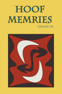
Cover side-01
Humument Book Cover(side)
Humument Book Cover (Front)
Color Inventory
Color Inventory


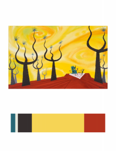
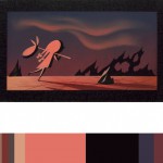
I choose this image (CONCEPT ART, SULLIVAN AND BOO, MONSTERS, INC., 2001) because the feeling this image gives to me is really close to my Humument book’s theme. The theme of the original book is about a resilience in the face of family tragedy, and the new theme is about imagery of fantasy. This image is fantasy because the scenery in the image seem does not exist in real world. Here is link to Cooper Hewitt Research: Here

Total time spend: 2 hour and 50 minutes

Color Harmony: Phase 3

book cover chriswarecolorinventory.ai

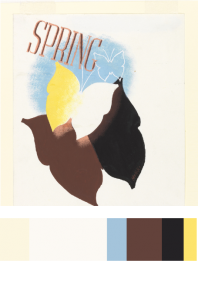
I chose this piece ( Spring in the Country, 1935) posted by Edward McKnight Kauffer, acquired it in 1963. I chose this piece to reference in my Humument book cover because most color contains in this piece are warm colors, like yellow, chromatic red (brown), and muted yellow. The theme I chose for my humument is relax, warm color can better to represent my theme, it gives a feeling of warmness and relaxable.

source link 

Color Harmony: Phase 3

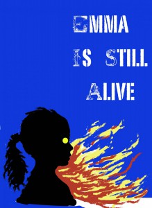
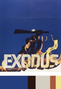
After our trip to Cooper Hewitt, I decided to choose a piece of art by Saul Bass called Exodus. This piece was created in 1961, and was poster designed for Otter Preminger’s film Exodus. I chose this particular piece because i thought it would be an excellent color scheme for my humument, and it also featured fire, which is already a pretty important part of my piece. I then created its color pallet, and used it as a base for my own cover art.

colorpallete