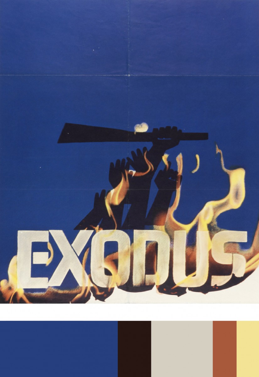
After our trip to Cooper Hewitt, I decided to choose a piece of art by Saul Bass called Exodus. This piece was created in 1961, and was poster designed for Otter Preminger’s film Exodus. I chose this particular piece because i thought it would be an excellent color scheme for my humument, and it also featured fire, which is already a pretty important part of my piece. I then created its color pallet, and used it as a base for my own cover art.


Nice choice, but where is your book cover? You should put it on to this post. I can’t really comment on it since I don’t see them. However I believe its going to be great, I can tell.
Since the humument cover is on a different post, I’ll just comment on it assuming you’ll add it to this one. With regards to your color inventory, I think that the dark brown-black color is used just a slight bit more in your humument cover than it is in the poster you referenced, but I feel that the negative space directly above the figure of Emma could be played with by moving the title’s text around. Maybe you could get an even more dramatic effect by finding the right arrangement of each word.