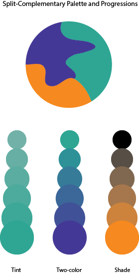
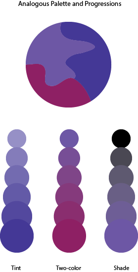
In this phase I learned about more behind color by learning about color harmony. When certain colors are together it feels as though it’s very pleasing. Colors can be harmonious in terms of shading, tints, compliments, tone and gradient. For the split-complementary palette, I had to choose one main color then choose two colors that is on either side of its complement. I chose orange as the main color while blue-green and blue-violet are the other two colors. For the analogous palette, I had to chose colors that were adjacent to each other on the color wheel. In this case I picked red-violet, blue-violet and violet. It took me 2 hours to complete this phase.


These are some interesting color combinations. The colors you chose for the Analogous Palette give off this haunting vibe to me, which is made more apparent in their progressions. I’m curious about how the Two-Color progression for your Split-Complementary Palette would have looked if you had paired orange with the blue-violet.