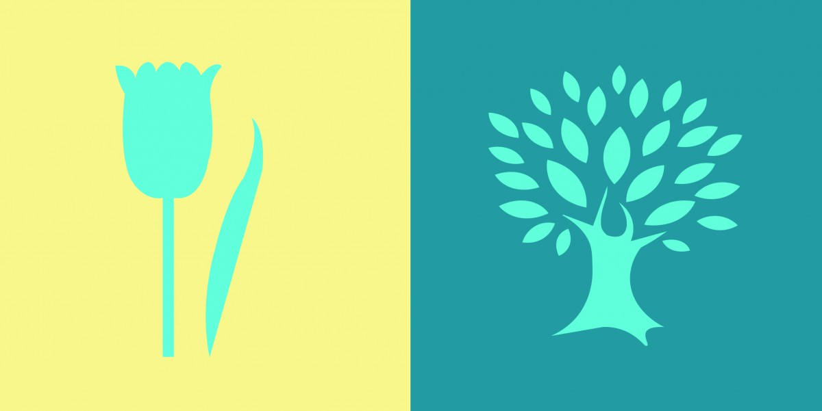
In this project, I did a research of the meanings of different color. Then I picked a color that I think it represents my partner’s personality the most. The color I chose is cream yellow. Because I feel like she is a friendly and quiet person. Next we chose a shared color that contrasts both of our color choices. I also learned how to use less-saturated hue or variation in value to create good contrast. Finally, we picked a icon for each other. By making the icon, I learned some Illustrator techniques. I learned how to use pen tool to create a simple silhouette. I filled it with the shared color and place it within the background. Overall, I really enjoyed this project.


Nicely written about your composition. However this should be your phase 3 instead of phase 4. If you want to make phase 4, than you have to explain what you learned from this project over all. If you look at our peer Jay’s phase 4, you might get a sense what to write about. In addition, don’t forget to add how many hours you worked for this whole project.
I see why you pick that color for your partner, and I’m totally agree with your opinion. And the colors are very nice too, but the color illusion was that clear, I’m not saying its not good, but from a unprofessional view.