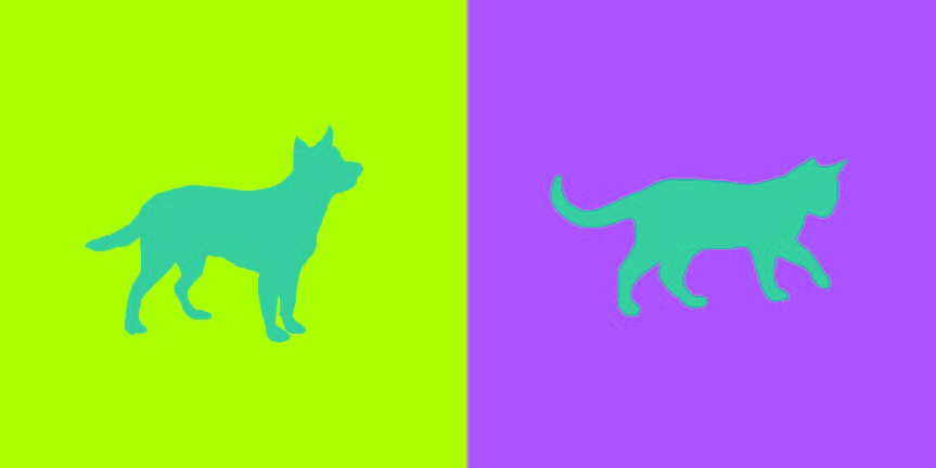
This project I found to be really fun and interesting. Not only was everyone able to work with a partner but we had the chance to get to know our partners in this activity. So with my partner Tyler, we had to pick a color for each other that best represents the other person’s personality. Then we had to pick a color that matches both of our personality traits. Next we had to come up with logos that represented each other but in a way that they are similar. With all of these elements we had to make sure our work showed simultaneous contrast. I chose yellow-green for Tyler because he’s mainly funny and outgoing(that represents the yellow) but at the same time he’s relaxed(that represents the green). Tyler chose to do a pink-blue color for me because although I’m cheerful and giggly(that represents the pink) I’m also intellectual, trustworthy and relaxed(that represents the blue). Our shared color is a blue-green to represent our relaxed traits. Tyler chose a cat logo for me since I’m cuddly but clever like a cat. I chose a dog for Tyler because dogs are outgoing and he really loves dogs. This part took about 4 hours and 30 minutes to complete.


I really like how the blue-green seems to glow against the pink-blue, so I think that’s indicative of a successful color interaction. The amount of care with regards to technique is also apparent with the way both of your logos came out.
its very obvious to see the illusion of color of the cat and the dog. Very impressive.