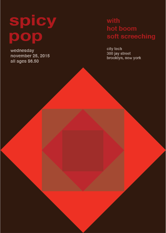
For this phase I was out in TK and Ashley’s group, we had to make a poster that follows 3 cards that was assigned to our group. We had to make a title that was a cross-sensory metaphor. In other words using, words that involves the senses of the body such as touch, taste smell, etc. For our title we used the sense of taste and sound which is “spicy” and Pop Our main primary color had to be a warm color, so we went with red. We went with a bad religion style for our composition. This poster took 3 hours to complete.


Nice poster, I like the different saturation with the color red. The title and the logo pops out from the background, which the saturated red makes it balanced. Nice work!
I really like the band poster. It I like the colors you guys chose and the design you make in the middle. Very catchy. Awesome job.
Wow, this is a very vibrant poster design. I particularly like how the more saturated colors are alternated with the less saturated colors, which makes for an interesting sight with how each color is juxtaposed to one another. I also think that it was a good idea to make your band title the most saturated item on the poster, especially as a strong red color given the fact that it was named “spicy pop” to begin with.