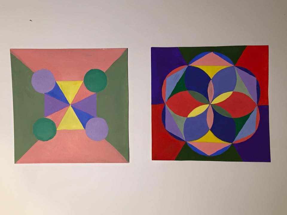
The left is a high key range collage then the right is a broad range collage. The high key collage took around one and half hours, the other one took around three hours to complete.
The left is a high key range collage then the right is a broad range collage. The high key collage took around one and half hours, the other one took around three hours to complete.
The OpenLab is an open-source, digital platform designed to support teaching and learning at City Tech (New York City College of Technology), and to promote student and faculty engagement in the intellectual and social life of the college community.


I like your painting overall, however I think your green (On the side) for the high key is closer to chromatic color. Add white to make it high key. Also with the green bubble, it looks more toward prismatic color. Which is good, but add a little more white to make it high key.
this is very cool i like the feeling of movement the patterns creates as you keep looking at them or stare at them for awhile.
These designs are amazing, I can’t image how long they took to create. I really like them. Awesome job. However, Prismatic colors are sure colors, but I can see you added white to blue, which desaturated it.