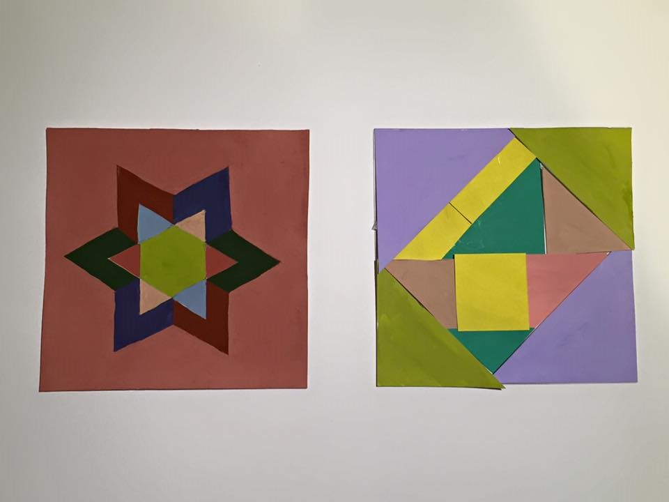
Each collage took around two hours to complete. The left is a high key range collage, this is my second painting of the High Key. The right is a broad range collage, little bit hard to watch the color.
Each collage took around two hours to complete. The left is a high key range collage, this is my second painting of the High Key. The right is a broad range collage, little bit hard to watch the color.
The OpenLab is an open-source, digital platform designed to support teaching and learning at City Tech (New York City College of Technology), and to promote student and faculty engagement in the intellectual and social life of the college community.


Nice, beautiful work. I thought that we are suppose to use the same shapes. However, I like how it turned out. I am not sure if that middle light green is broad. I guess you can use them, however I would add little more different light color on the broad range, because that is the only light part that I see in that painting.