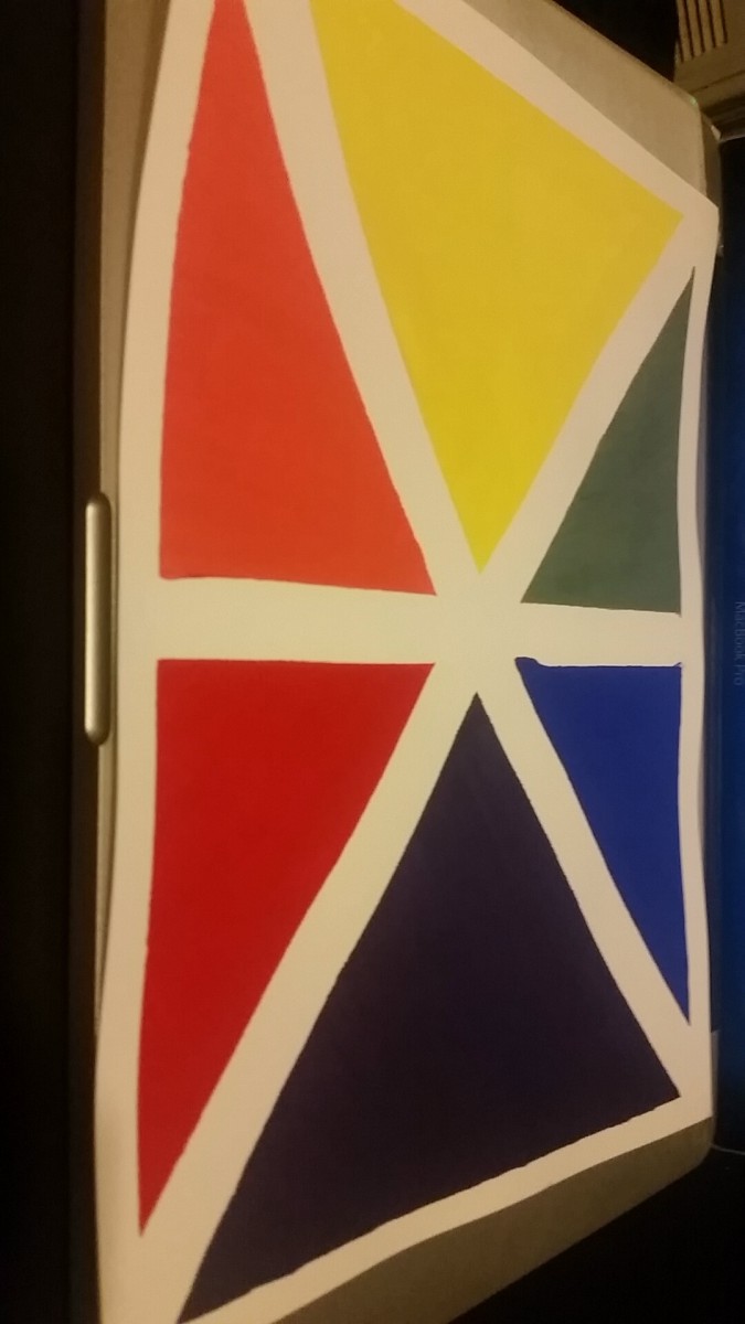
My concept came from the simon says game where you have to copy the pattern when the colors light up so i tried to incorporate that into my color wheel.
My concept came from the simon says game where you have to copy the pattern when the colors light up so i tried to incorporate that into my color wheel.
The OpenLab is an open-source, digital platform designed to support teaching and learning at City Tech (New York City College of Technology), and to promote student and faculty engagement in the intellectual and social life of the college community.


The presentation of your color wheel concept shows a clear effort to make things as clean and precise as possible, considering how nicely all the shapes came out. The violet would have come out more vibrantly if you had used magenta and cyan, but I think that might just be the lighting from the photograph affecting my perception of it.