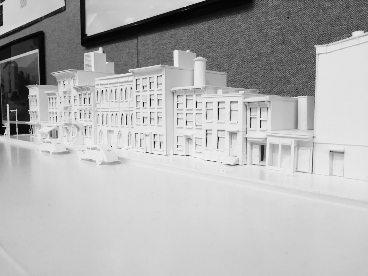
high key
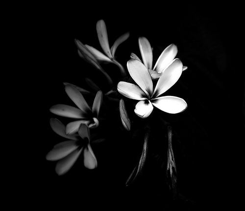
low key
The first image is high key and the second one is low key. You can see the differences between the light. High key has a brighter figure and low key has a darker figure.
high key
low key
The first image is high key and the second one is low key. You can see the differences between the light. High key has a brighter figure and low key has a darker figure.
The OpenLab is an open-source, digital platform designed to support teaching and learning at City Tech (New York City College of Technology), and to promote student and faculty engagement in the intellectual and social life of the college community.


I like how you are trying to find high and low key, but I think you should look for more of low key. Both of the images, represents as high key to me. I can see low key on the haunted hotel poster, however most of that image is concentrated more toward the high key. You should take picture for low key!
For the high-key image, you could try cropping out the top if you wanted to try and get it as light as possible, but I think the contrast with the dark wall is nice too. As for the low-key image, I agree with Ayano that there’s too much light for it to be a low-key composition. You can try cropping the darker part of the poster and see how that works if you still want to use it. I think it could make a good dramatic effect if you got the right section, though it might just be too small an area in the end.