Time Spent: About 1 hour
Time Spent: About 1 hour
The OpenLab is an open-source, digital platform designed to support teaching and learning at City Tech (New York City College of Technology), and to promote student and faculty engagement in the intellectual and social life of the college community.


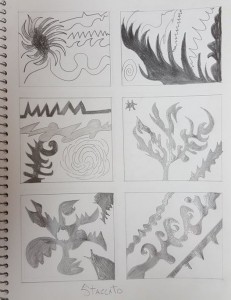
There are so many different kind of lines in each boxes you made. Example for your third box of Staccato, I can see there are 4 compositions in there, three kinds of sharp lines and a rose. I think you should put the rose in the box of Legato, because it has rough lines.
I really like your design for staccato, because it stands out more than the legato design. Probably because of the figure part of the designs are missing in legato. I can see a little concept of tree or nature from both design, the geometric shapes and the organic shapes are a lot similar where you managed a round part of shapes into pointy shapes of vice-versa. (Well, that is just from my perspective) Above all I like both design, but the staccato design stands out more. (I am not sure, but I think it might be better to combine posts, because its the same hw.)
https://openlab.citytech.cuny.edu/rosenspevackfylcf15/2015/09/30/sound-visualizations-phase-1/
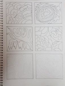
As Jingyi said, your rose could have its own separate thumbnail, although I think it would remain a staccato composition unless the lines were connected. The staccato designs could be more successful if the shapes and lines were separated, and the legato pieces might be too complex to repeat in patterns. I also feel like the legato lines could benefit from more variation in intensity, to further illustrate the change in tempo/beat of your chosen music piece. Alternatively, you could have experimented with shading some of the empty spaces and trying to create more definitive legato patterns from those as well.