Project#5: Gallery Catalogue Entry

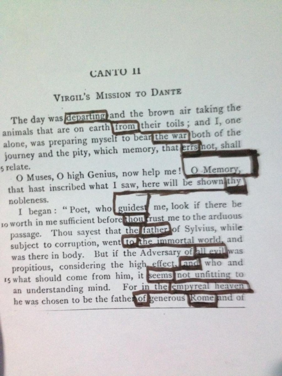
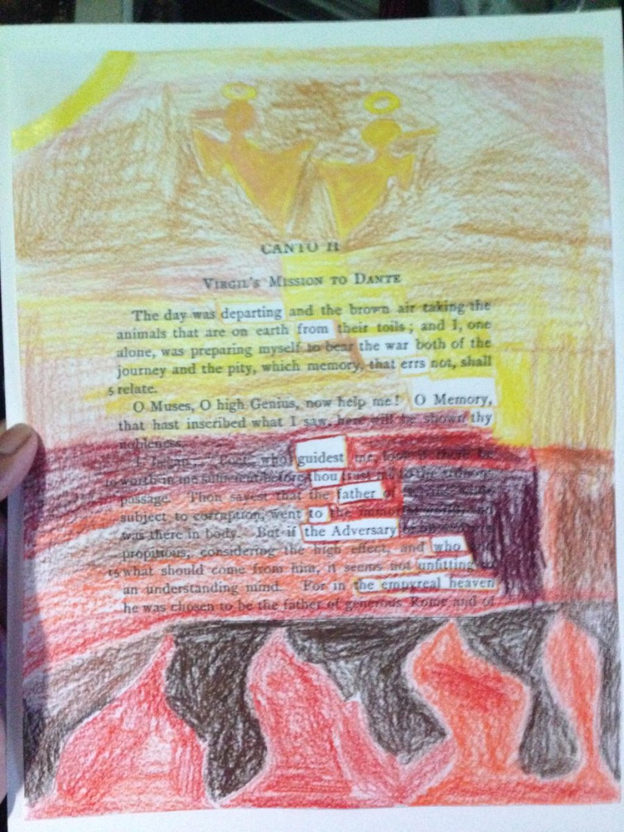
Love is a humument created by Jessica Pareja. The artist used a double page from the book  the famous Romeo and Juliet by William Shakespeare. The interpretation shown is to bring out the artist piece in a different interpretation of the text. The artist had designed the piece to show the reading  from top going across and going to bottom with lines guiding the reader from word to word. The reading says “ I cannot nor any other man. I love myself. Love lent me counsel and I never would.”. After reading the piece, the artist wanted the readers to understand her feeling and thoughts. The artist wanted to express that someone dear to her left however, she just tries to love her inside in fear of getting hurt. It is designed to give off a sense of sadness, understanding, and fearful.

The artist used an analogous palette for the color choices of this piece. The colors are meant to give a sign of hope for these character. The theme might be love, looking for love but she just wants to be loved by people surrounding her. The blue and green as well as gray give off a positive color. The color shows more of a sad feeling and yet with the yellow it symbolism hope within herself.  The artist chose to draw a heart in the middle and colored it yellow to show around the words more clearly in the piece. The yellow heart is hope of love is within herself and it symbolism a light to her life. All the colors are around the heart to symbolism her darkness and fear. The colors around the heart is a violet blue, dark green, light green as well as gray. The words represented in the artwork can be seen clearly and they are in a rectangular shape. The lines are shaped in blue, the blue is sending out a message of sadness.

In the original text, the artist used Romeo and Juliet to show the opposite of being in love. In these scene the couple just started to fall in love with one another however, the artist try to do the opposite. The message is very different than what is on the original text has however, the artist felt like it was perfect for it describe sadness in love.The scene is when Romeo and Juliet just start falling in love and is actually giving a sense of love feeling. The message in the humument is the opposite, she wants to love herself and scared to love someone.

Overall, the readers and artists might question the artist choice in color or why that scene or they may find out their own intepretations to this humument. The artists main purpose is to leave the readers and viewers inspired and just have an understanding to her inner feeling. This feeling that have a hope and fearful start. The artist tried to used muted color and cool colors to show the impact of her situation and how slowly she grow out of it. The meaning of the piece is to feel love.

Project#5: Gallery Note

Jessica Pareja

Love

This artwork piece is designed to represent what love is, its bringing out an emotion in want is  “love” according from the text. The artwork is portraying how the character lost someone dear to her and now she can’t love a man. However, the true feeling is the viewers to understand her own inner feeling. The artist uses a text from Romeo and Juliet and the image is to show her opinion.

Project#4: Revising the pitch

Brooklyn if you walk around the neighborhood, you’ll encounter many lovely places. However, the question is what influences people to choose the path they decision to walk on? Many ideas come to a person’s mind when choosing a path, it can come from using your five senses.  If you walk in the streets of Brooklyn you’ll get to see areas full of crowd people and as well as lonely places. I understand the people who choose to walk in crowded places, there you’ll see a lot of commercial areas toward the nearest subway. You get to see buildings toward being able to smell different kinds of food. However, there are  people who walk in lonely areas. The feeling of stress that puts people to walk along lonely areas. The sign of freedom that makes people enjoy of being lonely or being with someone to just talk alone with.

There are many people who come visit  Brooklyn, some just visit, some just moved here and others just work here. If those people don’t know the area or just came out of work, they’re most likely people who’ll fall for easy traps that led into crowded areas. People who study around City Tech which is located in Jay Metro Tech station. They walk straight from the campus point and straight into the train station. These people whose head are full of work, studies, and extra information won’t pay attention to anything but getting home. How about the people who have free time, they just walk to the store get food and wait till time flies. People shouldn’t just kill time, they should walk on these people lonely areas to realize the bad pain. People can only experiences areas with loneliness, if people decided to walk areas with a calm senses. People can began by exiting out of city tech and heading up towards Johnson St and passing Adams st. Making a right people will see Cadman Plaza East and Tillary Street, there people will witness the Korean War Veterans Plaza. There people will see the park with not enough people to be bothering one another. In the Korean War Veterans Plaza, people just walk around there, however you can feel the presents quietness just by being there. Its a small ahead that people can quietly sit around till all their ideas or pressures they have leave. Comparing the more crowded areas with here people get the feeling often to get lost in their thoughts.

The Korean War Veterans Plaza isn’t the place to hang around people can find lonely areas ahead. However, what happens the Korean War Veterans Plaza is the history it represents. In a local online newspaper, Don Evans stated “It’s a small monument compared to the expansive World War II memorial in nearby Cadman Plaza Park, the heroic arch on Grand Army Plaza honoring Civil War soldiers or the modest Korean War Veterans plaza in Columbus Park. Designed by architects Danby and Nute, it is a tribute to soldiers from an old neighborhood that is being revived by completed high-rise apartment buildings such as Oro and Bridgeview Tower with three others yet to come.” The Korean War Veterans Plaza is a memorial of the World War, for those soldiers who fought.  The Korean War Veterans is a place  of peace because not only do the people know its an area for respect but its written to never forget its propose. As Evans Stated  ““In loving memory of those men of this district who in the war of 1917 and 1918 fought and died for freedom. Their neighbors through the Seawanhaka Democratic Club erect this monument,” the inscription says.”  The Korean War Veterans Plaza is a place that has shown peace, quietness and as well as loneliness. The plaza influences the people to find happiness in a memorial.

After a long day, the tour ends and people have to return home. Lonely and quiet areas around the Korean War Veterans Plaza help people gain a sense of peace from any situation they’re dealing. Being in crowd areas maintains people busy it will make people feel annoyed that everyone in your way. However, once your at the Korean War Veterans Plaza you get the sense of relax. Being in busy area doesn’t relax anyone, people try to walk areas they’re going to walk lonely areas to try to avoid the crowd without making someone have a headache. Taking lonely areas gets a person thinking less, sometimes lonely areas can take you the fastest way to avoid the crowded areas. After seeing the history of the Korean War Veterans Plaza. it makes people enjoy there walk and view. Instead of just having to a relaxed area, the history of the Korean War Veterans Plaza opens up minds. There aren’t many people who know the history of the Korean War Veterans Plaza.  This will allow people to open up and wonder areas, a quiet area to know about the history.


Work Cited

Evans, Don. “Brooklyn’s World War I Memorial Gets Overlooked on Veterans Day.” Brooklyn Daily Eagle. Brooklyn Daily Eagle, 14 Nov. 2007. Web. 21 Dec. 2014.

Coate, Betty. “Chapter 1 A Year Later: Brooklyn Korean War Veterans Plaza.” The Unidentified Solider in the USO Poster: An Extraordinary Odyssey. By Richard Coate. N.p.: n.p., n.d. N. pag. Web. 21 Dec. 2014.


Project #5: Reflection

In this project we had to create a humument and write a description about it as if it were a gallery catalogue entry. My piece was called Dauntless and gave off a feeling of being brave, fearless, and determined. I think I did a good job at explaining all of the aspects of my piece and what they all meant. Creating the first draft of the humument took me about an hour and a half. Making the color palettes and references in class took about 2 hours. Then making the final drawing of the humument took about 2 hours to do. Writing the gallery note took me about 30 minutes and writing the gallery catalogue entry took me about 3 hours. It was a little hard to write as if it wasn’t my work of art. But I do think I ended up doing that really well while still describing the proper meaning of the piece. I could have expanded on my word choices when I was explaining some of the parts of my piece. This was overall a very fun final project to do. I enjoyed having to pick our own text from any book and creating something out of the words on the page.

Project 5: Reflection

Project 5 was the last project of the semester. It was a project shared between our Eng 1101 teacher and our Adv 1100 teacher. I feel like I’ve learned a lot this past semester. I learned how to write proper essays and we even touched a little on public speaking. We learned the different formats we could use for an essay, along with how to summarize a piece properly. This project was very challenging because we had to do a 50 word post that explained our piece. That was hard because I kept going over the amount. I liked writing the catalog because of using the word I to describe myself , I had to put it in third person.  It was something that I never usually do. I felt like I was writing a short story. I feel like my writing has improved, because my vocabulary has improved. The glossary entries we needed to post really helped expand it.

Reaching the end of the semester, I feel like I accomplished something. My perspective has greatly improved. The many field trips we had really helped. If I were to compare my writing now to when I just started class , I’d see a great difference. I know that I still need more work on my writing, but I’m still happy I improved. I’d like to thank my awesome professor, Ms.Rosen for the patience she’s had with me and my late works. I know that its not a good habit to have in college but I’m still working on it. She was not only patient she also encouraged us to visit during her office hours to help with our essays. That really helped and I’m sure if she didn’t offer, I probably would not have gone. The idea of posting our homeworks online was awesome. At first it didn’t really make sense, but I got the hang of it. I really thought my first year of college would be really dreadful, but the way Professor Rosen taught, just blew the dread into the air. I feel like I could handle college a little better now. THANK YOU VERY MUCH PROFESSOR ROSEN!!!!!

Gallery Catalogue Entry

The Humument piece called Empyrean, created by Moeen Razak is based on Dante Alighieri’s novel Inferno. A Humument is a piece of work inspired by Tom Phillips who created the very first one based on W. H. Mallock’s novel A Human Document. In the Humument presented before you, the artist tries to bring out a different interpretation of the original text. The artist uses a staircase style to help guide the reader from top to bottom. The artist uses analogous colors to help portray his meaning of the piece. From where it says” departing from the war errs O memory thy guidest thou father to the adversary who unfitting the empyreal heaven. After reading this piece the artist wants readers to feel enlightened by it. It should give its readers a spiritual effect.

By using an analogous palette for the color choices, the artist helps contrast heaven and hell. The colors used range from red to orange. It uses their chromatic gray hue along with their prismatic hue. Their are some colors that use a muted tone to express a duller hue. The colors, such as red and red orange are more hot and vibrant, so it helped fit with the hellish theme. Colors like yellow and yellow orange are a little cooler and aren’t as vibrant. The artist used these to represent heaven. When these colors are desaturated enough they can start to look cooler and have a darker value. With these colors the artist uses them for shading and produce a darker effect.

The artist uses red as his dominant color. Red has a negative feeling, like war or death. Also anything mixed with red, gives off a more vibrant hue, for example red orange. The sub dominant color would be yellow. You may ask why the artist has done this? The artist wanted to keep some of the original meaning of the text, so he used more red then yellow. The red shows more hell then heaven because the book is mainly about hell. The spaces that are left uncolored are there to help guide the reader along the piece. The artist makes it very obvious which side is hell and which side is heaven. He draws flames in red orange to show the hotness of hell. He uses the lighter colors like yellow, along with a picture of two angels to help distinguish heaven.

The title the artist chooses for this piece is Empyrean. It is a word that comes from the original text, but in a different form. It is stated in the original text as empyreal. The words basically have the same meaning (highest of heaven). The artist uses that word as his inspiration for the meaning of this piece of art. That word itself surrounded by a majority of word that have a negative meaning really catches the eye.  When the piece is read there is a message of how hard it seems to get to heaven. It makes you think as if you were on a journey and their are many forks in the road. You have to choose a way to go. That choice is what puts you closer to heaven or hell. The next few lines talk about ”all evil”. It shows how all evil is not welcomes in heaven. The precise word used is that they are unfit to be in the empyreal heaven. After reading the piece and the message the reader should feel enlightened. The message is different than what is printed on the original page of the book.

Many readers may have their own interpretations of this humument. Moeen Razak’s interpretation is just one of the many opinions out there. The main purpose the artist tried to portray  is enlightenment with spirituality. Having people see the differences of heaven and hell, would get them to choose. They would start to think where they would want to end up. They would think a little more before they make a decision. Using bright warm colors to portray heaven and hell helped support the artist’s view of the piece.

Project #5: Gallery Catalogue Entry

Dauntless is a humument created by Priya Maharban. The artist used a page from the book Divergent by Veronica Roth. The interpretation brought out by the artist in this piece is different than the interpretation of the text. The artist has designed the piece to be read from top to bottom with lines leading the reader from word to word. It reads “Dauntless I barely fear people judging and observing. All occupied. Dauntless only are left…don’t fear”. After reading this piece the artist wants readers to feel inspired by it. It is designed to give off a sense of bravery, fearlessness, and determination.

The artist used an analogous palette for the color choices of this piece. These colors are more of cool colors to go with the bravery theme. The blues and greens give off a positive effect. The artist also chose to use a wing to draw around the words to be read in the piece. The wing is the a symbol of bravery in the piece. It can be related to the bald eagle, which is a very brave animal. Always determined. The outline and inside of the wing are colored in shades of blue. The outline of the wing is a muted blue while the inside is filled with a violet blue. These colors both help with the bravery theme as intended. The words to be read are all outlined in a rectangular shape. The shape is also a dark green color. The reader is also led on to what word to read next by lines leading from one to another. Those lines are a yellow green color. Green is an overall positive color that helps with the positive impact of the piece. The outside surroundings of the wing are also colored in a yellow green.

The dominant color of the artists piece is the violet blue inside the wing. The sub-dominant color is the yellow green surrounding the wing and also the lines inside of the wing that guide the reader from word to word. The accent colors are the dark green that make up the rectangular shapes and the muted blue that is the outline of the wing.

The title of the piece is Dauntless and the word is also used in the reading. That word itself means fearless and determined. When the piece is read there is a message of not caring or fearing about people who judge you, especially if they are trying to intimidate you. This is comes from “Dauntless I barely fear people judging and observing”. The next few lines “all occupied. Dauntless only are left.” tells readers that they will keep doing what they’re doing but remaining brave and fearless will keep you going and staying determined. Then there is the last line “Don’t fear” which has the obvious message of telling all the readers not to fear those who judge them, especially if they’re doing it for negative purposes. The overall piece after reading and viewing it makes the reader feel determined and inspired if they see the strong message within it. This message is very different than what is on the original text of the page in the book. It is just a scene that actually gives off a nervous feeling. The message in the humument is the opposite.

Readers may find their own intepretations of this humument by Priya Maharban. Its main purpose is to leave the readers/viewers inspired and determined. Having them feel brave and fearless at the same time too. The artist used bright and cool colors to emphasize the positive impact/meaning of the piece and its message.


Dante’s Inferno: Humument

The wording for the Humument

The wording for the Humument

The finished Humument for Dante's Inferno

The finished Humument for Dante’s Inferno


Analogous and Split-Complimentary Palettes

Took about a hour to finish. It was finished in class.

The Color Palette

Took about an hour and half to finish because finding the right colors to use was hard. Had to start over a couple times.

The Humument itself took around an hour and a half to do.

It was hard sticking to the color palette I made.

Project#4: Aesthetic Mapping (Self-evaluation)

After doing project#4, I came to an understanding of this project the point of this was to get a the writer to understand the feeling of the setting. As a writer one must understand how to write a description. As a writer one must come to an understanding of their point and force. According to my essay in the pitch as I stated “Brooklyn if you walk around the neighborhood, you’ll encounter many lovely places. However, the question is what influences people to choose the path they decision to walk on? Many ideas come to a person’s mind when choosing a path, it can come from using your five senses.  If you walk in the streets of Brooklyn you’ll get to see areas full of crowd people and as well as lonely places. I understand the people who choose to walk in crowded places, there you’ll see a lot of commercial areas toward the nearest subway. You get to see buildings toward being able to smell different kinds of food. However, there are  people who walk in lonely areas. The feeling of stress that puts people to walk along lonely areas. The sign of freedom that makes people enjoy of being lonely or being with someone to just talk alone with.” I felt like it was a good introduce for the essay. I described what my topic of my essay was going to be about however, as Hai Lin commented I should have started stronger. In my body paragraphs an example, ” If Korean War Veterans Plaza isn’t the place to hang around people can find lonely areas ahead. There are more areas that people can enjoy, while walking people can continue there path though walking towards Clinton and Pierreport Street. From Pierreport street taking  a right to Hicks street. In the area people will see varieties street that are lonely there, people can just walk in the area and look at the old buildings. The you can see the amazing architecture. People can walk around freely without bumping to someone anyone can almost feel that they own the street however there might be two or three people in the surrounding.  While looking around the area, the people who enjoy architecture might draw sketches or take pictures that will help them better the area for the future or keep it the same for their projects.” I wanted to stay force of lonely however, I just describe the place instead of force why it feel and how the surrounding is. Same goes with my other essay, I start to force on other  and not my point my essay however, I feel like I did in my second essay.