Category Archives: ADV1100

Field Trip : “Wonder” Exhibit at BHS

Favorite Photo By a student named Daniel Oliverio

Favorite Photo By a student named Daniel Oliverio

As we first walked through the hall of so many other beautiful photos displayed, I couldn’t stop staring at this one photo. So, obliviously it’s my favorite out of all of them. It reminded me of the Project#3 with the different values, Narrow, broad, high and low. This picture mostly shows to be a low/narrow value  (even though you can see a bit of green from the grass but whatever). It doesn’t seem to have the exact focal point because of the scattered coins, words/numbers and grass but I didn’t think the photographer wanted to show the exact focal point. I can’t assume in what he wanted to show. Also, I loved how the photo is zoomed in closely to show the dramatic impact on the tombstone.

Project #2 Reflection

Project 2 is about sound and vision. We were using our five senses to express our feelings of listening a song. Different songs express different emotions.

The first step, we listened a song and draw our feelings. I feel like this is an interesting way to develop my creative skill. The sound I’ve heard was sent to my mind, then my mind figured the sound and sent a picture to my hands. The pic can be full of curve lines or straight lines or even a monster.  The next step, according to the pic I’ve created to rebuilt the song(s). For this project, I’ve also learned about the Ps and popcorn maker. Even though I still feel confuse about some parts, it still a fantastic learning experience.

Value range research

I feel like high key is full of light, low key is full of dark for a picture.

High Key
High Key

This is high key because the background is bright and the light is on the fork. The first thing I saw in this pic is the bright spot on the fork.

Low Key
Low Key


This is a pic of a recycle box when I zoom in, I feel like this pic is low key because the pic is almost full of black. There are only two color in the pic and the black is about 80% and the white is about 20%.

High Key/Low Key

20141015_125852[1] 20141015_125900[1] 20141015_125912[1] 20141015_131603[1] 20141015_131647[1]High key is when the color white dominates most of the image. I only took 3 pictures that correctly define high key. The first picture was when I looked up and the stairs were white  so I captured that. The second picture was of a drawing of a boy in a case on the wall. It was done in pencil and the paper was white therefore the dominant color was white. The third high key picture was of the blinds. It was mostly white and light gray because of each thin line in the blinds . Low Key is when black dominates most of an image. I took two low key pictures. One was of a light that was fairly bright that it made everything around it dark look dark even though it wasn’t. The double doors in the staircase was the second picture because they’re black doors with small windows.

Trip.

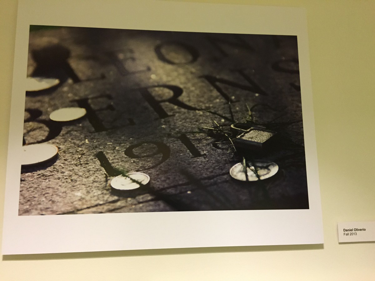
Our first trip was down to lower Manhattan, to a zine exhibit being held at the center for book arts, and to the Rubin Museum. I really enjoyed my time there, so much that I zoned out while I was taking in everything that was there. Many pieces were really captivating to me not only because of their content, but of the diversity that sat in that room. We were given a small “tour” and learned a bit about printing and type, I found that whole process really great, much better and personal than modern print (but i still would choose modern over old fashioned any day!). At the museum, we took a look at the Francesco Clemente installation. It was a collaboration of his works throughout the 80’s up to now, based on his experiences in India. I was drawn to the piece called “Hunger”. It depicted a common man taking a bite out of the serpent eating its own tail, or the Ouroborus. It shows a cycle of life, a rebirth if you will. It meant to me that the beliefs in India were those of reincarnation and man’s “hunger” to pursue that. I wrote a few pages about it in my sketchbook.

Caught my eye.


This work in particular really grabbed my attention at the center for book arts as I browsed through it. The authors remark at the bottom was one that to me signaled a relationship between the reader and author, one of the author being completely comfortable being themselves to the reader. I thought that this level of honesty and lack of censorship is what I’d be comfortable with.

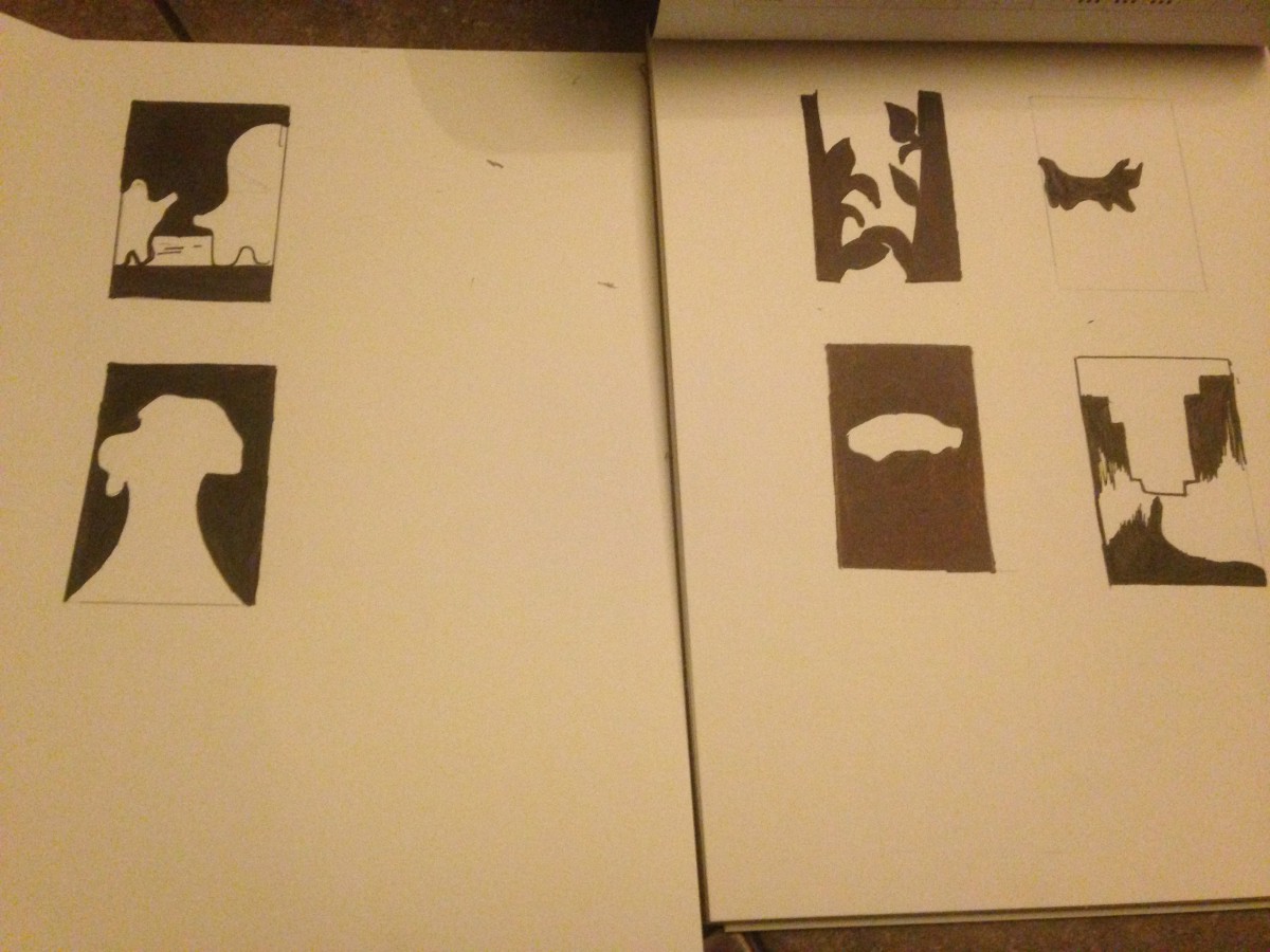
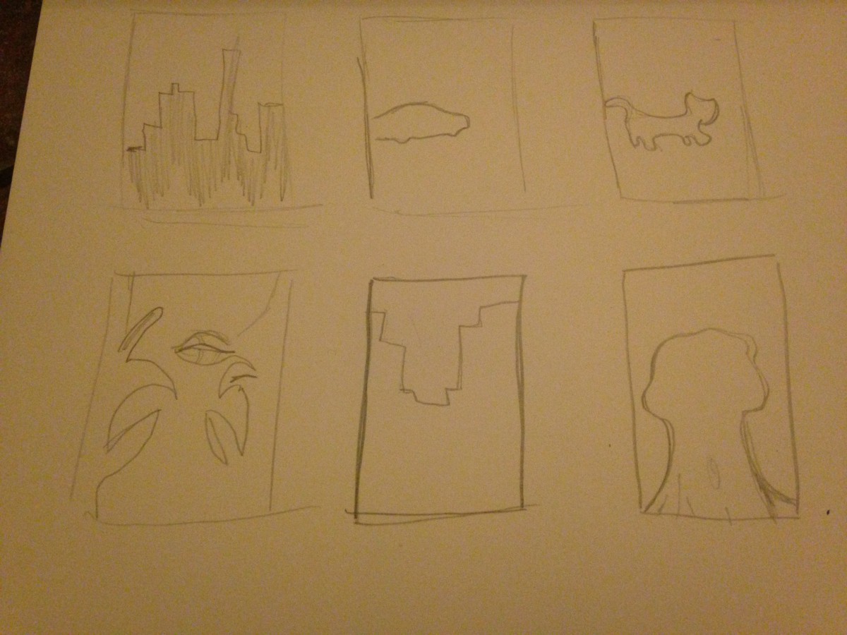
I do hope one for one project we will in turn, create our own zines and mass produce them for our classmates and even the school if we feel like it. I had a good time.