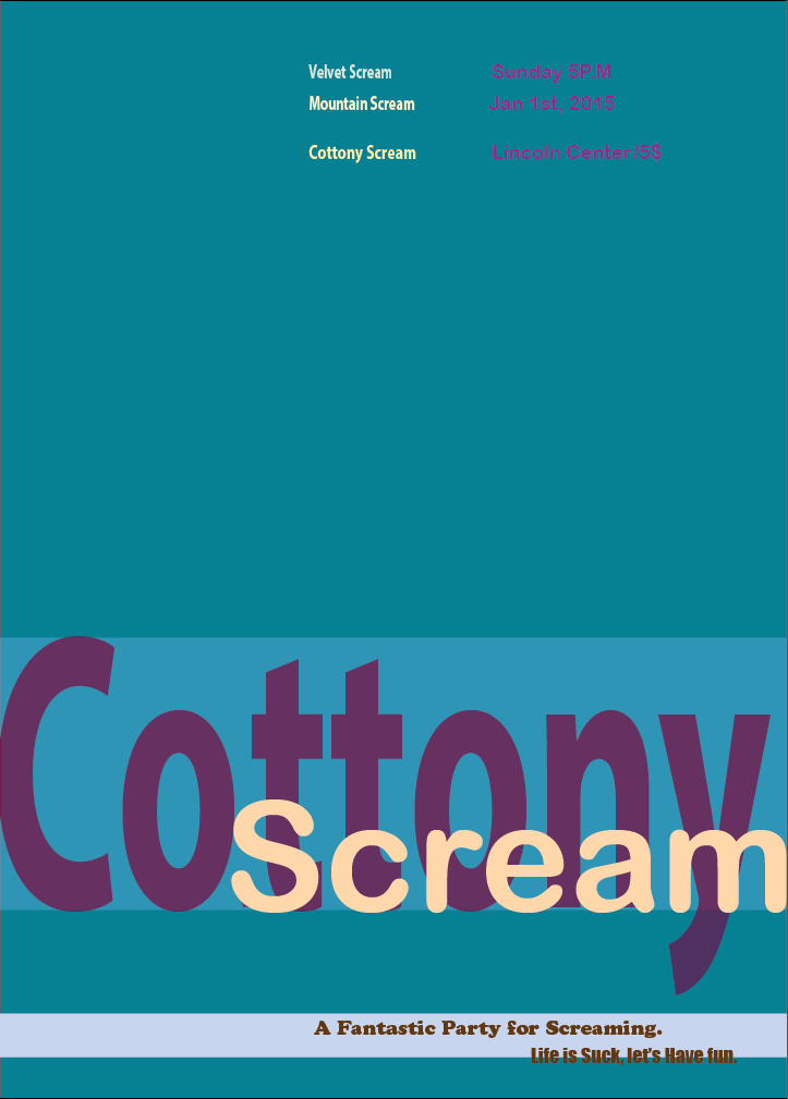
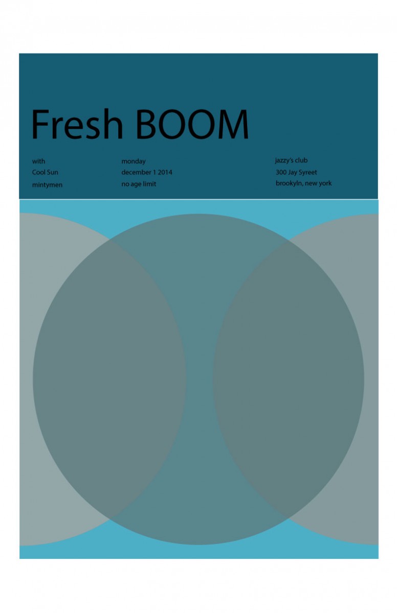
During class to finish & recreate the assigned band poster on Illustrator.
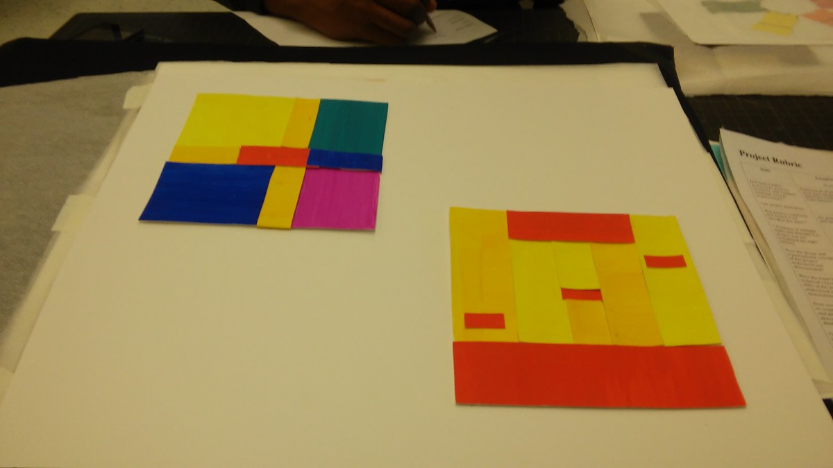
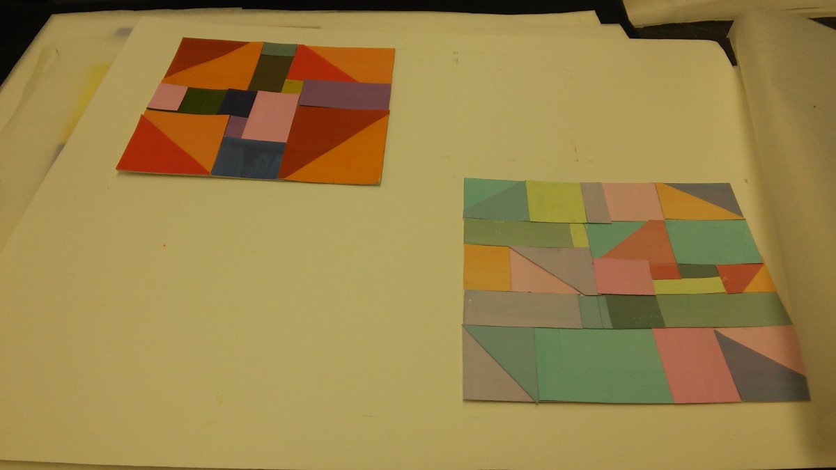
During the start of project #4, we began to work with the use of colors. First, we created a color wheel to visual see the colors and understand more of color. We later had to create a chromatic gray, muted, and prismatic color studies. For each of the following three, we created two collages one narrow and the other broad. Later, we worked with a partner to create a poster and than individual redo the same poster in Adobes Illustrator. In this project, I learned more between chromatic gray, muted and prismatic colors. I got to understand more between the value, towards high and low. I feel like I could do better when it came to the first chromatic gray collages, instead of having dark, unknown color. I have a bright colorful chromatic gray which is the opposite of it. Also, I feel like I could have done better in the crafting is the painting. I’m not use to painting and this is my second time painting for a project. If the project requires to paint I will be more careful however, I feel like this project helped me in learning the color value. This is important if its matter with colors, the range and value changes and can affect the surrounding to make it interested or not.
It took about an 45 mins.
For the Prismatic color, it took about 45mins because the color came directly from the tube.
It took about an hour to make the muted colors.
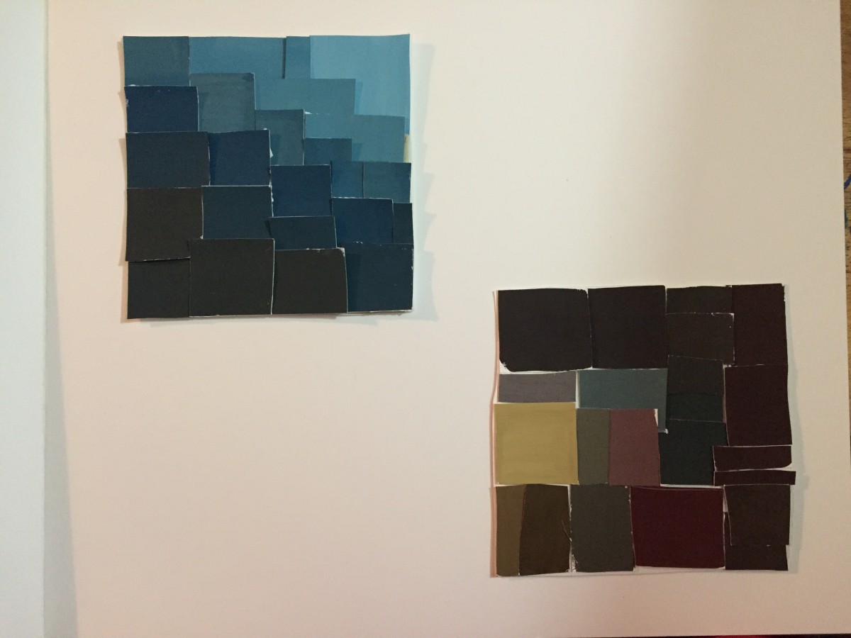
It took about an hour to make the colors. I add white to the color or white itself. I enjoy this part was hard to make. How it took me longer because I was arranging it.
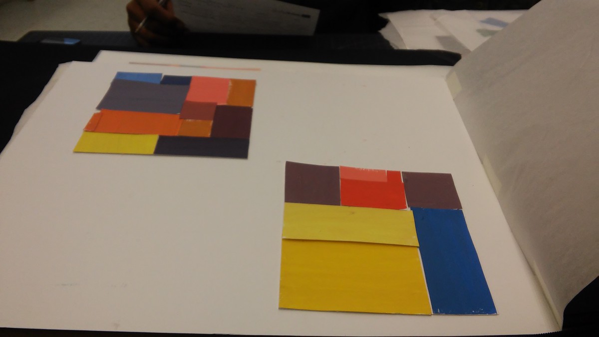
It took about an hour to make
It took about an hour to make however, its not like how a chromatic gray is suppose to look like. I going to redo it cause I understand what’s it suppose to look like.
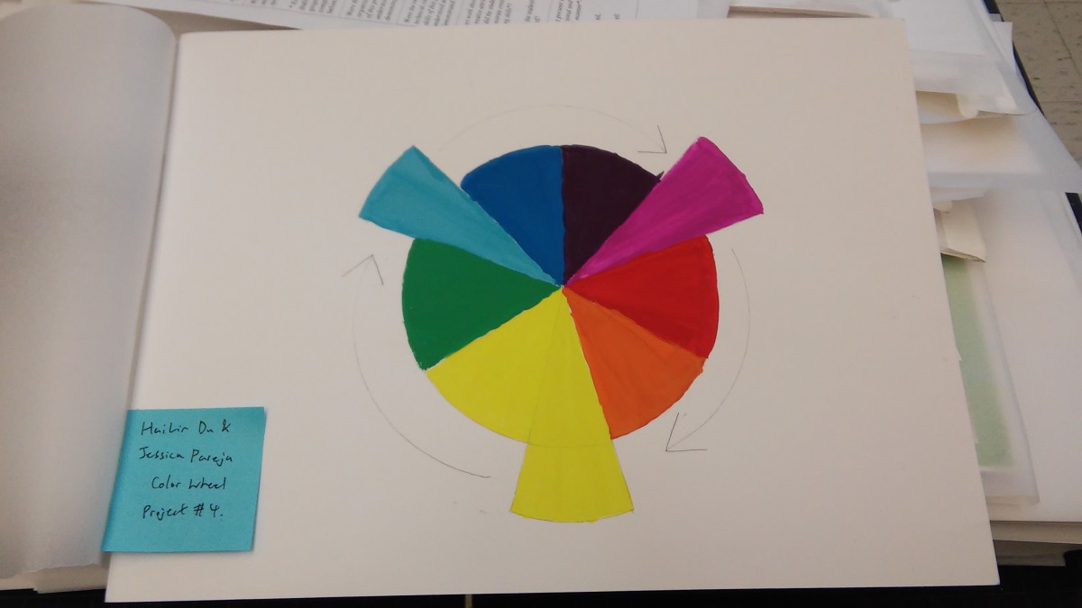
Color wheel:
It was a group project with me and Hai Lin.
Took about two hours to make.
It took about an hour to make however, me and Hai Lin made it together.
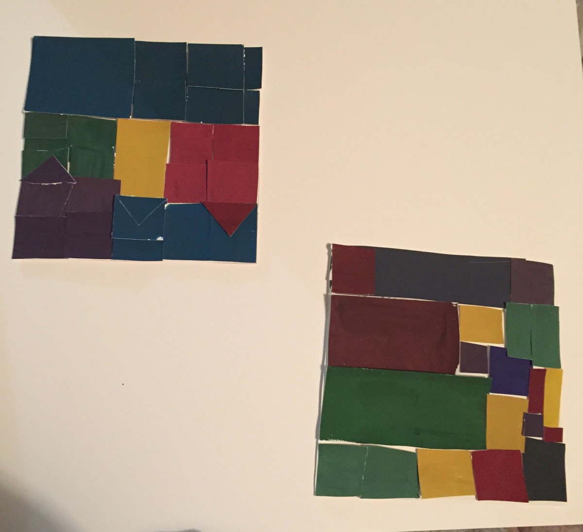
Muted Board & narrow(low key). Took 4hrs over all.
After the attention we paid to subway maps, and all of your focus on color in ADV 1100, how exciting to consider their connection. Read Christine Haughney’s 2011 New York Times article, “Train Line Far From Arrival Has a Color To Be Noticed,” about the color assigned to the still-under-construction Second Avenue Subway Line. What do you think of the choice, and what do you make of others’ reactions to it?
My Board & Narrow(low key) Chromatic Gray Studies
The OpenLab is an open-source, digital platform designed to support teaching and learning at City Tech (New York City College of Technology), and to promote student and faculty engagement in the intellectual and social life of the college community.

