Typography In My Neighbor
 Over all, most of the typography in my neighbor are well-crafted. They use the most attractive words to make sure everyone can see the typography. They are usually digitally produced. This can make sure the words are clear and well-seen.
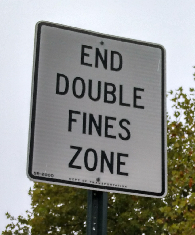
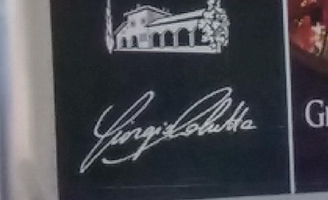 On the other hand, these typography use Gothic and Modern as their sign and advertisement. One of them use script, a typography looks like hand writing; and one of them use Slab serif as the design.
 In my opinion, I think the typography are big and well-crafted.They use Modern as their type design because most of them are advertisement. The typography need to be attractive and make sure their customers can see the typography clear and well-crafted.
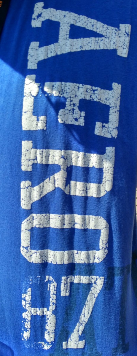
⇐It’s a typography from Jerry’s clothes
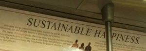
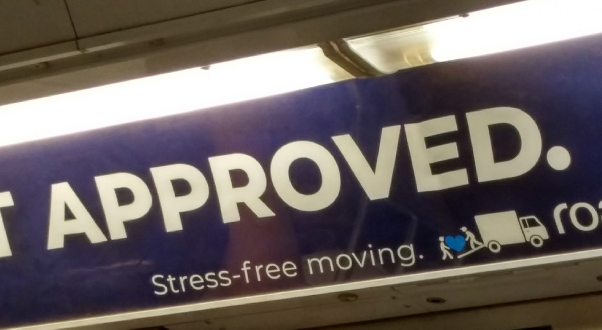
It’s a typography from The School Of Practical Philosohy and Advertised.⇒

