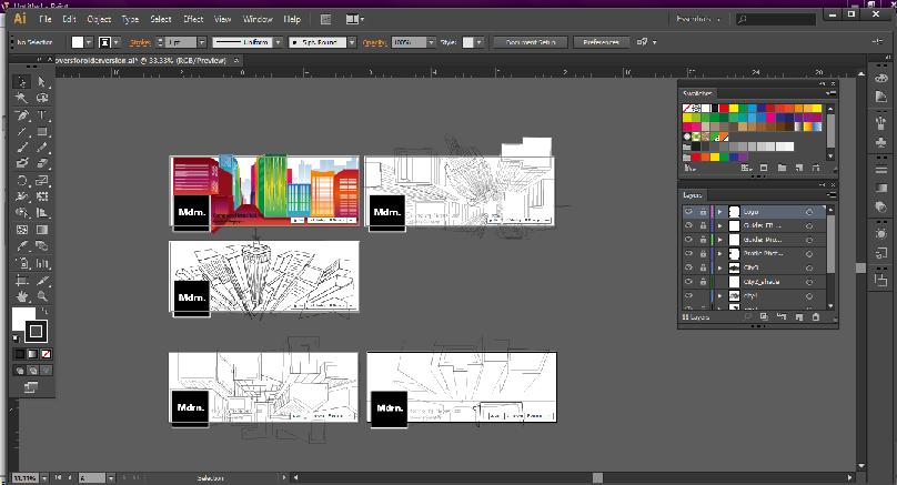
This week, I was given a new project to work on and it is their Facebook cover photo. They want to replace the old one and wanted something in a bird’s eye view, one point perspective. I immediately got artists block and start aimlessly searching on Google for ideas. After an hour, I was able to come up with two different ideas. During creating my first idea, I think I got a bit carried away because the entire thing was just exploding in color and the Mdrn. Brand is black and white, so Mr. Eyal Itzahki did not take to it too well, but the second one I did which was still in outline form, he loved. He wanted to leave it as is and post it up but then Mr. David Mathews disagreed and thought that it needed a little bit of color.
Next thing I knew the entire project was going around the room from agent to agent and a big discussion on color vs. black white erupted. Next thing I knew I was back at the drawing board because in the end they dismissed all of my ideas because it simply just did not fit the brand. They wanted something that looked like a scene from the Upper East Side, bird’s eye view and one point perspective. On top of that I now have a new assignment where I have to create some logos for a special section called Mdrn. Classic. So, while working on that I still need to come up with something for the Facebook cover.


