This solar system was created using Unity. I was able to include the sun, all nine planets, and the moon for Earth. All the planets are rotating on their axes and around the sun. I also changed the lighting, textures, and incorporated the sound to make the solar system look a lot more animated. The most difficult thing about this project was focusing the light and the camera in the right places. It took a while to find the right light setting to show a light and dark side for the planets, and the camera angle still doesn’t look entirely the right way because of how far from the sun some of the planets look. It was difficult to zoom into all the planets at the same time, and for some reason, they still look rather small compared to how much space it actually in the whole window on the final playback.
Group Bumper Project
This bumper was created by my group using After Effects. The theme was time travel, and our plan was to travel back in time to the point where we weren’t living in a world that is no miserable as it is now. We used scenes from a news report, the flying car from Back to the Future, and another scene going way back in time. We added some sound effects to match the scenes and text to pull everything together. If we had the time, we could have found the proper background music to match with the scene and grab the viewer’s attention.
Postcard
This postcard was created using After Effects. It combines a still image, the mountains, with a moving image, the video of the lights, and a graphic element, the text. I used to a mask to cover part of the picture so the video would be visible. I also used key frames to create different effects with the text, like the position of it and the way it fades out of the scene. The most complicated thing about this was getting the mask to cover just the right amount of the image, and timing the video to show up at the ideal parts also. It took a while to make sure the text was working properly, though I could have added some more effects to give it a better quality.
Movie Trailer
This movie trailer was created using Adobe Premiere. I combined movie clips from the movies Need for Speed, Dead Presidents, The Dark Knight, and two videos from Pexels to create an action movie trailer, along with different sound effects to create dramatic effect. This project could have used a lot more work. It would’ve turned out much better if I found a variety of movie scenes to use, instead of just those three. I could have also included scenes that had dialogue to just stray from the constant background music a bit. It was difficult finding the right scenes to show exactly what I wanted, especially because I didn’t have an exact idea of what I wanted the trailer to be about, so the topic was broad to me.
Sound Mashup
This mashup was made in Audition by blending the song Lust for Life by Lana Del Rey and The Weeknd, with Ariana Grande’s song Best Mistake. The mashup also includes a dark piano throughout the track, and a faint thunder and lightning sound effect as well. The most challenging part of this project was changing the levels around to make sure the transition from one song flowed properly to the next. I spent a lot of time working on the levels because I didn’t want one part being much louder than the next, and that’s also why I tried to pick songs that had similar tempos, so it would be easier to blend them together.
Album Cover
For this project, I used different Photoshop tools, such as clipping masks, text, and the gradient tool, to recreate an album cover for the band, the 1975. I tried to create an effect that gave the text a bit of a glow, but it’s somewhat hard to see because of the dark background. It might have looked better if the letters were filled in instead of just being outlined, but that wasn’t working out the way I hoped it would. I think the background image of the colored smoke blended well with the roses, which creates another interesting, eye-catching effect.
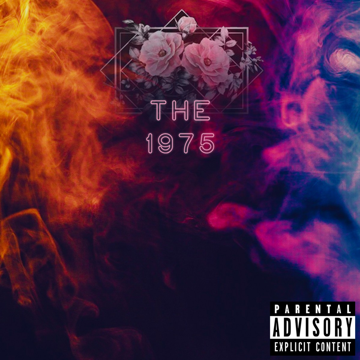
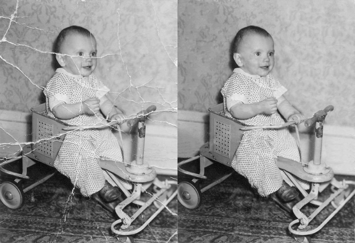
Photo Correction
In this project, I used a few Photoshop tools to correct a damaged image. The old picture was destroyed, and the tools made it look repaired and new again. The best approach to this project, that worked for me at least, was zooming in as close as possible and trying to fix the destroyed areas by matching it with the areas surrounding it. There are some parts where the part I fixed is a lot darker than the area around it, so that is something to be mindful of. For the most part, I used the spot-healing brush and the patch tool a lot to ensure it all had a consistent color.
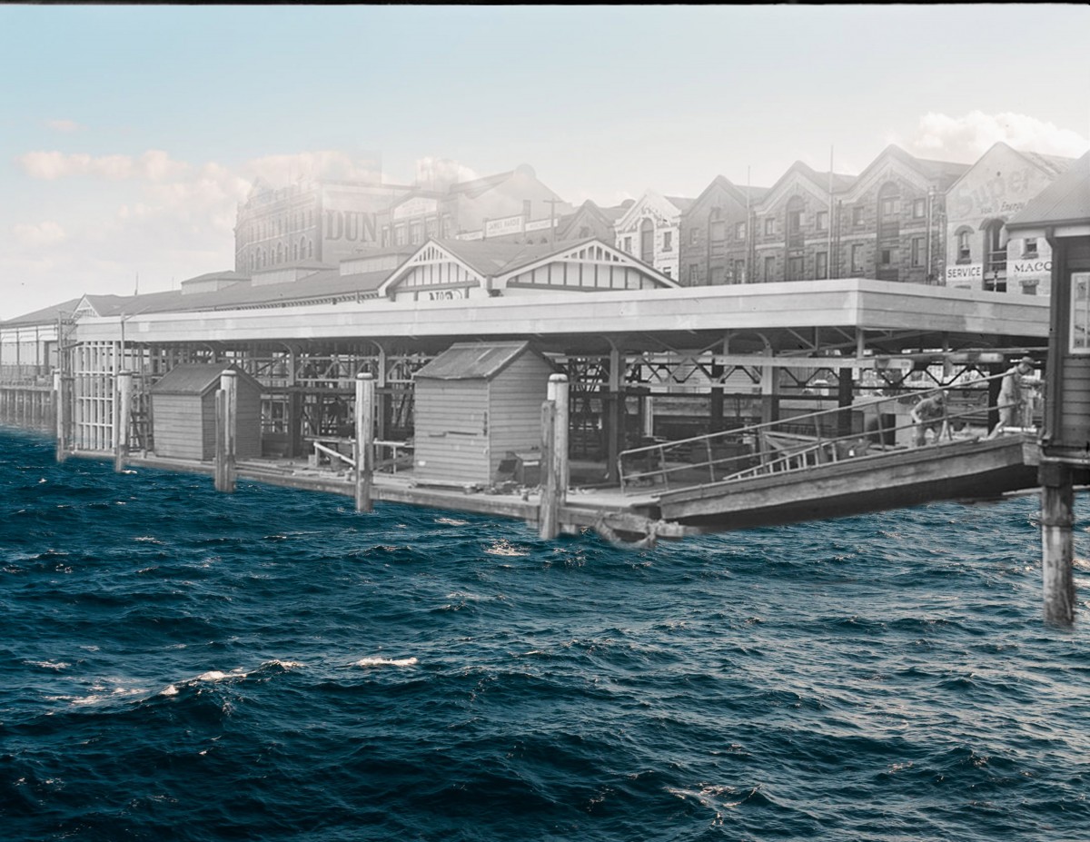
Old and New
This piece consists of two images, one old image in black and white of a dock, and a newer, more high resolution image of the sea in color. I combined the two images to make it look like one. The old image is the black and white part in the middle of the dock along the shore. I tried editing it in a way that would show the sea and make it look like one image, but the edits also make it look harsh. It didn’t actually blend right from the dock to the sea the way I hoped it would, so it is easy to tell where the edit is. I tried to zoom in and use the tools carefully, but it still has a stark contrast. Although, at the top, I did use the gradient tool to blend the skyline from the old image with a clear blue sky, and that did blend well.
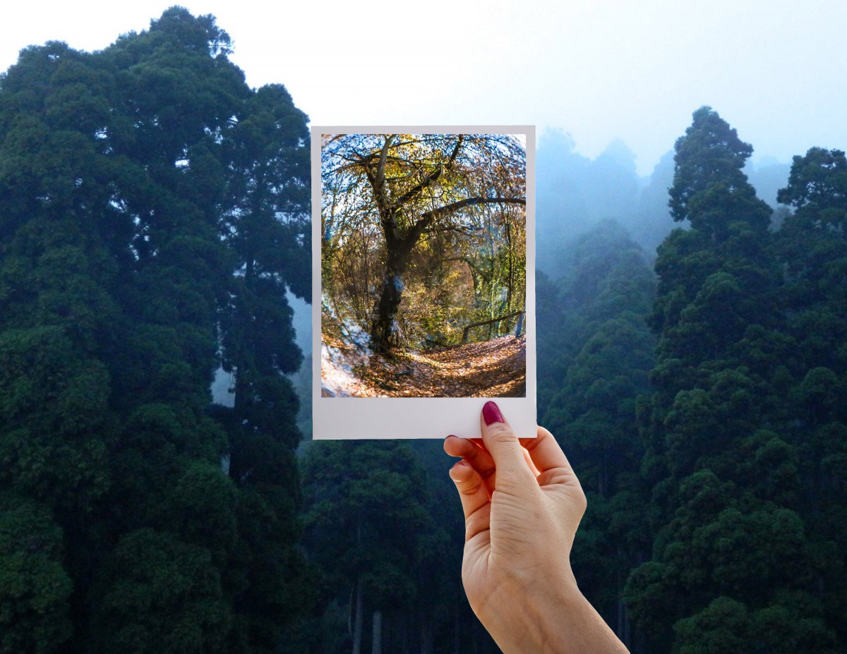
Hyper Realism
In this project, I combined three images to create a surreal scene. The background image is of a forest, and the hand holding a photo frame in the middle is a separate image. The photo frame has another picture of a tree in the woods, which is a more high resolution image with different lighting, as compared to the first image. I liked that the image in the frame showed this unnatural, curved version of the forest. It might have looked better if I figured out how to changes highlights, hues, and contrasts of the images to make them look almost like the same image, and then the part with the frame would be curved. It would have had the same effect and look more put together, while this kind of just look like one picture placed randomly on top of another.
Business Card
For this business card, we used aspects we learned in Illustrator, including using the pen tool to outline uniques shapes, working with different fonts, text, and adding gradients. The most impressive part of this was the way the letters came out, as it is supposed to be a gradient from pink to black, but to me, it actually ended up looking a bit metallic with the almost shiny effect the gradience created. I was trying to outline the lotus flower with the pen tool, and I initially was going to fill it in with different colors, but when I tried to, it kind of ruined the outline, so I just left it as is in order to at least keep the shape.


