
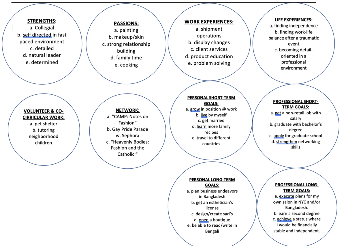
“Attentive & Adjustable” is the brand of Refatara Noor, Refa (ree-fuh) for short. The colors in the logo include white, yellow, and navy blue. Blue signifying strength, reliability and responsibility. White for good and simplicity, and yellow for high-energy, hope, curiosity, and happiness (Chapman, 2010). The logo also includes the simplistic icon of an owl which is representative of the openness for knowledge and wisdom. All the adjectives used above are accurate in relation to Refa’s personality and work ethic. Below is a simple and concise diagram of descriptive bubbles that mirror her character.
MISSION STATEMENT
Refa wants to be an influence that radiates positive energy into her colleagues in the work force. She is able to effortlessly blend into and adjust into whichever kind of environment she is put into. She goes out of her way to make her peers feel comfortable and welcomed. Refa hopes to work her way up to a brand marketing manager or content marketing director of a well-established company. She is known amongst her family, friends, and colleagues for being organized and extremely detail-oriented, which is a great asset to have when tested to stay calm in a stressful environment. Refa’s curiosity to know about the “behind-the-scenes” for everything is also a great asset to have as it shows how willing she is to learn and shows her excitement in learning something new and then implementing it into her behavior at work.


Leave a Reply