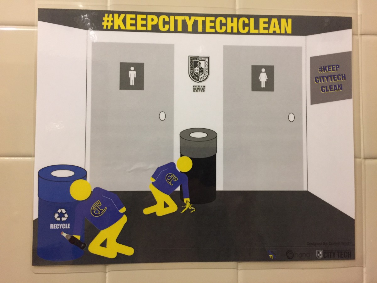
This sign is all over campus. Do you find it easy to “read” its message?

Here is a close up.
I don’t find it easy to read. Instead:
I feel like there are sick people, all over campus, collapsing near garbage bins. They are so weak, they can barely grasp the food they find on the floor. The fact that they have no hands and feet makes it much harder for them to function normally in society.
I am concerned for their wellbeing.
Only after experiencing these many initial “reads” of the sign do I realize that it is meants as a kind of PSA for cleanliness. The bold graphics only serve to confuse my eye.
Am I alone in this interpretation?
“””


I laughed at how truthful this was. It really does look like sick people just dropping in front of garbage cans all around campus. And I think because it has words on it its obvious but when you look at it and don’t read it i think its a poster for people with a disability or something.
This poster is illustrated to spread the message “keep city tech clean,” but the illustration aren’t in proportion. Every time I look at this poster, I can see how the people are being pull by a soda bottle or a banana peal.
I find this so funny because I probably pass by this poster so many times, but I can’t find it in my memories.
At first, I thought this was graphic design, but as a graphic designer, nor communication design major I can analyze how this poster was made and is the worse poster to advertise the message “keep city tech clean.”
I agree with Jasneily in that I understood that the poster was trying to promote a message of keeping the CityTech campus clean and that the figures used in the poster were poorly designed turning the poster into something more comical rather that a serious public service announcement. I always saw the poster and thought “poor design choice”, but I would have never taken the point of you of the figures in the poster being dragged to the ground by the items they’re holding (ha!), that’s an interesting point of view. I kind of though the figures looked like that had a serious case of sciatica.
Stick figures in a work of graphic design? I’m weak