Field Trip Report: A Tour of the United Federation of Teachers Printing Shop

On April 15, 2019, Our Digital Media Foundations class had planned a trip to the United Federation of Teachers (UFT) Print Shop Located near Wall Street in downtown Manhattan. The United Federation of Teachers is a labor union representing a majority of the supportive staff working in NYC public schools including over 75,000 teachers, 19,000 classroom paraprofessionals, and also counting a plethora of more school secretaries, attendance teachers, guidance counselors, psychologists, social workers, adult education teachers, administrative law judges, nurses, laboratory technicians, speech therapists, and 64,000 retired members. Our class was specifically taken to tour their printing facility that takes the organizations printing jobs as well as outsourced ones. To imagine the magnitude and scale of the work done in a print facility for mass production, getting a close-up look into the different stations and machines used was a real appreciative opportunity to consider the world of print more seriously. 

epson

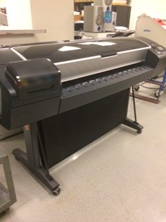
The “Epson Stylus Pro 9800 Extra Wide Printer 44″ brings forth a challenging standard to the world of artistic / photographic large format prints with the highest quality of detail and finishing. Enabled by its specialized inks UltraChrome K3 and Epson Micro Piezo™ advanced specific printhead helps produce these finishings on poster sized documents. 

letter 

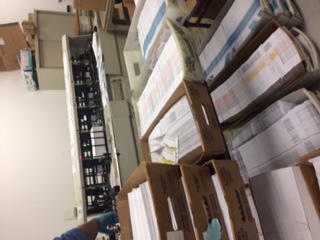
One of the major pieces of equipment seen was one that prepared several prepackaged mail into envelopes at once. It had the ability to fold paper into envelopes and seal them in on one continuous factory stream. 

yeet

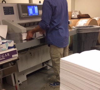
This heavy duty guillotine cuts several dense stacks of paper with pressured perfection. All of its coordinated measurements are recorded into the computer and all the worker has to do is arrange them onto the cutting board slots. Although the machine has the power to cut ones hand effortlessly, there are highly sensitive sensors in place that prevents any major accidents from happening – thus fully stopping production if anything is blocking the way.

The whole trip has made the class collectively appreciate the opportunity to look through a really close lens how much work goes behind the pieces we used to take for granted, and quite possibly even consider printing as a career choice.

Logo/ Banner: An Inquiry

banner My logo is my last name inspired by my stylized recognizable form of handwriting. As a brand my personal identity reflects my youth and playful approach to subjects with the balance of maturity by making the design as clean as recognizable as possible. I’ve taken into example the stylization of major companies such as the Walt Disney Company and Coca-Cola to develop my sense of identity without needing to stray from what makes me, me. Identity being the main focal point of my personal project of my career, my banner pieces together the collective identities that make up the diverse face of humanity. On a closer introspective one may realize that this portrait is not quite discernible if it’s male or female, and for good reason. I wanted to grasp the diversity at its core, one that can be all or none at once to open doors for the work i create and the goals I set. With the use of muted colors I give the impression of my modest approach to my work and the professionalism it deserves despite my overactive and bubbly mind.

PSA Poster: Gender is Limitless


As someone that identifies outside the gender binary, I believe that everyone deserves a space to be able to express themselves freely as their own identity. In efforts to raise awareness to the diverse spectrum of people in our communities, I hope this helps reduce intolerance and fear over the stigmatized aspects of both gender, sexuality and everything in-between.

poster

Inspirational Quote Index Cards

I have a magnet with this quote that I pass by every day on the refrigerator and more often than not, It continues to drive me throughout the day. I take Theodore Roosevelt’s words seriously in a literal context, especially when carrying on my projects to both challenges myself and to keep me from being discouraged by anything that may cross my road.

An index card sample
Font: Bauhaus 93, regular
Point Size: 60pt.
Tracking: 30pt.

I had used a photo I’ve taken of myself working on a painting and complimented the red brush strokes of the piece I had worked on. Using a bold, large san serif typeface, I was able to balance the photo itself against the heavy contrast of color.  

An index card sample
Font: Agency FB, regular
Point Size: 53pt.
Tracking: 10pt
Skew: 22°
Horizontal Scale: 108%

The second option of this quote is placed in the background of discarded flowers to suggest the idea of personal striving through turbulent times. Weeds are considered to be one of the hardiest plants to grow and when balancing the light blues and the rest of the darkened window. I decided to use a thinner italicized typeface to compliment the photographs delicacy all while trying to keep the assertion and seriousness the words Roosevelt meant to deliver.

I decided to add opaque boxes to balance the placement of lettering between the dark explicit contrast of negative space.

An index card sample
Font: Bernard MT Condensed, regular
Point Size: 53pt
Tracking: 10pt
Skew: 22°
Horizontal Scale: 108%

Keeping in mind the addition of a yellow opaque box for the last edit, I wanted to compliment the typeface on fitting as if it were on a billboard towards new horizons since the given text implies towards the ever needed perseverance.