The evolution of McDonalds logo
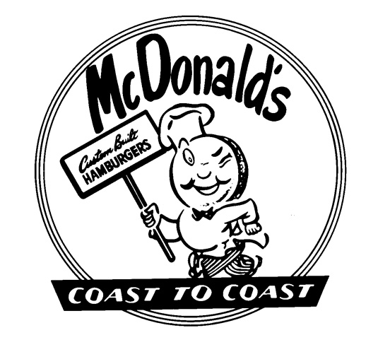
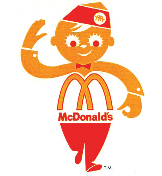
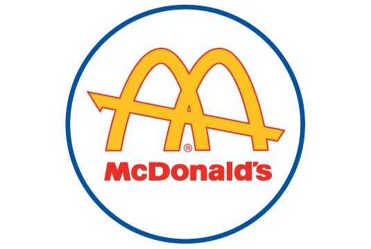
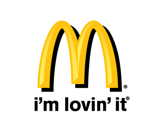
McDonald, the most famous and biggest fast food chain restaurant in the world. It has more than twenty-three thousand fast food chain restaurants in over hundred countries around the world. In other words, it has a huge marketing potential. The McDonald’s logo is the one of the most famous logo in the world, we can see that on everywhere in the modern society, that shows the McDonald logo is the one of the well-known logo in the society. The letter “golden M” is the best symbol for the fast food restaurant McDonald, combines the traditional red with the background color has been becomes the world’s most famous brand attributes. So why the designer would use the “golden M” to represent fast food restaurant? In fact, the original design concept of the logo doesn’t really means to use the letter M as a symbol of McDonald. This logo is design at 1962 by Stanley Meston. The original design concept of the “golden M” is from a stylized sketch two golden arches combine together to makes it looks like the letter “M”, and this idea is also comes from a person names Richard. The golden arches as a symbol of to manage a goldmine. However, it also means to brings “merriment and delicious” to the customers and brings them into this “merriment golden arches”. So why does the designer use the red color background to cooperate with the golden arches? The answer is right up in here, from the research shows that if a logo using yellow color to cooperate with a red color background will makes customers be agitated. Plus the hard seats make the customers won’t want to stay in the restaurant and seize the seats to slow down the other customers. Fulfill the purpose of a “Fast food restaurant”. In this case, it seems to be good to the both sides, moreover this can be more benefit for the McDonald company uses a short time to makes more money. The first McDonald was opened in 1940 in San Bernardino, California. During that time, McDonald was only serving barbecue alongside its burgers, fries and drinks weren’t show up on it menu yet. In 1948, McDonald was modify its menu and service system and named “Speedee Service System”. This is the first step that its enter the fast food career. In 1952, the golden arches was come out, and it rename “McDonald”. During 2003, the most successful advertising and slogan were appear. Soon, the famous slogan “ I’m lovin it” quickly spread to the whole world, that’s the reason why we can still see that slogan till now.
Resources: http://www.creativebloq.com/logo-design/mcdonalds-logo-short-11135325