Space and Color
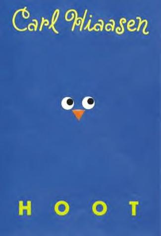
This image shows space because the title is separated from the author. This makes it easier for the reader to distinguish the two. There is also a little owl face in the middle of the book, which helps give the reader a sense of what the book will be about. Having the white space on the cover, makes the viewer focus more on the title, author, and image. There is not much on the cover which makes it easier for the reader to remember the names. Having the book one color is eye catching. Having the text yellow makes it readable.
-
Recent Posts
Recent Comments
Archives
Categories
Meta

