
Sailing Through Design
The “Sailing Through Design” exhibit at the American Institute of Graphic Arts (AIGA) displayed a diverse collection of pieces by Manuel Estrada. The exhibition focused on Estrada’s logo designs, as well as his book, magazine, and poster designs. In addition to his actual designs, the exhibit invited us into to Estrada’s mind, also displaying the inspiration behind some of his work. Upon entering the exhibit you could feel the “balance between text and image, thought and emotion.” that Estrada incorporated in his designs. (AIGA) Some of the pieces that caught my attention were “La Paz Perpetua”, “Nu Bes”, in addition to the hanging pieces, and floor quote.
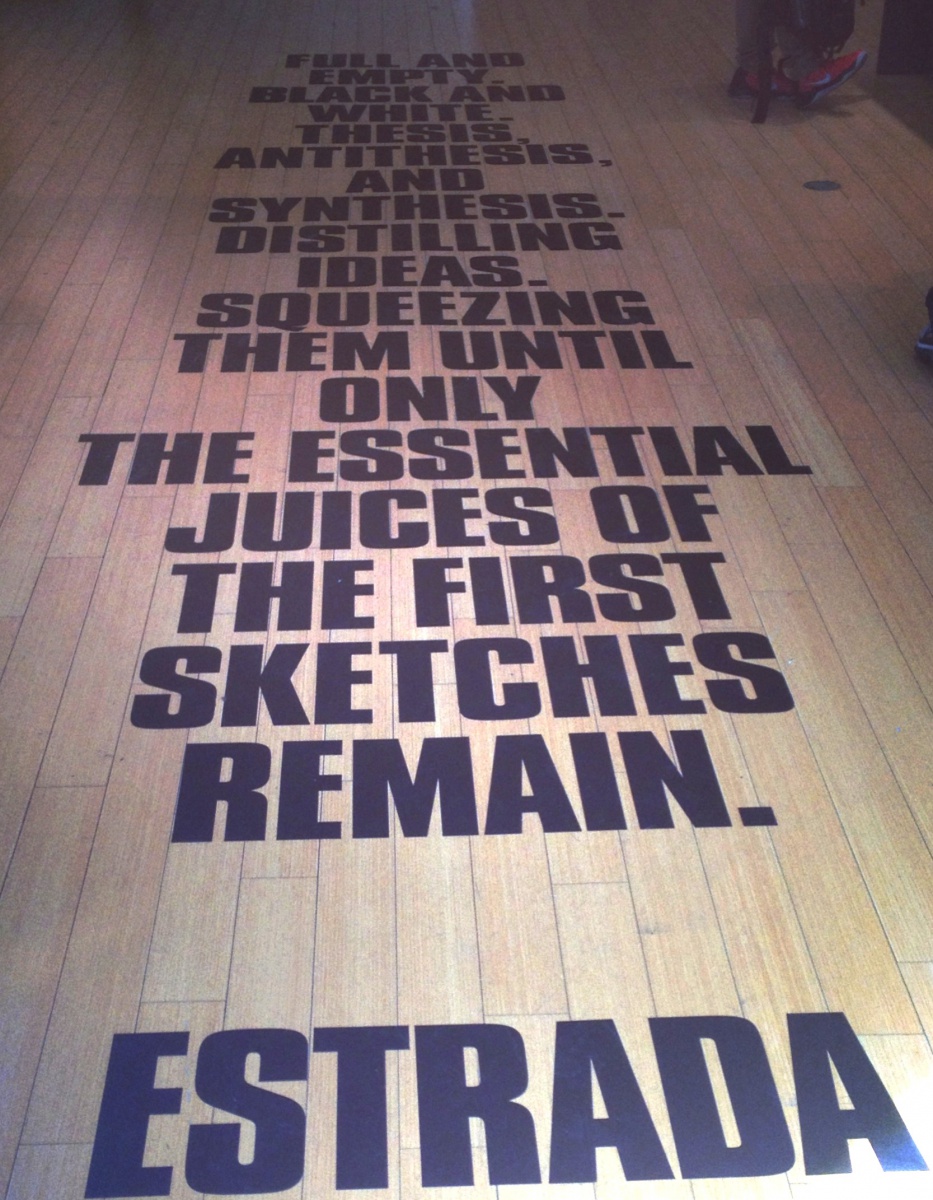
The exhibit’s layout design displayed the balance Estrada incorporated in his work. In the center of “Sailing Through Design” was a
quote that read
“ Full and empty.
Black and white.
Thesis, antithesis, and synthesis. Distilling ideas. Squeezing them until only the essential juices
of the first sketches remain.”
-Estrada
For me, this quote captured the thought
process of the designer. Being the first thing I
noticed in the exhibit, this quote rendered in
my mind during my entire experience there.
It foreshadowed Estrada’s working process,
which was also on display for us to see. The
thick black capital letters capture your
attention as soon as you enter. Although text
in all capital letters tent to be hard to read, it
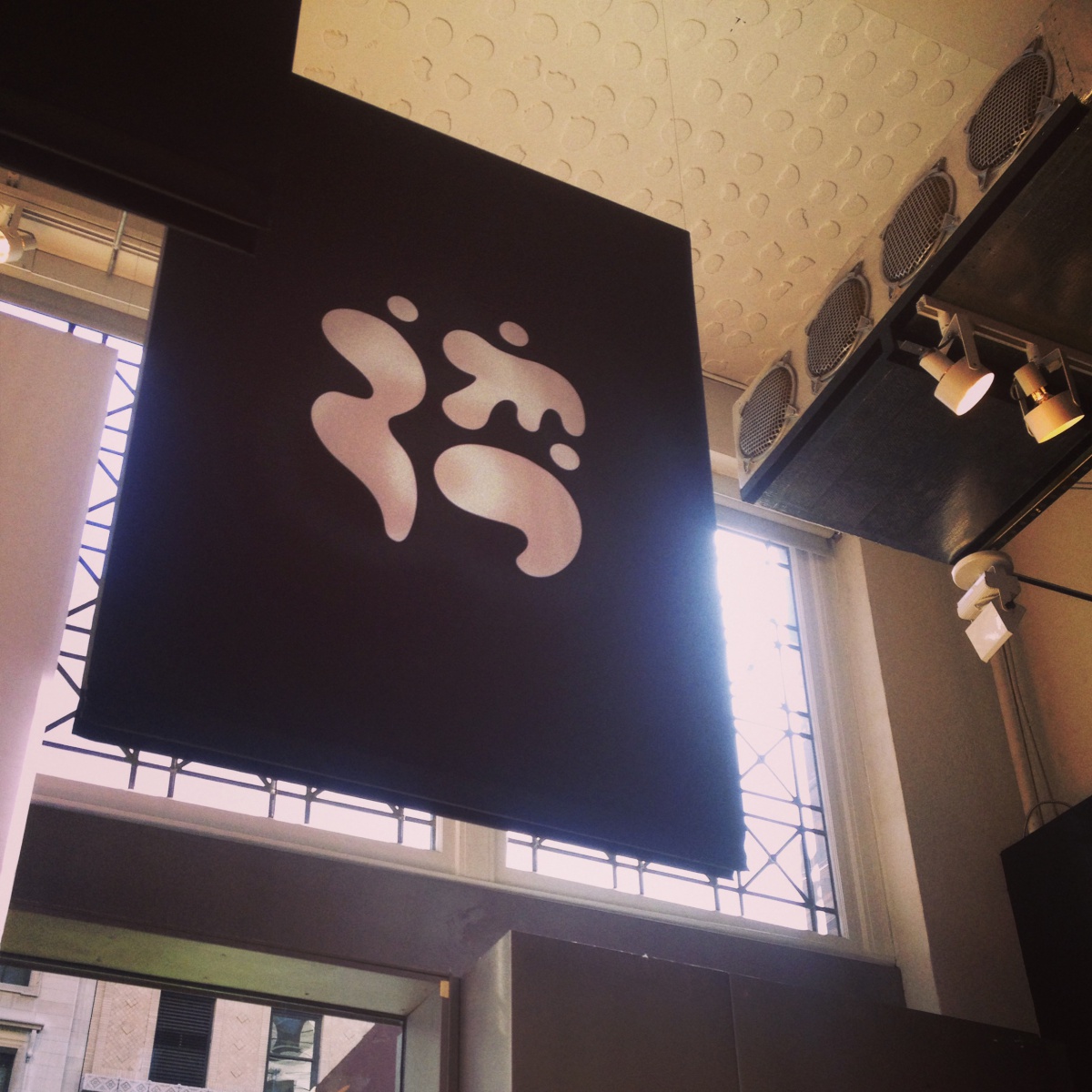
was very useful as a floor piece in the exhibit allowing the words to jump at you as caps often do. In addition to the quote, which served as part of the layout design, the hanging symbols also stood out to me. Located above the quote, were black and white banners with Estrada’s symbol designs on them. The symbols hung from an industrial style ceiling, and added to the minimalism of the exhibit. The huge banners served as the “sail” in the “Sailing Through Design” exhibit.
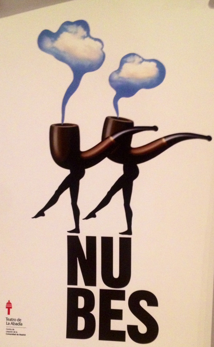
Furthermore, another piece that stood out to me was a poster called “Nu Bes”. Estrada used graphic design media to illustrate this poster, which depicts two smoking pipes with female legs. The image is very playful, yet sophisticated. The actual cloud image in the smoke puffs adds a sense of realism to a fictional concept. The use of color transitions from light to
dark as you pan the image. The illustration is centered on the page with the smoking pipe’s legs resting slightly above the type. The typography used on this poster was a heavy weight Sans Serif font that is aligned with the legs of the smoking pipe. The dimensions of this poster are 11×14.
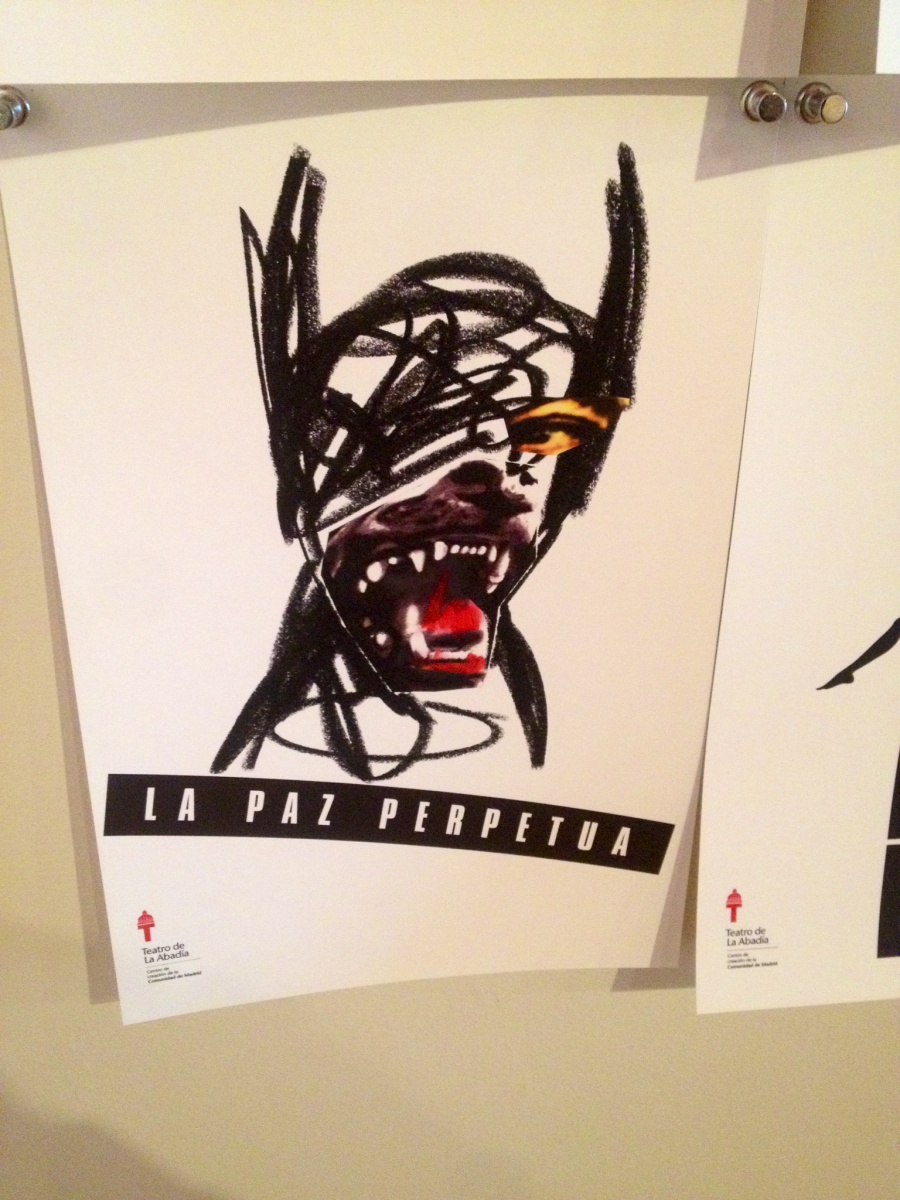
Another piece that caught my eye was “La Paz Perpetua”. The image reminded me of the Givenchy 2011 Fall/Winter collection which was focused around the image of a ferocious Rottweiler growling. Moreover, this poster was illustrated using mixed media. The potential materials used by Estrada are charcoal, and magazine cutouts. The image of the beastlike dog combines artistic expression, with realistic features of a dog and
man. The color in this image comes from the magazine cutouts allowing them to stand out above Estrada’s dark charcoal work.
The positioning of the beast is portrait style with a Knockout Sans Serif typography spanning diagonally below the illustration. The dimensions of this poster are 11×14.
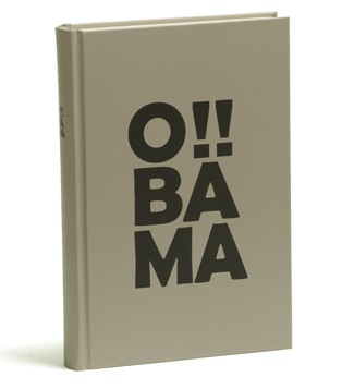
In addition to the two posters mentioned above, I also liked Estrada’s cover for Barack Obama’s autobiography. The cover is very simple, only including Sans Serif typography. This gift edition of the book uses three lines of type on the cover to spell out “Obama” The typography has a very thick weight to compliment the width of the 300-page
book. The text is aligned in the center with two characters on each row, with the exception of the top row, which features two exclamation points alongside the “O”. The dimensions of this book were bigger than the other books on display. The dimensions of this book are about 1.2 x 4 x 7.
In closing, the “Sailing Through Design” exhibit allowed us, as visitors into Manuel Estrada’s thought process behind his designs. The pieces mentioned above really caught my attention because they were allowed to stand out due to the simplistic, minimal design concept of the layout. I enjoyed the “Sailing Through Design” exhibit at the American Institute of graphic Arts (AIGA) and learned a little bit on how focus my thoughts while designing.

