Author Archives: Nicole Harripersad

UFT Field Trip

On November 29th, I went on a class trip to the United Federations of Teachers (UFT) Printing Area. I have never been to a print area before in my life, even though I always print out brochures from my job with just an industrial printer. In this place, they had more than just industrial printers. The machines I saw over there were very cool. I witnessed a stamp machine where the machine stamps on the uft logo on envelopes just so it can be shipped out. I also witness a machine that opens up envelopes and slips in a piece of paper inside the envelope, that saves so much manual labor and time for people where they slip in the paper by hand. And my favorite machine that I saw over there was the machine that prints on t-shirts and clothing. Seeing that up close makes me want to print some of my designs o a T-Shirt and sell them. I really had a great time at the UFT Printshop, and it makes me want to print out a lot of cool things whether its paper, clothing, or objects. And I hope as a future graphic design teacher I get to work with different types of printing.

Logo Research Report

Logo Research Report


Logo I have chosen: Shell Gas Logo

Shell today is known as an oil and gas organization, it was initially back in the 1891it was an exchanging company that worked in conveying old oriental ocean shells to western countries. The founder of Shell was Marcus Samuel. In 1833, retailer Marcus Samuel chose to extend his London business. He sold collectibles, yet now included oriental shells. He expected to benefit from a form for utilizing them in inside outline. Such was the request that Samuel rapidly started bringing in shells from the Far East, establishing the frameworks for an import-send out a business that would, in the end, wind up plainly one of the world’s driving vitality organizations.

Marcus ran a successful import-export business, M. Samuel & Co trading with the coalition in the Far East, which Marcus carried on with his brother, Samuel Samuel. It during a trip to Japan that Marcus ended up plainly inspired by the oil sending out business situated in Baku, Azerbaijan, which was a piece of Russia around then. Transporting still represented an issue as the oil was conveyed in barrels, which could spill and consumed up too much. After nine years Marcus Samuel, the originator of the organization, made a decision that he requires a logo for his company.

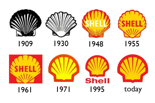
Since first appearing in the early 1900s, the Shell logo has moved from a realistic pecten or scallop shell to today’s simplified shape with distinctive colors. Like many first drafts, the 1900 logo was poorly designed. It was a dull, lacked quality and was just a plain black and white version of a mussel shell. The mussel shell is not an attractive shape, and the angle at which it was pictured was not amazing. Today designers acknowledge three-dimensional designs are a hit.

The logo was turned from dull to remarkable. We still worship the same scallop shell, shot from above. The 1971 logo, which is still used today, was designed by the French-born Raymond Loewy, who also created logos gas companies such as BP and Exxon. All things considered, be that as it may, the constrained shading palette and the unforgiving dark foundation influenced it to appear to be poor. For color, Red and yellow were picked as the essential hues since Shell and its logo from the early 1930’s.

    California and the organization were quick to push their connections with Spain to the Hispanic population. The fantasy of planning a logo which goes on for a long time is something we would all be able to desire. The lesson in the lifespan of the 1971 rendition is clear: fresh, moderate plan that will dependably be mainstream. No matter what, the Shell Company, along with the shell logo will always be and have a simple design that will always be popular.

My Personal Logo Banner_Nicole Harripersad

In my Logo banner, I designed a Logo with a P and D. My last name is “Harripersad” so I decided to shorten my last name a little to Persauda. And the D stands for Design. So together its “Persauda Design”. In the banner, I also added a few art supplies to show my love and passion for art, because I want to be a teacher, to teach art and design. And I added a few anime characters from my favorite anime TV shows. Future Diary, Kill La Kill, Noragami, and K-On. I added these characters because I love anime, and I hope to create my own anime characters in the future to sell.

Personal Poster_Nicole Harripersad


I did an extra illustration for a previous class. This was one of the sketches I mad and filled in. Its basically Kim Jon Un depicted as a monster, and the poster I placed him in is called “KIM JON UN, A Monster Amongst North Korea.” I chose North Korea and Him as a major topic because the major events that are happening at North Korea such as Missile Launches, a death of a U.S Citizen and putting him in a coma, and public executions to other North Korean citizens. The citizens in North Korea fear him and so do other countries due to his harsh treatments and cruelties to prisoners and other people in Korea.  That’s why I did this drawing of him, to show who Kim Jon Un really is. A Monster

Visual Enhanced Quotes Digitial Media Foundations

For my quote I chose 

“Our sweetest songs are those that tell of saddest thought.Percy Bysshe Shelley” I chose this quote because I believe it is linked within anxiety and depression. I have had anxiety ever since I started high school in 2012. It’s painful and it sucks but I try to work it out each and everyday. I researched  anxiety art and I found a few pieces that touched my heart.

1. 

For the first piece it shows a girl but she seems to be stressed out or troubled by something. I chose this and added the quote to it because it definitely shows a strong perception of anxiety and what 1 point of view of anxiety and how it looks. Anxiety can hurt people and it looks like the girl is in pain too. The font I used for this quote was apple chancery. I thought it fit well with the picture because of its subtle font.

2. 

Another piece Is with a girl covering her face. But, what makes this look unique and strange is that she is slowly starting to break apart and that’s true. Anxiety can break a person down bit by bit, and in this art piece it looks like she is starting to crumble and cry because she can’t take on the pain any longer. I feel really strong about this piece because I find this true. When anxiety is eating you alive, it feels like your heart is on fire, and your stomach is slowly turning cold and empty, and soon you start to break apart. The font I used for this quote was Arial Italic. I used a simple font for this quote because I wanted the picture to stand out instead of the font itself.

3. 

The last piece shows a man, and his hands covering his face, but the hands are almost see through making the face to be easily seen. I find this very interesting and very unique because A person can cover their face to hide away their looks, but they can’t hide away their pain and emotions from others either.  And the font I used was Georgia because I believe a serif font would fit perfectly in the picture

Digital Media Foundation Bio

Hello. My name is Nicole Harripersad and I am an artist and a student attending the New York City College of Technology to earn my Associates degree in Communication Design, and then earn my Bachelors in CTE Teaching to become a Graphic Design Teacher. I hope to work with other advertisement companies in the future and work with other graphic designers as well. I learned about art software’s when I was just 12 years old and became very interested in it in Middle School. Soon I was addicted to Adobe Illustrator, Photoshop, and InDesign. I became interested in the Communication Design major because of my addiction with anime, and manga style art that I fell in love with when I was just 5 years old.  I hope I get to enhance my natural illustration skills more, and learn new software’s in my major

Daily Travel_Grids

I found this in school. It was sit straight like the columns used in my calender template

I saw this in school. And I liked how the certain boxes were placed

I’ve seen hierarchy grids around, they looked like nested organized schedules. And I saw this in school and I really like how it’s simple and boldo.o