Car manufacturers have had many different logos throughout time. Almost all of them had changed their logos to show change into their companies. But to me there was always one that stood out to me and I loved. That was “Audi”. Audi went through many changes until they got to a design they stuck with for many years to come. Those four united rings have a deeper meaning than you think.
https://www.auto55.be/multimedia/photos/417465/25767-audi?id=124068
https://www.audi.com/en/company/history/history-of-the-logo.html#:~:text=That’s%20when%2C%20in%201932%2C%20the,four%20interlocking%20rings%20were%20born. Where most of the information is coming from including the Images as well.
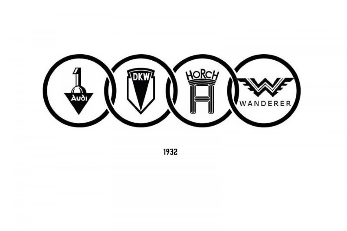
Firstly the story begins with audi. Just them as a major car company with a logo that is nowhere near as refined and elegant as the four united rings are. Audi’s first logo was something simple, but odd looking too. This design stood from 1910-1932. Sometime in 1932 was when it was time for a change. That’s when Audi merged with three other companies DKW, Horch and Wanderer. To become the auto union AG, which became Audi AG. So with this big change the company eventually needed a new logo. Which became the four united rings. Which turns out to represent the four companies merging into one. This logo shows that together as one big merged company. They would make some vast improvements to automobiles. That would change everything into our future. Audi for sure makes some of the high end and presentable cars in the world. And now more than ever are some of the finest cars in the market.
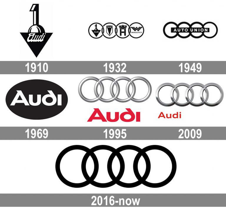
Audi over the years is one of the most recognizable vehicles to date, but that’s because of the famous logo they have and the many designers they had for those logos. Audi always wanted to make sure that the four rings were the most concentrated characteristic. Since the four companies merged to make Audi. I said designers that worked on this logo and the many evolutions of this logo throughout the birth of Audi. The designers wanted a challenge, but also something completely simple. That even kids could look at this logo and draw this without any challenges. Eventually in 2016 they made a trend towards simplifying their logo again. Around that time they changed their logo from being three-dimensional rings to becoming two-dimensional. So it could look good not only on paper, but on online services as well.


Here is a video explaining even more details on the logo and its history. https://www.youtube.com/watch?v=GSuZEb8MMXo
Audi really had lots of innovations through their logo design and when August Horch made the first ever logo for Audi it was the start of something big. August Horch was the original creator of the Audi logo and the person who of course founded the company in the first place. August was a german engineer and automobile pioneer that played a big part in the decision of Audi’s characteristics of their automobiles. Mainly August wanted drivers in these cars to feel driver friendly and enhance these important factors. August made this logo, this company, this lifestyle that Audi is known for and Audi till this day is growing, innovating and changing in ways that I know August Horch would be proud of. Till this day August is known to be one of the most respected men in the Automobile world.


Images from: https://www.hemmings.com/stories/article/august-horch
Information from: https://www.automotivehalloffame.org/honoree/august-horch/