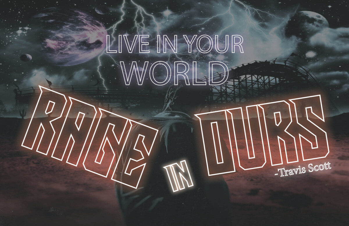
Here’s my first quote just needed upload here so it could be put with the refinements I did on the other two visual quotes that I have done. This one needed no change, but I did explain what I wanted to go for in my last visual quote revised post. I will just give a little summary about this visual quote. I wanted to make it feel like it’s hot or with a “Rage” feel which I wanted to achieve and I think its close to that for sure matching the gradient with these warm colors as best as I can.
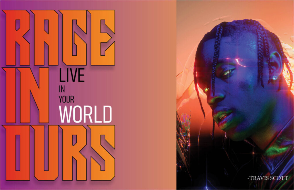
So for this one I really was just playing with the type size and adjusting it so it could fit better and not get cut off the postcard when printed. The top few words where it says ” Live in your” is all adjusted smaller including the “in” which works better lowercase or just smaller in general. The last thing I did was change the color of world to more of a cyan blue color that matches more of the image in the word “Rage.” The font to me works so I did not want to switch it in my opinion.
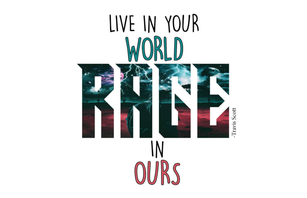
For the last one I needed to adjust the background because from the feedback I got from my class discussion of the visual quotes they though the background was a bit to flashy and I agreed. So what I did in Indesign to make it less flashy was tint it a little and bring the opacity of that tint on the image to about 53% so you could still see the image, but now its not distracting to the eye when mixed with the quote which is all glowing like lights. I just though trying to use photoshop for this was not needed at least for this simple fix.