For my logo research project, I chose the company ABC or the American Broadcasting Company. ABC originally began as an NBC radio network. Launched in the November 1926, the NBC Radio network was owned by media titan RCA. Nearly a year later, RCA split the programming into Red and Blue divisions. Although there were two networks under the same name, each had its own respective formats. The Red Network (WEAF) consisted of popular programming with commercial budget sponsors and more prominent affiliate stations. The Blue Network (WJZ) consisted of low power stations with cheaper advertising rates for sponsors. Much of the content was unsponsored and contained educational programming and news broadcasts. The station often tried out pilot programming which would transition to the Red Network if it was a success.
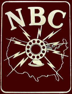
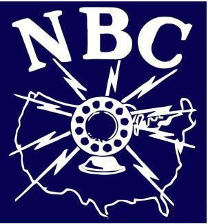
RCA began to acquire more affiliates throughout the country, including starting an Orange Network on the west coast, which eventually was absorbed into RED. The FCC began to investigate media conglomerates and their business practices. Many of the larger networks including CBS and were being accused of monopolizing programming and advertising. It was alleged that the more powerful affiliates were affecting the free market and making it harder for smaller stations to compete. In 1941, the FCC ruled that networks were not allowed to control more than one radio network simultaneously. RCA was forced to either divest from one of the networks and spun the Blue Network off into its own subsidiary in 1943 after being sold to Edward Noble for 8 million dollars. Eventually the Blue Network became the American Broadcasting Network (ABC) in 1946.

Throughout the years, the ABC logo has evolved from its early days as a radio network During the radio broadcast era, the original logo for The Blue Network the original logo featured the network name with “the” and “network” in all caps an italicized transitional serif type and all caps. The word “blue” was in a script similar to the “Edwardian” or “Palace” typefaces. Beneath was the full company name “The American Broadcasting Company, Inc” in the same type and style as the non-script text above it. When the name switched, the “Blue Network” was dropped, and the new logo featured the full name in an old-style type. Each word was centered and had its own line. A variation of the logo was used in a station ident. The text was white with the black shadow behind it against a gradient filled outline of the United States.
With the advent of television, ABC transitioned into a television network. Another early version of the logo featured a television screen with horizontal scan lines and a radio microphone with the letter ABC in a traditional typeface. This might have been done so viewers could make the connection that the former radio station had transitioned to the television. The microphone sits between the letter’s “TV” in a sans-serif font and a thick stroke. The logo is black and white. In the early 50’s a new logo used the letters ABC centered in a round mirror or reflective looking shield with stars its border. Behind the “shield” sits an eagle with open wings holding a lightning bolt in its beak. Shadowing and detail was added to the wings and crest. The late 50’s logo featured the network name as an abbreviation in lower case letters. The text was black in a san serif type and had a slight tail and appear horizontally skewed. Around the abbreviation was centered within the counter of a large lower-case “a” in the correct aspect. Although color television had been in development since the late twenties, the technology evolved, and patents were obtained in the 40s. Color broadcast and television were becoming more accessible to the public.
Renowned graphic designer Paul Rand was recruited to redesign the logo to its current and best-known design. Born as Peretz Rosenbaum in 1914 in Brooklyn, Rand was known for his minimal but bold modernist style with his most notable corporate identity include IBM, UPS, Westinghouse, Enron and more. After a collaboration with NEXT Computers, he was hailed by Steve Jobs as “the greatest living graphic designer.” Rand believed design process is about finding the visual problem and solving it. He once told Jobs during a consultation meeting, “I will solve your problem and you will pay me.”
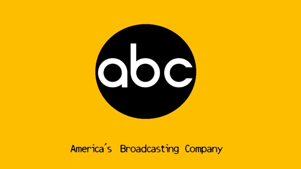
Rand’s new design featured the abbreviation “ABC” in a white rounded sans serif resembling a Bauhaus typeface against a black circle. As color television and animation evolved, variations of the logo appeared in different station idents in different colors. One iteration of the logo had each of the letters in the colors in red, blue and green, respectively. Throughout the 70’s and 80s the advent of CGI graphics, the logo was animated with many iterations and colors. In 1988, the logo received a refresh making the lines of the letters slightly thinner and remained largely unchanged for nearly two decades. In the mid 90’s, ABC was purchased by the Walt Disney Company and started incorporating Disney produced programs into its lineup. Disney Movies would also be featured during a block called “The Wonderful World of Disney.”
In the late nineties to the early 2000’s, the Emmy award-winning title design firm Pittard-Sullivan based in Culver City, CA was tasked to handle the bulk of the design for the marketing for Americas (#1) Broadcasting Company. The most notable being the black and yellow (and other colors) pop-inspired idents featuring black and white stills during primetime. Redesigns after 2007 updated the logo and gave it a glossy 3-dimensional effect with embossed letters like that of a polished button. Other variances that included toned down glossy “button” featuring blue and gold gradients were seen after 2013.
Some brand assets are available from the ABC All Access website. It is a membership only website that allows downloads for limited marketing materials, logos and show assets. There is a set of viewability guidelines specifically for corporate advertisers and 3rd party streaming services in a PDF format. The site also provides programming insights, market lists, sales guidelines, affiliate maps, and special-order forms. A commercial sales contact page contains contacts for media operations and other policy manuals.
In over 80 years, ABC has evolved from a radio station spin off to providing over 300 TV stations original and syndicated programming and is home to the renowned morning talk show, Good Morning America. ABC has a viewership of nearly 10 million in 2021, provides and maintains standalone video-on-demand services. ABC also supplies programming to streaming services including the partially Disney owned streaming service HULU. With all the original content produced, ABC owns several studios in New York City and Los Angeles.