Visually Enhanced Quote Project

For my three concepts of my chosen quote “Adventure Is out There!”, I mostly focused on a very literal idea of adventure:

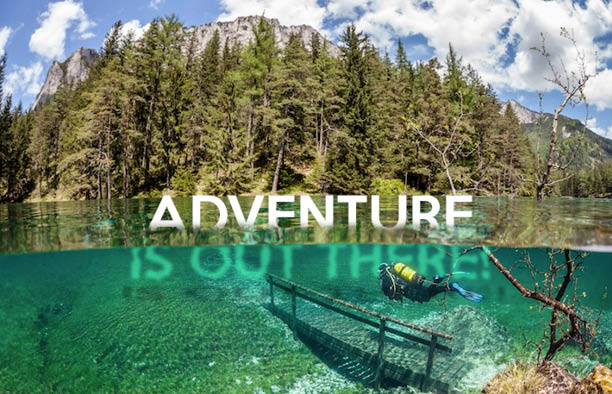
In my first and photographic concept, I have intentionally chosen a photo of some body of water in which you can see both above and below the surface. Since “adventure” can be broken down to numerous different meanings, I went down the water “route” and further empathized the quote with my type treatment.  | pdf file

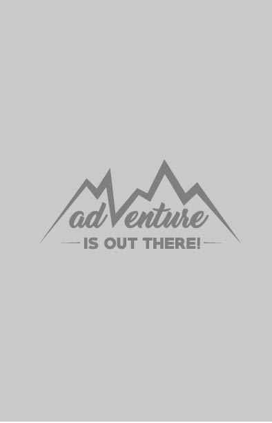
Because I imagine a more outdoor setting when I think of adventure, I chose mountains in this concept. I wanted to have the type to also visually depict the quote so I had a part of the mountains act as a letter “v”. | pdf file

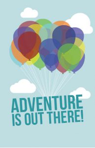
The quote being from the movie Up, I wanted at least one of my concepts to resemble where it came from. Given that balloons play a huge role in the movie, it was a must to incorporate it. But instead of the balloons being tied to a house, I had them connect to the type/quote. | pdf file


UCLA Extension Posters

2016 Winter Keith Knueven

2015 Spring Willem Henri Lucas

I found these two posters for UCLA Extension the most appealing, especially the Spring 2015 poster by Willem Henri Lucas. What really worked/s for me is the photograph of rubberbands in the background to empathize “extension”  in addition to its repetition and bright, contrasted colors. I also found the type treatment where “UCLA Extension” is stretched out and aligned with the photograph to be clever in keeping the theme consistent.

The Met

Before reading this article, I did not think that a change in logo would or could cause an uproar. Of course, logos are a company’s identity, but when The Met changed theirs, others did not exactly criticize the design of it/ Instead, they were just not in favor of the act of changing it. Some felt that their logo should stay as it was since it is a museum after all so it would only make sense to keep it “historic”. I did not think it mattered too much. nut I now know how much it could for your business to represent themselves.

What I Learned This Semester

This class was definitely a challenge for me. However, I can say that I learned a lot such as the importance of craftsmanship, design elements and principles, etc. which were all new to me. Unfortunately, my craftsmanship still isn’t the best but taking this course did help me with precision. For instance, I became more comfortable using the exacto knife as it got easier to use since the beginning while learning other small techniques through trial and error including using a separate sheet of paper to prevent fingerprints. In addition, I feel that I have been able to spot various design elements and principles everywhere and anywhere outside of class, taking note on what works and what doesn’t especially when improving and applying them to my own “work”. Overall, I have learned a whole new understanding of design this semester.

Cooper Hewitt Exhibition

On the upcoming trip to the Cooper Hewitt Design Museum, I am most excited about the Pixar: The Design of Story exhibition where it showcases the making of the movies I’ve grown up with from Finding Nemo to The Incredibles to Wall-E. The exhibition features the development of not only my favorite characters hand-drawn, painted and even sculptured, but also scenes and minor characters from a number of their popular films. Being surrounded by Pixar’s work will, without a doubt, make me nostalgic.

character-design 181026_a36bcbbd76996b87_b

Project 3 Reflection

IMG_2446IMG_2450IMG_2448IMG_2449IMG_2447
Project 3 helped me understand and play around with layering, transparency and mostly value. As this project gave me the opportunity to attempt perfecting the right grayscale color progression with the paint and magazine, I feel that I am able to easily tell whether there is either an adequate or too much of a “jump” from one color to the next. My project was not entirely successful with this, but I was able to see the mistake after it was assembled and placed next to each other. With the marker texture, I’ve also learned that value, not only works with color but works with any texture there is.

OpenLab Workshop

From attending this workshop, I learned how to use WordPress more efficiently and improve how my ePortfolio is being presented. More specifically, we looked at both good and bad examples of an ePortfolio, learned about plugins, which I never really bothered to notice and we also did an exercise, giving me some idea on what else to add to my portfolio as it is not the most appealing or interesting at the moment. Overall, the workshop has helped me become more comfortable using ePortfolios, which I will use to my advantage, knowing that I’ll be using it for future classes.

3 Companies I’d Be Interested in Working for Are…

1) BuzzFeed (Site/YouTube channels)
I chose BuzzFeed because of how much I enjoy their content on a daily basis, especially their YouTube videos. I am really fond of their editing as well as camera work (for example, this video in accompany with this video) therefore, I would love to be part of their video production.
2) Google
Even though Google is one of the biggest companies out there, making it almost beyond reach to work there, it is no doubt that it would be an amazing opportunity. The openings in their Creative Lab caught my attention, and I definitely would not mind being a part of it.
3) The Representation Project
The Representation Project would probably call themselves more of a movement than they would a company, but I am drawn to what they do as it is something I find very important generally and very important to me. They use the media, especially film, to challenge gender roles and norms as a social construct, bringing them into question. I am/would be interested in using design in any way possible to promote and spread awareness and/or even be a part of their film production.

Project 1 Reflection

IMG_2025IMG_2026IMG_2027IMG_2029IMG_2031
Our first project helped me further understand the use of frames. Seeing that frames serve as a separator, isolating the design from its surroundings, the 4×4 cut outs separated one composition from the other, making any viewer focus on one at a time. In addition, the frames covers the rest of the design that lies behind it. Thus, frames can also help with setting apart a fraction of a design or picture from the rest of it. In short, I have learned that frames are mainly used to call attention.