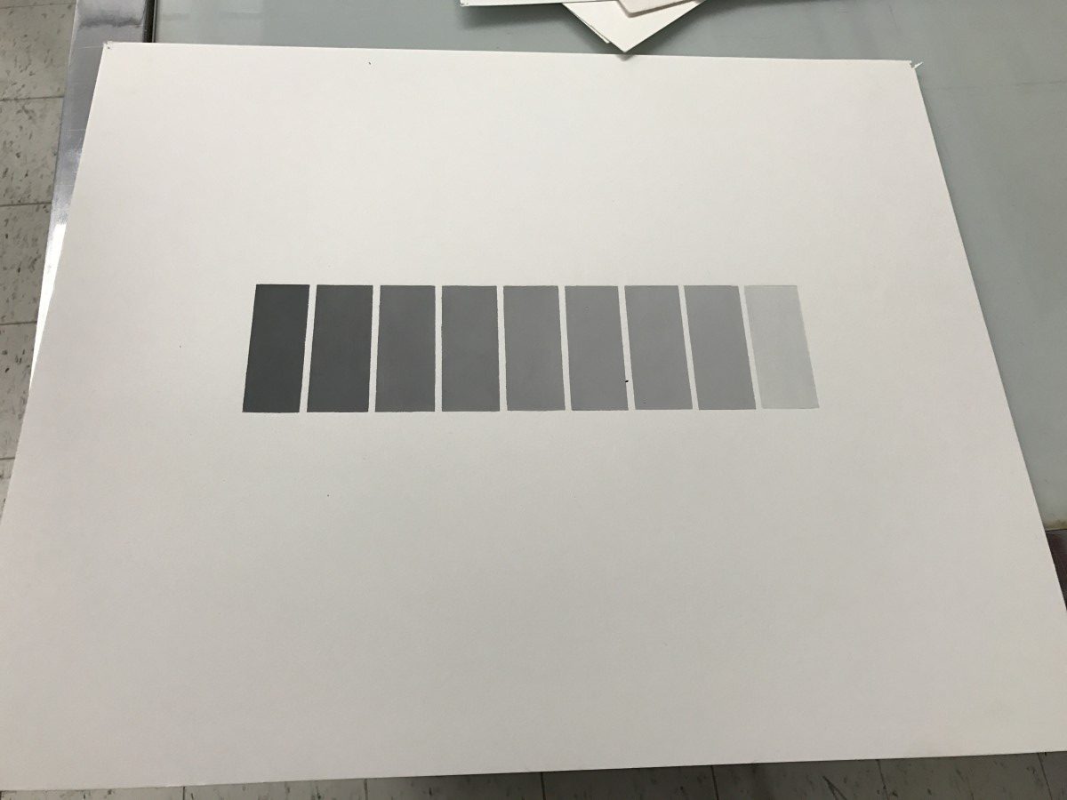

Coming into Graphic Design Principles I did not know what to expect, but I was open to new techniques and ideas. The first few projects were intended to teach us how to control space using various black shapes. This was more difficult than expected because we had to figure out how much space was the right amount for a shape. The high contrast between the shapes and page made weaknesses easier to see, so a shape had to sit perfectly on the page. This exercise taught me more than how to control negative space, it taught us that perfection comes through trial and error and that you don’t know what works until you try it. We were also introduced to the group critique, at this moment I knew that this was the class I had hoped for. It was a class that taught the art of design and not just software. The group critiques were interesting because everyone displayed their projects in one place for comparison. We have learned a lot about design so far. On day one we saw the world through the eyes of a consumer, and the designer. The group discussions inspired me. Seeing the theory of design shown through real world examples was a great way to learn what worked. While working on the projects that we were assigned we learned that balance is key and less is more. These concepts are important to me because they can be applied to many aspects of design, anything from typography to images needs balance. After learning these concepts, I see them applied in all forms of media.
This class has inspired me to dive deeper into my interest in fashion. Clothing is just another medium that I can use to show my vision. I use the concepts I’ve learned so far to design my clothing. Although clothing is three dimensional controlling space and perspective are key factors in the design process. Clothing has to appeal to a person just as much as the ad it is in. While designing the challenge is to create an aesthetic piece that is still different yet wearable and functional. Because I understand what the consumer wants, I can now create it. Because of this, I have already seen improvement in my designs. I am eager to learn more so that I can become the best designer I can be.

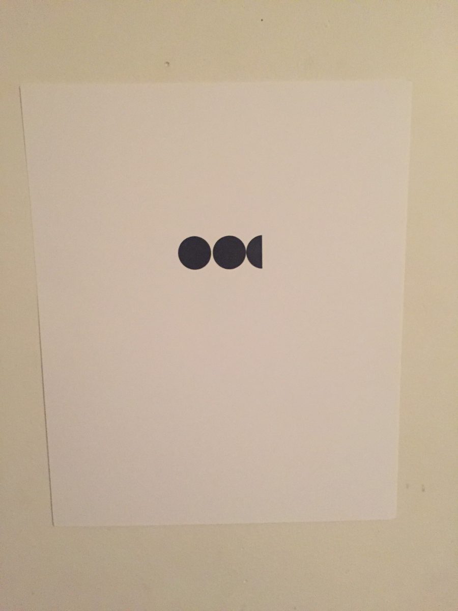
I chose this quote because I believe in being life long learning. The image behind it represents the drawing that kids would make on a chalk board. i paired these two together to show that creativity and learning often go together.
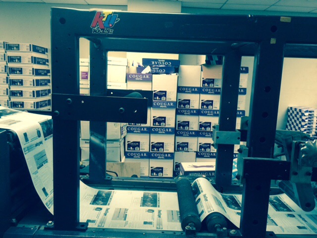
The field trip to the UTF print shop at 52 Broadway was very insightful. It allowed us to see the inner workings of a print shop that prints on a massive scale. The shop had printers for every job. They were capable of printing large objects like banners and high volume objects such as mailers and newsletters. Since the print shop has been around for a long time they had some old-fashion printers and some of the latest technology. The old fashion printer was similar to what you would see a newspaper printed on. It uses huge drums of paper and still had to be worked by hand by a man walking up and down on fatigue mats. We also got to see one of the more modern printers at work. It was this large scale printer with a external control panel and it was printing their latest mailer. It is capable of printing the thousands of copies that needed to be mailed. After that we were shown the area where it was less about printing and more about packaging. I learned that there is a machine that is capable of stapling papers together in a variety of ways. After papers are printed and stapled they have to be put into envelopes and mailed out. Were also able to see this process. This machine was all about gears and timing, it opens, fills, and seals only using and series of mechanical parts. The head of the print shop also showed us one of the newest printers he said it was the only one on the east coast. Things such as print quality and worker safety have improved greatly. Seeing all the printers in one place allowed us to see the gradual change in print technology. 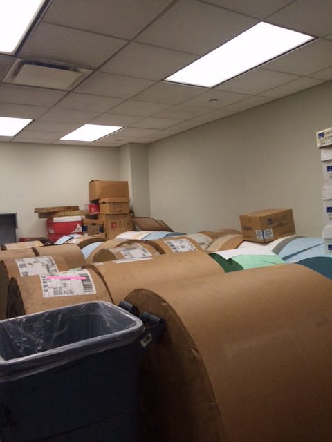
The name Bayerische Motoren Werke was first registered in 1917 creating what we now know as BMW. The logo was based on the Rapp Motorwerke logo which was the company that became BMW. The logo had a similar black ring but used the colors on the Bavarian Free State flag inside and gold for the type and outlines. BMW even placed their letters the same way as Rapp Motorwerke did in their logo. BMW decided to design the logo around the former company to stay connected, because BMW assumed all business responsibility from Rapp Motors.
Other than the influence from the former company the BMW logo had no other inspiration, despite the myth that its was inspired by airplane propellers. This myth was created in 1929 when a BMW magazine showed airplane propellers creating the BMW logo. This was just ad campaign and had nothing to do with the creation of the logo. Since then the logo has undergone many changes. The first major changes were made in the 1950s, this was the first time that BMW used white and silver lettering and outlines. Unlike other variations of the logo, these models of the logo were very successful. BMW used the two logos in everything from ad campaigns to their motorcycles.
Since then the logo has changed very little. In 1979 BMW used a san serif font in the logo instead of the original serif. This was most likely done to keep up with new styles of marketing in the 70s and 80s. The current BMW logo was created in 1997 and it give the old logo a 3D effect. This is the logo that car enthusiast of today know and love, the BMW logo is one of the top 10 most recognizable car brands.
The colors of the BMW logo may have something to do with it’s popularity even though it was not intended. When seen in a logo the color blue symbolizes trust and loyalty. These two things are needed in a car brand because customers need to trust that the brand is dependable. The color black signifies elegance and power. The BMW logo is a symbol of status because it is a well known luxury car brand. The color white in the logo shows simplicity and purity. Even though it was not intentionally designed that way the color white sums up the logo. The BMW logo works because it is simple and true to its heritage.![]()