
Transparency
I overlapped lighter colors with darker colors while tweaking the opacity on the different shapes I also created a gradation of the colors from dark to light. Furthermore i discovered by using complimentary colors it creates a vivid, more captivating feeling. I wanted to create something to draw the eye, something fun, and playful.
Value and Texture Collage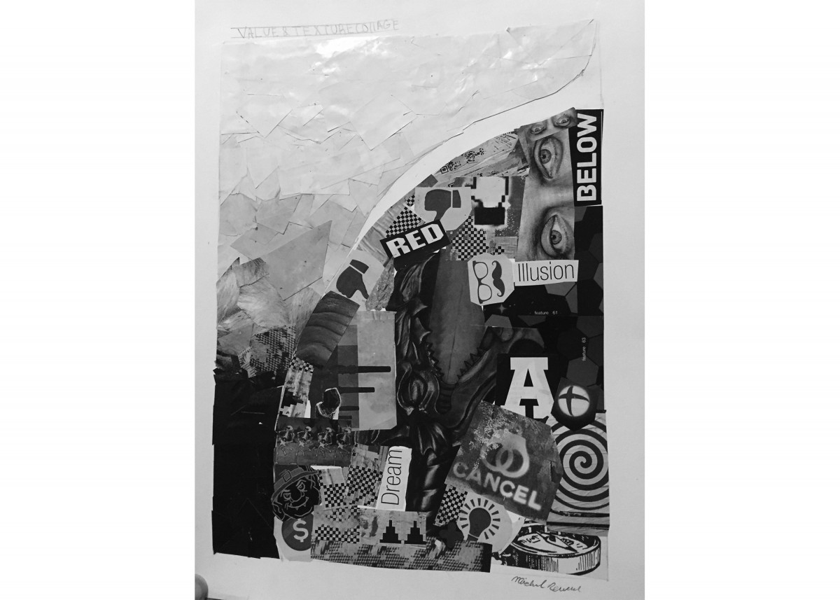
Using Value and Texture i created a dark to light gradation. The left side represented value, the light to dark gradation i created almost creates a falling out of the sky feeling. While the right side represented texture, I wanted to create an intricate design of different visuals clashing together.
3D Elements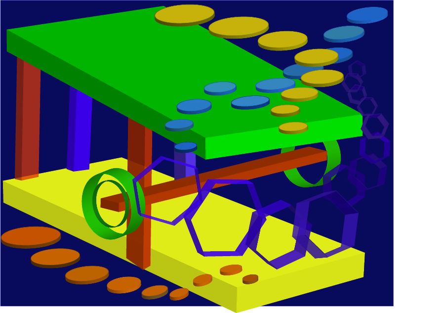
I used a recurring theme of repetition to create a 3D feeling. I also applied transparency, and dark against light colors to slightly alter the shade of the color scheme. I wanted to incorporate space, low vs high chroma, warm vs cool along with many other visual elements

