Monthly Archives: November 2018

Selfiemotion – Phase 5 Delivery

By the end of the project, I feel that this project was the most difficult out of all other projects. I think it was difficult because, it was hard trying to achieve all three elements of the project, into one image. I could achieve 2 of the elements but always be missing one, or not expressing it to my full extent. Overall this was a bit fun, because I tried expressing happiness, by looking like a clown, since clowns can bring happiness, and it was fun trying to use non-expressive things as facial expressions.

Selfiemotion-Phase 5-Deliver

The mode I have chosen is “Happy”. I thought this was a nice way to understand and to observe the kind of expressions our faces show and what features shows that kind of expression. I learned that the expressions you think may show what you have in mind but others would see something different. I would have chosen another mood if I could have done this differently

Selfiemotion-Phase 5-Deliver

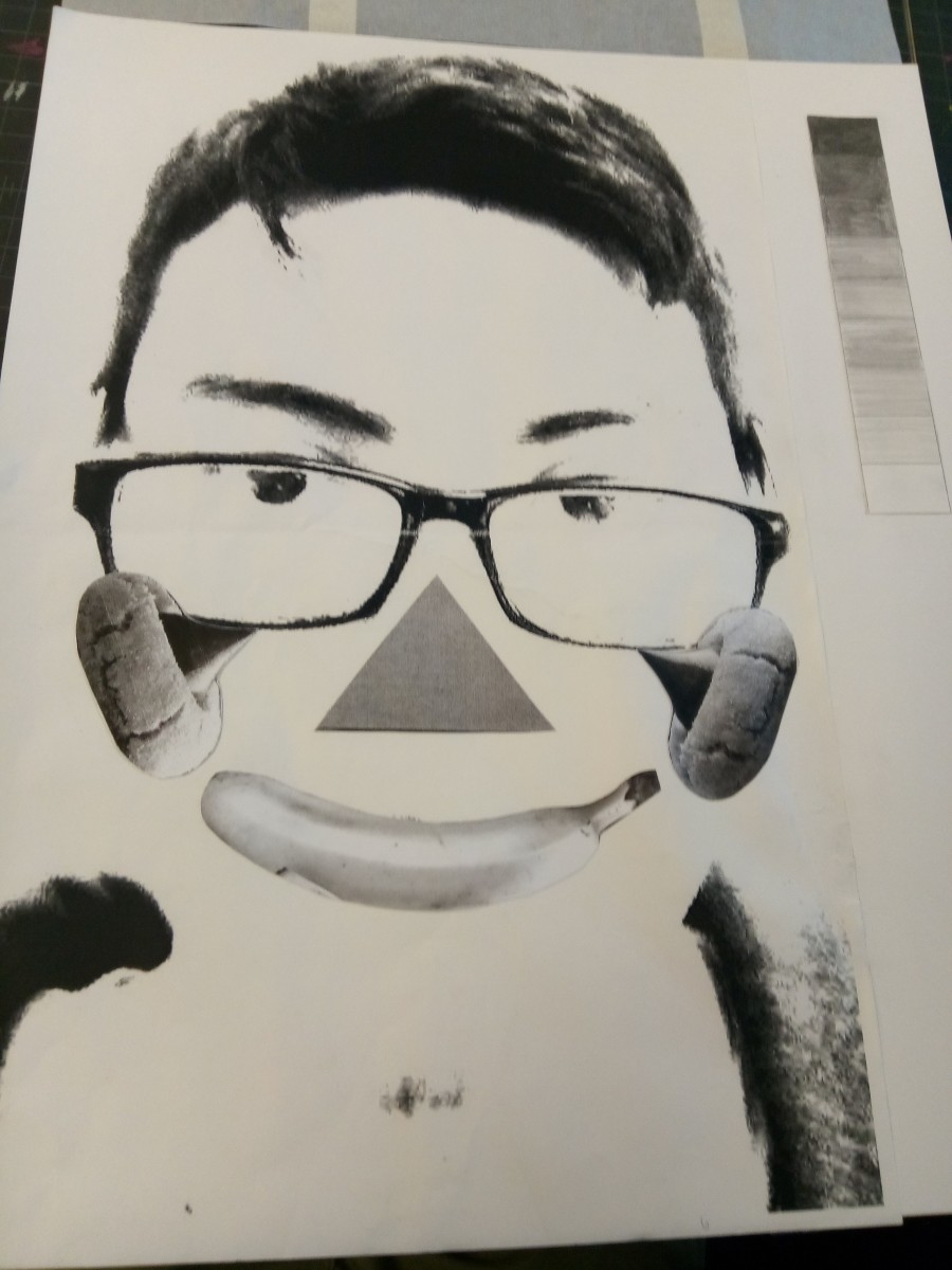
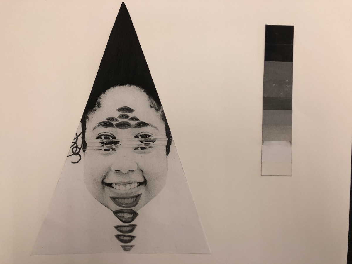
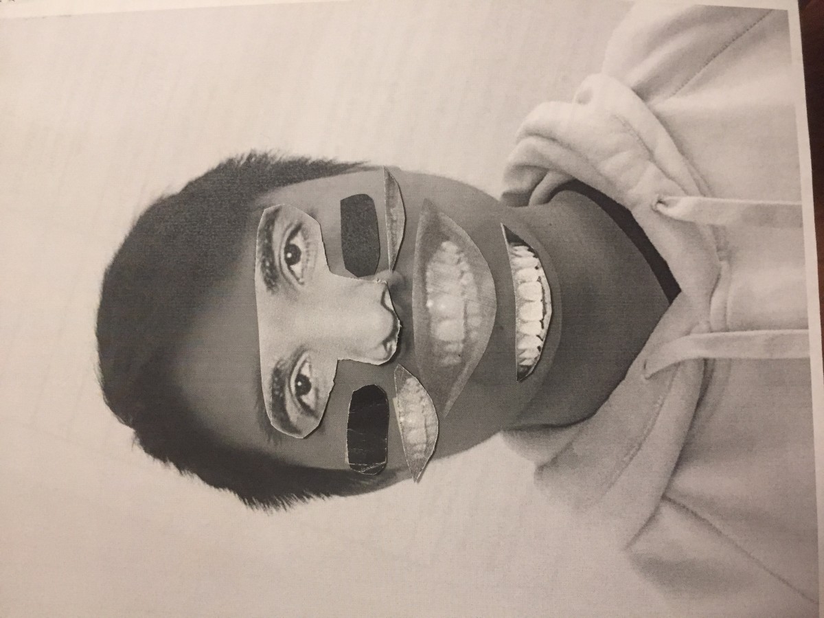
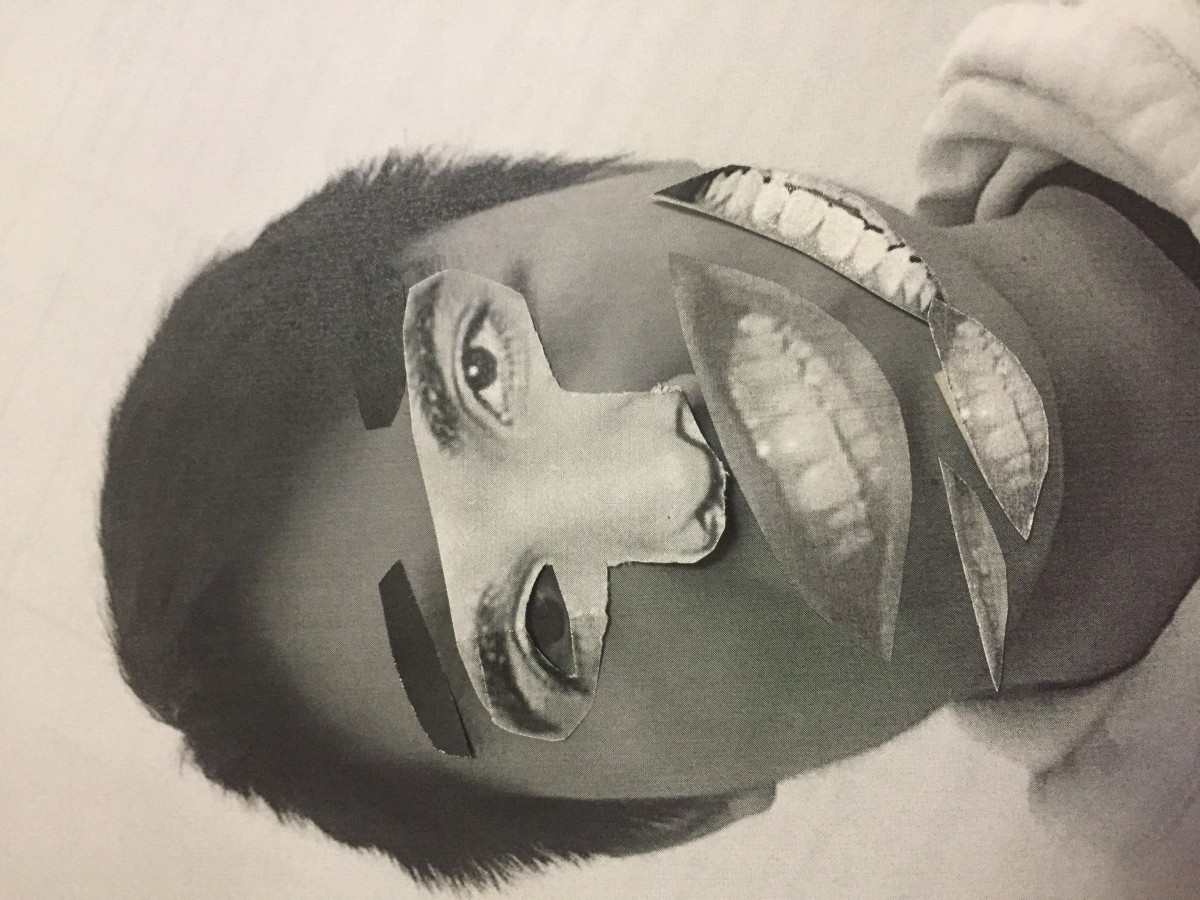
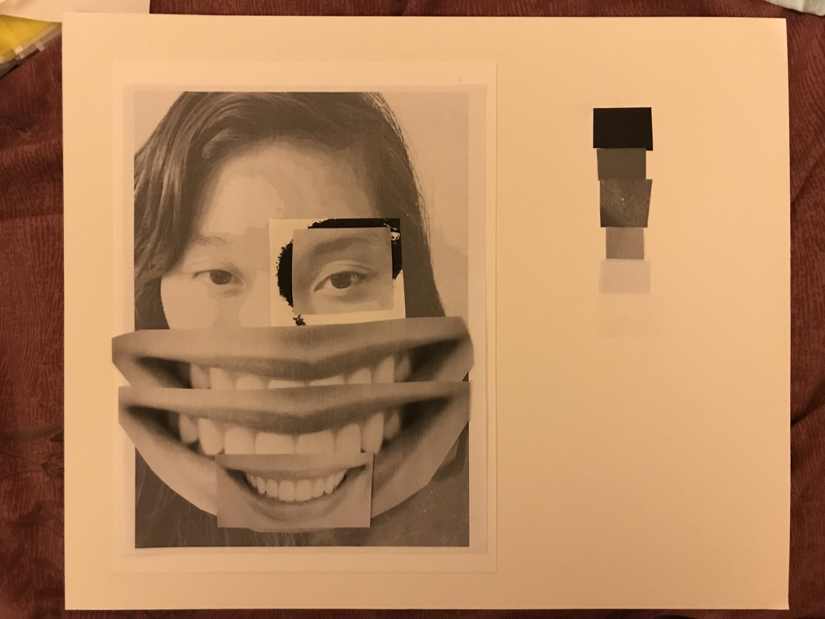
The mood I’ve chosen for this project is “Surprise”. I decided to have the focal point(s) be the eyes, with the darker outlines highlighting them. Additional details like the raised eyebrows and gaping mouth were added to emphasize the emotion.

To me, a surprised emotion usually involves something that blows your mind away, so I added bits and pieces of my own head doing just that. I placed it in an upwards movement to recreate that scattered and blown-up metaphor, all the while using the eyebrows to guide viewers toward that same motion.

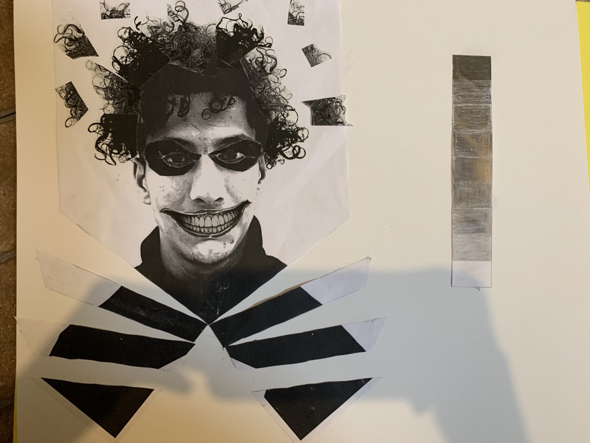
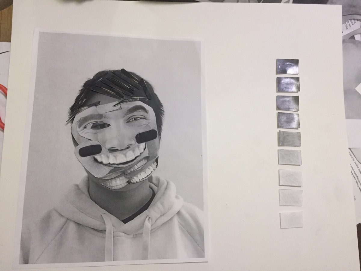
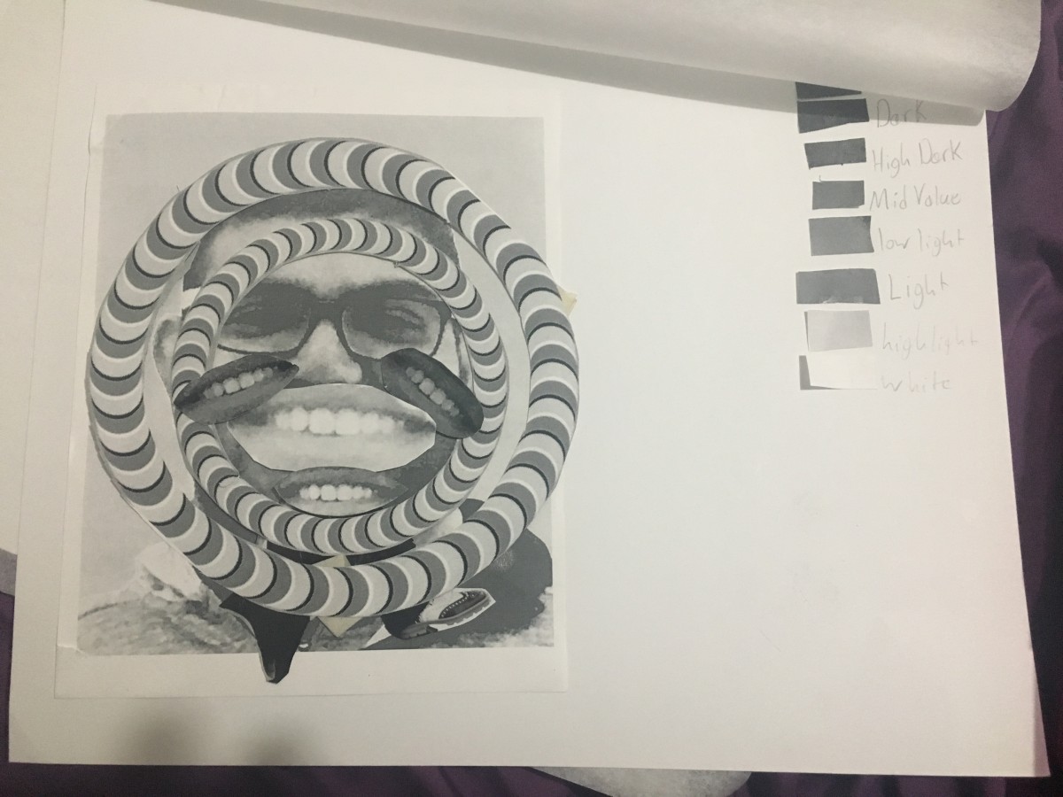
In this project I learned the importance of expressing emotion in a visual context without it being so obvious (ex: emojis). I think the concept of the mind blowing up was translated well enough, with other visual cues (eyes and mouth) giving hints as to what expression is being made. I think the unsuccessful part of this project was how little of the grey scale was in this piece. Yes I added pieces that built up towards the darker ends of the scale, but a majority of the work is dominated by the lighter end of the scale (ex: the face), whereas the darkest part of the scale is in the hair. This, I feel, leaves plenty of negative space surrounding the picture.

Project 2: Texture & Pattern – Final Delivery & Sketches


Here is my final composition and work for our Texture and Pattern project. I enjoyed the project overall but felt I struggled with my first couple of sketches. Ultimately I came to a better understanding on what was needed to achieve proper contrast and texture, and was able to finish with results I’m satisfied about. I learned how to design with type and use varying sized/shaped letters to create different contrasts and textures, while also learning to use lines outside of a contour to copy images that in reality do not have these contour lines we seek in them.

Project 2: Texture & Pattern – Develop in Ink


The fence’s texture is smooth and curvy; For contrast, the fence is dark on certain parts but is very bright from sunlight on others while having a flat and mostly darkened background.
The rocks are smooth and mostly round, while some have more straight and rugged edges; The left most rocks are much darker and bold than the rocks to the right which are all very light in contrast, while finally being tied together by the very dark black background below the rocks.
I feel all my sketches achieve what my descriptions entail, including the roundness of the rocks . the contrast of the darkened and light parts of the fence, the rocks’ very dark background, etc.