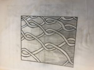
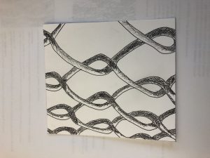
Fence: This image is an example how the shadows make up a dark part of an image. With the sun shining it’s light for the right side which helps create a dark and light sides to the fence. Using only lines and letters I used heavy tipped ink to create a shadow on the fence.
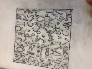
Tree: This image is an example of how contrast works with a image. I used lines to and with heavy ink marker I created a more contrast side to the tree and also with the words I made the typefaces bolder.

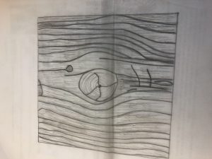
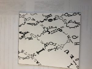
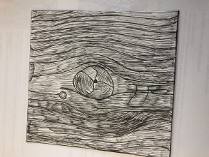
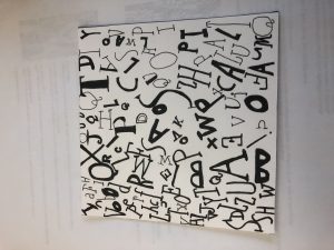


I like the ideas you have come up with but, for the type of the wood photo the image looks lost. You could try to separate the background from the foreground so that you can see the image more clearly
This good contrast between foreground and background and this shows a lot lines and a lot organization between both sketches